Well, the first project for my Computer Imaging course has been submitted for grading. I guess I will be finding out next week what the instructor thinks of my artwork, but until then I have other things to do.
The next project will be a self-portrait. As I’ve done three self-portraits in the past twelve months, I wasn’t too thrilled with the assignment. I have some ideas, however, and I will mull those over in time. This assignment will be, once again, three different compositions. The first will be a straight RAW photo that is processed in Photoshop. I use Lightroom for initial processing of RAW photographs and then only move into Photoshop if I need some heavy duty processing (mostly if I’m going to get extra-creative). Since I’m not the teacher, however, I will be following instructions like a good little student :-D. The other 2 compositions are going to be some sort of photomanipulation of a self-portrait using at least three sources. Also, each of the 2 compositions is supposed to be different. I have a few ideas on those as well. This should be, umm, interesting.
Holy crap the new Morbid Angel album is horrible!
The other classes are proceeding apace. This is going to be a busy but very rewarding semester. I just had my senior hold removed at UH (I have senior standing due to credits earned at the community college level even though I’m not quite a senior in terms of the courses I’m taking) and then I can start to think strategically on a long term plan for finishing the degree. I’m looking forward to this challenge, especially now that I’m in the thick of things.
Also, I did promise the three compositions from my first project. Here is the breakdown:
The 1st composition was to be inside a space of 480 x 360 pixels at a resolution of 72 dpi. For this one we could only use cut and paste aspects of collage work. The only exception was that we could resize the image to fit the work if necessary, which is good because 480 x 360 pixels is not a big space in which one can work.
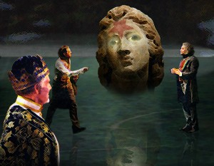
The 2nd composition was to be inside a space of 4.5″ x 3.5″ at a resolution of 200 dpi. This composition could be manipulated as we saw fit.
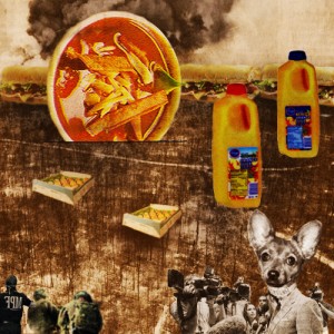
The third composition was to be inside a space of 500 x 500 pixels at a resolution of 72 dpi. In this composition we were allowed to manipulate as we saw fit, but this time we needed a unifying color theme. I chose orange.
The Houston Chronicle was to be the source for all three compositions. While not required, it would have been wise to make all three compositions something different and for each one to have a concept behind it. I conceptualized all three of the my compositions. Without further ado, here are “Chomp!,” “Lucretia’s Judgment,” and “Revenge of the Food.”
These took a little longer than I would have thought. I’m not much for collage work, so this was definitely a challenge.
Well, I have an assignment for my Fundamentals of Digital Photography class to finish up, so I’m heading out. I will update everyone soon regarding my progress. Until then, my faithful and not-so-faithful readers, I bid you goodnight.


Leave a Reply