Author: Rick (Page 14 of 17)

The Changing Mind’s Eye

I was inspired by some long exposure photos I saw in the 2010 Folios edition of “Silvershotz”. On Wednesday the overcast cloud bases were in cloud roll mode, so I thought maybe I could pull off something similar to what I saw. I got to the George Bush Nature Preserve here in Houston and went to the pond on Noble Trail. I set up the tripod, used the built-in level function on my camera, and searched my bag… I found that I left behind my 4-stop neutral density filter. I knew right away I wasn’t going to get the shots I originally wanted. Undaunted, I took a few shots anyway just to play some more with my camera.

For those who don’t know, a neutral density filter is a filter that cuts down on the amount of light that passes into the camera lens. It’s called neutral density because it does not affect the contrast or light dispersion into the lens, it just cuts down on the amount going in. It fits over the end of the lens. This allows for long exposures during bright light and will allow very narrow apertures for macro shots where a deeper depth of field is desirable.

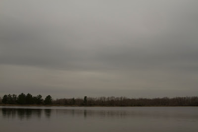
I took a few shots and decided on my Day 6 shot and left the others to sit on my hard drive. About 24 hours had passed and I decided to take a break from my paperwork and fired up Lightroom to look at some older photos. For some reason I decided to look at yesterday’s photos first. This is the original shot here:

The initial reason for rejecting this was that it just wasn’t what I was looking for when set out to take these photos. But I learned a little while back that nothing stays the same, even 24 hours later things change. I saw something more in this photo… something dark and sinister.

The darkness of the trees in the horizon stirred the emotion in me, so I started playing with it a little bit to bring into focus the vision within my subconscious mind. There was a harshness in the winter trees that played against the soft and subtle tones of the clouds. It was almost as if I were in a dream that was descending into something more sinister. After converting the image to black and white, it really became apparent that this was the vision in my mind.

The image was still too dark to be effective. I lightened the photo but the trees now looked funny. I was able to darken the horizon and found the darkness of the trees was playing very well off the clouds, which now had a rough but wide dynamic range. The white at the top center begins to darken as you move through the image, ending in the nearly black trees. The water took away from this effect, so it was cropped out. Once I softened the clarity of the entire image, my mind’s vision was fully realized:

This now was the final image. It shows a dark and sinister path ahead, which is what my mind saw when I opened the photo again less than 24 hours after initially rejecting it. The image is entitled “Chimera Descent”.

This little exercise highlights the fact that everything in life is fluid and changes can occur rapidly. I still go through some of my old photos looking for new visions that exist within my mind. Nothing stays the same, and sometimes the things we reject contain a beauty that only comes after initial contact.

Any comments on this are welcome.
Diving Tower Study 1 by Marius Rustad

As I’ve said before, minimalist photos rank are my favorite. To take simple elements and bring them all together to create a powerful image takes a vision and a mind beyond my feeble skills. This picture by Marius Rustad is no exception as it is a powerful photo.

According the short bio of Marius contained in “Silvershotz”, he was an only child, but he says he never felt alone as he was growing up. I can certainly see how this translates to his work. The photo here shows the lone diving platform, but one does not get the impression at all that the sense of loneliness one would normally get from an image such as this. Instead, the platform seems to enjoy its place in the seeming void of the water. This sense is reinforced by the perfect calm of the water, making the reflection nearly flawless. If it weren’t for the reflection and the darkening color of the water at the horizon, it wouldn’t be much of a stretch to believe that this platform is floating in the air. The calmness of the water also provides serenity.

The placement of the platform suggests that while it is far away, it is not so far that it is inaccessible. On the contrary, the platform seems to have chosen this spot as a small test of one’s worthiness to climb aboard. The test is there, but not impossible, or even hard, but still must be passed.

One area where this photo really stands out is the tonal range. The smooth tonality here is impeccable and was the first thing I noticed about this photo. The serenity offered by the calmness of the water is strongly reinforced by the ultra-smooth tonality of the photo. The only break throughout the photo (aside from the platform itself) is the horizon, but even that serves as a compliment to the overall feeling of the image.

The clarity is amazing, owing in part to his use of a 6×6 medium format camera (which is why the image is square). Medium format cameras use film that is larger than the standard 35mm film to which most of us are familiar. The result is superior clarity in smaller prints, with the ability to make larger prints.

I would encourage anyone to look at more of Mr. Rustad’s work, which can be found by clicking here.

What do you think of the photo? What does it say to you?

Spring Sea Ice by Roberta Holden

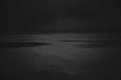
In my first semester photography class we studied with only black and white photographs. One of the dictums we were taught was that there images should be very dynamic tonally. The range should always begin with black and end with white. I suspect this rule was put into place to help us develop an eye for contrast (not to mention to provide a grading criteria) as in the world of art there are no hard and fast rules.

That’s what sets this image apart for me. The image is low on contrast, seemingly underexposed, and contains no pure black and no pure white. In my first semester class this would have not quite earned an ‘A’. But these things are merely technical, it’s what the image says to me that is important.

This image was taken in northern Canada and I assume it’s above the Arctic Circle. The harsh environment in that part of the world makes it a desolate and lonely place, not unlike those environments of the other extreme known as deserts that populate almost every continent. Here Ms. Holden captures that desolation. The darkness of the photo gives us the sense of the cold and lonely desolation in this part of the world. While most photos I see of the polar regions are taken in the day, the nighttime capture here adds weight to the feeling.

Not a lot of people know much about this part of the planet, mostly because barely anyone lives that far north. Ms. Holden makes no attempt to try to force more understanding here. The motion of the ice and water is captured in long exposure. The mystery of the Arctic environment is highlighted by this motion blur. We can see enough to know what is there, but not enough to form any sort of coherent understanding. Along with the sense of desolation, the darkness adds to the mystery of the region.

The absence of pure black and white, along with the low contrast, challenges our thinking of this environment. Polar regions and deserts are opposite extremes in terms of environment, and they are rightly thought of that way by most people. The lack of dynamic range and contrast for the most part forces us to consider that the environment is not what is extreme, it is our thinking that makes it extreme. Here we see that it this area is just what it is… the result of nothing more than its geographic location on the planet.

These simple elements all combine to bring a high level of complexity to this minimalist photo. Very few minimalist photos can convey so much, and of this work Ms. Holden I’m sure is proud. To see more of her work, you can visit http://www.nobarriersphotography.com/. I’m interested in hearing your thoughts on this photo as well.

Minimal

I don’t know why, but a lot of times I find photos with minimalist subjects to be some of my favorites. When I see one subject in the photo it often leaves me to wonder what the artist was thinking by not including any other elements. Does he only want to convey one thing? Perhaps he or she is leaving it up to our imaginations for what the image means. Or perhaps there is a more complex relationship between the subject and the space around it. I have started to develop a little more vision for minimalist type photos.


The image above is one I took on Saturday. The vent fan is the subject. It is surrounded by negative space, in this case it’s the sky. There is a relationship between the vent fan and the air, as well all know. The wind blows, turns the fan, which in turn pulls warm air from the attic and vents it out to the sky. But the beauty is we can’t see this action. It is left to our imaginations what is actually going on. The fan was turning slighty when I pressed the shutter, but I decided to not trying to capture the motion. Here I want you to wonder if the vent fan is fulfilling its purpose.


The above image was also taken on Saturday. This is one of a pair of sandals that my puppies got their teeth into early into their lives at my house. I have no idea where the right sandal is anymore, but that’s beside the point. Here we have the one subject that, rather than be surrounded by negative space, is shown surrounded by grass. Here I wanted to show the sandal in its permanent environment as part of the outdoor dog-toy collection. The shoe itself is all but forgotten, as the puppies moved on to chewing other toys, leaving this one in solitude. But if you realize that if I hadn’t told you the story behind why this lone shoe is sitting in the grass, you could be left to wonder… did something horrible happen? Did somebody lose their shoe? Is this a testimony on the wastefullness of some people. There are a number of questions as to why it’s there and the grass, although not part of the subject, adds to the mystery of the lone shoe.

As my vision evolves I’m starting to think about the relationships between elements more and more. It’s interesting what our mind’s eye can come up with sometimes.

Any comments, suggestions, or critiques are welcome.

Migrant Worker 2 by Peter Liepke

I was running some errands on Monday morning before heading to the tire shop to replace the tires on my vehicle. I stopped by Best Buy to drop some old cell phones in their recycling bins when I decided to head over to Barnes and Noble to pick up a photography magazine to read while waiting for the tires. As so happens I picked up a copy of Silvershotz. This is one of many fine art magazines out there and one with which I was not quite familiar.

It was in the current (Volume 6 Edition 1, International) issue that I first spotted the work of Peter Liepke. At first I wasn’t sure if these were photographs in these pages as there seemed to be no focus in the images whatsoever. I learned that the images were mostly gum bichromate prints. This process was developed in the 19th Century and gives a very painterly look to the photograph. The images I am discussing today was printed using this process.

Migrant Worker 2 by Peter Liepke

What can I say about the composition here other than it seems to be perfect? The sky, earth, and person all have an appropriate sense of scale, where the earth is bigger than the man and the sky is bigger than both put together. With the man all alone in the field, we can see the enormity of the task before him. Holding his tools he is looking down and focused on what needs to be done. Although the clouds appear overhead, through them we can see the rays of sun shining down on the man. It suggests that although his labors are hard and long, his reward awaits him in Heaven.

These elements all compete for attention, but no one element overpowers the other. The loneliess of the worker is telling. I have to admit that I myself am ignorant of the mind of a migrant worker, but here the image suggests a loneliness felt. Perhaps he feels forsaken? That could explain why his back is turned to the rays of light. Or perhaps he is so focused on his task that he fails to take notice of the beauty behind him? There are countless theories as to why this is. Here through the whole image there is more clarity than in some of Liepke’s other images, but nowhere is the image tack-sharp. This makes the image almost surreal, as to suggest that while we know about migrant workers and how hard they work, as mere observers we can never know truly their life experience, which is the reason we will never know why his back is turned on the sky.

In the Silvershotz article Mr, Liepke discussed some of his philosophy. In general he is against the current trend of showing vulgar and bleak scenes that highlight the failures of society and individuals. He sees himself as more a detached observer who wants to record the inherent beauty, and to show what could be instead of what is. Most of all, he wants to instill an inspiration with his work. With this image, while he shows a reality, there is an inspiration that can be gained.

I’m going to admit right away that this wasn’t my first choice from Liepke’s body of work to critique. My first choice was an image entitled “Poet’s Walk”. Unfortunately, that image is not found on his website and the only copy I could find on the web was less than satisfactory. But this image struck me. The balance of the tones and composition could not be ignored. All in all this is a beautiful image that could easily find itself amongst a collector’s favorites.

Anyone have any thoughts or ideas on this particular image?

Umm, Yeah… Okay

Wow, I can’t believe it’s been over a year since my last post here. I started this blog as a way to help track my growth in photography. Shame on me for abandoning it.

I’ve been a little busy with the camera, though probably nowhere near as busy as 2008. I did manage to take a little trip to Minnesota for the sole purpose of photographing some of the state. I’ve also shot a few concerts here and there, but nothing like 2008. With the absence of Ozzfest this year I was sure there were going to be a lot of smaller tours going through. I’m not sure if it’s the economy or what, but the concert season was unbelievably light this past summer. Other than the trip to Minnesota, my productivity with the camera this year has not been as prolific as 2008.

While I’m striving to take technically correct pictures (i.e. good exposure and, in the case of digital, white balance) I found my vision seemed to suffer a little bit. I’m not sure what’s going on, but my photos over the past 8 or 9 months just don’t seem to be all that interesting when I look at them. For a lot of rejected photos I will look at the digital negatives again 6 or 7 (sometimes even more) months later. In some cases I find that there is something there I didn’t see before… but this year that has been the case very few times. To that end, in the past 2 months I’ve been looking at a lot of what are considered fine art photos and trying to draw inspiration from them. Perhaps my mind is becoming more discriminating in my own work. If that’s the case, I need to sit down and figure out what’s causing me to be more discriminating.

Whatever the case, I’m thinking of merging this blog and Primordial Light into one website. I don’t know yet what the name will be as there is another website called Primordial Light, which is a hobbyist astronomy site. It will be a little while before I get to that point. Whatever the case, that’s still a little ways off as I work through the real-world responsibilities of a job and raising 2 puppies. Also, I will be discussing more of some other work I see out there and talking about how it works for me. This should help me get closer to the answer of what exactly is the nature of my own vision.

There aren’t any pictures today as I still have a lot of work to do. I just needed to update my faithful and not-so-faithful readers of my status.

Exposure

Few things can be as confusing to a new photographer as the concept of exposure. I can assure you now that I am not the exception here. Often I find that I missed a good shot because, while my meter said it was ok to go, I did not expose that part necessary to accurately capture my vision.

When the lighting is for the most part even, exposure is generally not a problem because, well, the lighting is even. However, as those who have spent a little time behind the viewfinder know, light rarely is even in any given composition. There are areas of light and dark which run a pretty wide gamut. This is where the problem usually occurs as exposure of one extreme often causes the other to suffer.

Here is a case in point. The first flag picture below was taken with a Pentax 645 with Kodak 400VC film. For this picture I placed the center of my viewfinder over blue sky (I don’t remember exactly where) and snapped the picture. The result was a nice blue sky, but the flag, as you can see, was very dark.

I metered the picture and snapped it when it said ok, but I didn’t think much about what it could look like until I thought more about the settings. The camera was set at f/22 with a 1/1000 shutter speed (which also happens to be the limit for this lens/body combination). When I looked at the flag again and thought about what it would look like, I correctly predicted that the flag would be dark, but to be honest I really wouldn’t know for sure until the film processed. I decided to take the picture again only this time I decided to expose the flag and recompose. The result was a much more vivid flag:

The other thing you may notice about this is the sky went from a semi-bright blue to a bluish gray color. I’m no light scientist, but I would venture to say that this is because the camera let in 4 times as much light this time around (f/22 at 1/250) and the result was a slight overexposure of the sky. When I got the film back from the lab and scanned it in, I was amazed at how much difference existed between the 2 photos when just changing the exposure base.

The reason I can bring this to you now is this marks the first time I made a concerted effort to record my settings after each photo. In the past I metered, shot, and moved on to the next thing. I find in film this can be a little self-defeating as since I couldn’t check on the settings at the time of the photo, I wasn’t able to make any correlations on why one photo worked and another didn’t work (from a technical stance… aesthetics are another matter altogether). I could check shooting digital, but even then with the sheer number of digital pictures it becomes somewhat overwhelming comparing all the settings.

When it comes to digital versus film exposure, there is a fundamental difference. My first photography professor told me that it is better to overexpose than underexpose because an overexposure contains more “information” than an underexposure. Well, I took this information to a concert with me and found that I took a lot of overexposed shots that no amount of digital manipulation could fix. What my professor left out was that overexposure is better for film photography (unless of course you have a 15-second shutter speed at 2:00 in the afternoon). I can’t really blame her for that as we were supposed to be focused 100% on film photography. When it comes to film, you should generally expose for shadows where in digital you should generally expose for highlights. From what I can see, highlights can be recovered quite well in the darkroom, but DSLR camera sensors don’t handle blown highlights nearly as well as a pack of Ilford paper.

So the biggest lesson here is to record, whenever possible, the settings used to take a picture. It takes a little work in between shots, but when specific settings can be tied to a specific photo it becomes very easy to see what works and what does not. This will hopefully translate into one being able to take the best picture the very first time.

As always, comments are accepted and welcome.

PS – As for the flag picture, a little light and color balancing on the 2nd shot yielded me what I think is a beautiful flag. I call it “Phoenix Rising”.

New Toys

I know it’s been a while since I posted here. While I have been shooting (and my flickr profile attests to this), I really haven’t been challenging myself for the past few months. I spent some time in Los Angeles near the middle of July, but most of my shots were of the snapshot variety. The one time I got to try to take some really breathtaking shots of the city was ruined due to heavy smog. Oh well, better luck next time.

I did get a new toy from the UPS man today. I had been in the market for a new point-and-shoot digital as I found the limitations on my Olympus quite… well, limiting. After careful research I decided to get the Ricoh R8 digital camera. This camera got some really great reviews in terms of features and had better than average image quality. It also has one thing that most cameras do not have – a really close macro function.

In fact, this camera can macro focus with only a space of 1 cm between the lens and subject. That’s some of the closest macro focusing I’ve seen on any camera. To compare, the macro lens for my DSLR requires 12 inches from subject to leading element. The Olympus Stylus 770SW requires 8.4 inches from subject to lens in regular macro mode and 2.8 inches from subject to lens in Super Macro mode. I’m in the process of playing with it, but I do have some pictures to share with you…


I call this one “Gozer Kitty II”. There is a membrane inside the posterior wall of the retinas of many mammals, which is why you get reflections when you shine a light directly in the eyes of a cow, a raccoon, or in this case, a cat. Human retinas do not have this membrane present. The cat looked at me as the flash was going off. I normally try to use as little flash as possible, even on point-and-shoot cameras, but this time I was testing the power of the built-in flash.


This was me taking a picture of my steering wheel while waiting for a train to cross. I had to macro off at this point and was amazed at the level of detail captured so close to the steering wheel without macro. It also shows that I need get a toothbrush on the inside of my car soon.


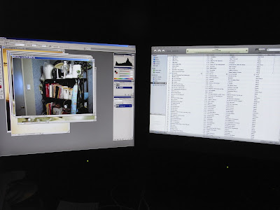
So while I was scanning some film I picked up the camera and took a picture of my Windows workstation. The screen shots are pretty clear here, better than I expected. My Olympus seems to have problems metering the LCD screens sometimes and gives mixed results. I love how the displays seem to be floating in a sea of black.


Finally here is a macro shot. I know this isn’t a super sharp focus, but I think this camera holds its own very well here. The camera was only a little over 2 cm from these CD spines and was able to get a clear picture of the labels underneath the plastic. My Olympus has what’s called a Super Macro mode that lets you get really close, but it has problems figuring out the subject and so the focus is sometimes hit or miss. On other macros taken earlier with this camera, it got the correct subject about 75% of the time on the first try and was almost always corrected when recomposing the image.

All in all, I think I am going to be pleased with this camera. The image quality is great and once I learn the different features of this camera, I think this will open up some creative possibilities when I find myself without my SLR or DSLR. I know that the camera is just a tool and that it’s the person looking through the viewfinder (or in this case, LCD) that makes the picture, not the camera. But let’s face it, sometimes if the tools aren’t there, the job doesn’t get done.

Making Art

I’ve always been of the school of thought that art is that which we use for expression of the self. The imagination is not constrained by the rules that hamstring the sciences and one can use almost any medium imaginable to express that imagination. And that expression can be on any level from the obvious to the completely abstract. In essence, art is what we make it.

Effectively expressing one’s self obviates the need to master a given medium. Da Vinci could not have painted the Mona Lisa without first knowing how to effectively combine the canvas, paint, and brush to achieve the effect he wanted. Mastering the medium is all about achieving the desired effect.

Part of art instruction, aside from learning the myriad of media available, is challenging the student to find new ways to express the self. It’s one thing to simply put forth the objective, but it’s a different thing entirely to put forth the self in a way that challenges the artist and stirs something in the viewer. Once the artist is able to tap the imagination in terms of expression, the sky is pretty much the limit.

Consider this picture:


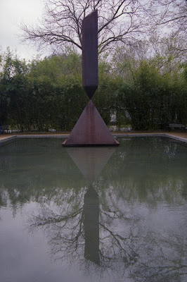
This sculpture is part of the Menil Collection in Houston, TX. I set to shoot this to make it look as if the branches were springing forth from the obelisk. I thought with the contrast from the backlight I would achieve that effect. A quick glance shows that I achieved that effect in the actual object, but closer inspection shows the distinction between the branches and the broken obelisk body. I submitted the printed photo for critique.

The teacher praised me for coming close to achieving what I wanted, but then told me that aside from achieving my stated effect, I really did little more than document art produced by somebody else. I was a little deflated because I was proud of the picture, but I knew he was right in his assessment. In essence I had mastered the medium as far as what I wanted to do, but I had not challenged myself into representing the subject in a different manner.

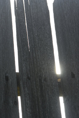
Fast forward about 4 months and I find myself trying to find something to do with my camera. I was doing up some barbecue of the slow smoked kind and decided to take some shots in my backyard. I thought my back fence would be a good subject for expressing decay since, even though it is still standing, is nearing the end of its useful life. Here is the shot I thought best represented the decay I was seeing:


After stewing over this one (and publishing it on Primordial Light) I started to think that there was something missing. I still can’t quite put my finger on it, but there is something missing. I see decay, but then what? The sunlight coming through really didn’t add anything to the picture.

I had spent much of my time over the past 3 months concentrating on concert photography and had not really done anything else. I thought back to what my Photography professor had said about the obelisk picture and realized while I was creating art, I was not challenging myself or the viewer.

I decided to offer up the challenge to myself and here are the new and improved obelisk and fence photos:


The same images taken in new directions with very different results. One person I spoke with gave me 2 different reactions after looking at the photos.

Now I challenge you to let me know what you think after seeing these pictures. In the words of my buddy Mark – “Don’t be afraid to comment on the photos”.

Digital Toolbox

One of the amazing things about digital is the vast array of tools that are available to the photographer for processing the shot. Indeed, the amount of hardware and software packages available is astounding. You can get a Chromira processor for a price that runs well into 5 digits, a scanner dedicated to film (thus creating digital pictures from film), full featured software such as Adobe Photoshop, or even small programs like Apple iPhoto. All these things help someone take the picture from the camera and do amazing things with the picture.

Most of my photos would not be possible without the tools in my digital toolbox. All my film photographs are scanned directly from the negatives rather than prints. I use an image editor to clean the dust from the scan (sometimes dust is inevitable and DigitalICE takes too long). Then I use Aperture to correct and exposure issues, etc. with the image. Some say this is cheating, but most things that can be done in Aperture can be done in the darkroom as well. I try as much as possible to take the picture correctly the first time, but there are times when the output can be improved upon. Even the great Ansel Adams used darkroom tricks to improve his prints. I’m sure that if he had lived to see what can be done with a computer, there would be digital tools in his arsenal.

Now that I have a little more time, I am starting to explore some more the digital tools out there. I use Aperture for much of my processing work. Up until now there weren’t that many plug-ins available for Aperture. Since the release of 2.0, however, the plug-ins have started to trickle in. This evening I downloaded trial versions for 2 of the plug-ins available and decided to see what I could do. Here is an image that I played with earlier:

This is the original picture exported directly from the RAW file. For those not from Texas, this is the Texas Bluebonnet, a flower native to Texas that draws out the photographers from every hiding place in the state each spring. When I took this photo, I accidentally left my camera in ISO1600, which gave me a lot of noise. Also, the colors seemed a little washed out to me. Since my focus was on the flower and not the field around it, I cropped the picture and fired up AKVIS Noise Buster and got this result:

This is now a more noise-free photo. I left the out-of-focus flower in the picture to keep the original subject from being too centered and to let the viewer know that this was taken in a field of bluebonnets and not in a garden or a flower pot. I discovered AKVIS a while ago and have used it much since it’s purchase. In fact, most of my concert photos go through AKVIS. The colors were still a little washed to me, so I imported the new noise-free image to Aperture to tweak the colors and ended up with this result:

To me now the blue in the flowers really pops out against the green of the grass. The only trouble is now the flower in the background stands out a little more. I suppose I could have cropped the photo closer to the subject, but I just didn’t want a totally frame-filling subject. This picture is what would eventually end up in my flickr photostream. Some people seem to like it.

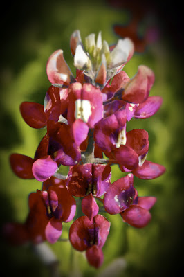
So I was reading through some groups and found that there were plug-ins available for Aperture. So I went and downloaded DFT Ozone and Tiffen Dfx. DFT Ozone allows for selective color changes while Tiffen Dfx is a filter plug-in. I took this image to see what I could do with it in both the plug-ins and this is my result:

Now I have a centered portrait of a Texas Redbonnet (doesn’t exist for those non-Texans out there). DFT Ozone was used to change the color of the petals while I used Tiffen Dfx to add the vignetting. The final edit was the crop in Aperture to tighten the image. There is still a trace of the other flower, which still gives the impression that the picture was taken in a field. I wish I had saved a copy of the image between plug-ins, but before that I hadn’t even planned this blog entry.

I know that I’m not even scratching the surface when it comes to digital tools available. I found an Aperture plug-in earlier that will allow one to isolate the area of the image to be edited. That one will be downloaded a little later. I know that many will say that Photoshop offers some of these things as standard, but there are drawbacks to Photoshop (cost, learning curve, etc.) that drive users to seek other solutions.

As always, comments are welcome and encouraged.

« Older posts Newer posts »