Author: Rick (Page 15 of 17)

The Results are in…

For those who read this (all 3 of you hehe) that may have been wondering what grade I received in my Photography II course, wonder no more… I received a B. The teacher didn’t go over anything when he looked at our portfolios… he simply went through them, snapped photos of a couple of pieces, closed it up, and went on to the next person. I’m not sure what the basis was for the final grade. I know that I did miss one critique, so there may be an issue of productivity. At any rate, perhaps I’ll ask him sometime down the line.

There aren’t any pictures tonight. We had a get together at my house earlier today and I’m kinda tired from the cleanup. Have a good night everyone.

The Portfolio (Warning – Long Post)

This semester has been stressful to say the least. There have been a lot of demands on my time these past few months. This doesn’t even count all the things going on beyond my control, such as rising prices, getting sick, and presidential elections, that affect me. In a few days it will all be over and I will be able to relax (relatively speaking) for a few months before the next semester starts.

I may take Photography II again as it will help me grow as a photographer. I know the professor will help me go in new directions. However, I won’t really be learning anything new by taking the course again. I wouldn’t mind taking a more advanced photography course at the University of Houston, but that costs a lot more money than the local community college. Hmmm… I’m sure there are other options.

But before I start daydreaming again, I have settled on my final portfolio. I made some changes from my last post by taking a couple of pictures out and adding in a few others. I tried to make the flow a little more logical through the pictures before taking a radical turn at the end. You can see for yourself when you view the photos. Speaking of the photos, without further adieu, here they are:

#1

#2

#3

#4

#5

#6

#7

#8

#9

#10

#11

#12

#13

#14

#15

Ok, 15 pictures are ready for the portfolio. There is no overlying theme to them, but there is definitely a flow to them. For the uninitiated, here goes:

1. Sunset at Padre Island, a suburb of Corpus Christi, TX;
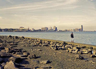
2. A man walking along the seawall just off Shoreline Drive in Corpus Christi, TX;
3. Downtown Corpus Christi from the piers;
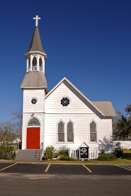
4. The courtyard at St. Mary’s Catholic Church in Brenham, TX;
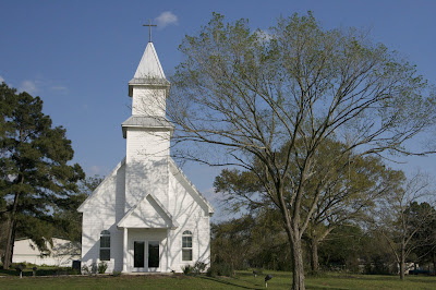
5. Mill Creek Church in Bellville, TX;
6. The dome at Sacred Heart Catholic Church in Galveston, TX;
7. St. Paul’s Lutheran Church in Schulenburg, TX;
8. The Chapel at the Houston National Cemetery in Houston, TX;
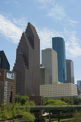
9. The northwest corner of Downtown Houston, TX taken from the bank of Buffalo Bayou;
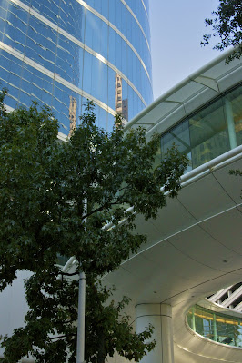
10. The traffic circle coming from the 1500 Louisiana building (formerly Enron II) in Downtown Houston, TX;
11. The cello player sculpture in front of the Lyric Center in Downtown Houston;
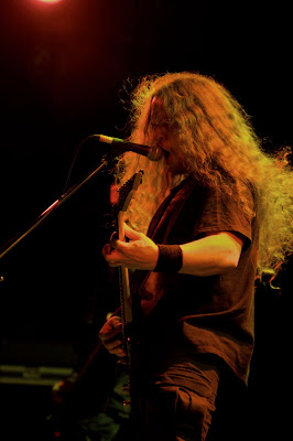
12. Waylon of the band Mushroomhead during their performance in Houston, TX on April 12, 2008;
13. Nothing of the band Mushroomhead during their performance in Houston, TX on April 12, 2008;
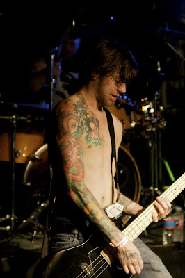
14. Nate Johnson of the band Since The Flood during their performance in Houston, TX on April 3, 2008;
15. Rick of the band Since The Flood during their performance in Houston, TX on April 3, 2008.

As you can see, there is a flow to the way the photographs are arranged. It took a bit of thinking to get that together. Numbers 2 and 3 were film shots taken with my Pentax 645 on Kodak Portra 160NC color film. All the rest were taken with my DSLR. All of the photos except 10, 12, and 15 are printed on archival inkjet paper using an Epson 2200 printer. Numbers 10, 12, and 15 are printed on photo paper using the chromira process.

Barring any last minute order tweaking (we are always second guessing ourselves), this is the final portfolio this semester. Let me know what you think as I need the feedback to grow.

That Time Again

We’re coming up on the end of another semester. That means it’s portfolio time. This time I don’t need an unifying theme, but I do need 15 to 20 of my best prints. I’m going through them at this point and have decided on some to go in, but I’m going to need a few more. The cool thing is this semester we had a digital project, and I have plenty of digital photos to choose from this semester.

The cool thing is I’m seeing growth in my photography. The not so cool thing is that I’m having trouble charting my growth… i.e. I’m having trouble seeing what it is about my pictures that shows growth. Hopefully soon I can figure this out.

Here is a sampling of what I’m submitting for the final. First are the digital shots:

The first photo was printed with a chromira process. This process takes the digital image and exposes it to normal photo paper. The print is then processed normally as you would a film print. The others were printed on either Moab Somerset Enhanced Velvet paper or Moab Lasal Premium Luster paper on an Epson 2200 photo printer.

And now for the film prints:

These were both taken on Fuji 160C with a Pentax 645. I was able to complete the first print successfully in the enlarger. The second print, however, had a few dust problems when I put it through. It looked as if there was some dust in the emulsion. I’m thinking with this one I may go ahead and print it on the Epson. I have a feeling that it will really pop out if I print it on the Moab Somerset Enhanced Velvet paper, which gives the photograph the feel of a watercolor painting.

As you can see I have 7 selections so far, so I’m just under halfway there. Then I need to decide on the portfolio format, mat the prints, assemble the portfolio, drink lots of caffeine, etc. Oh yeah, I have 2 other finals I need to study for as well.

Comments are welcome and encouraged.

Frustration…

… comes from many sources. On Monday it was a perfect storm when my computer containing my income tax information developed issues, I contracted a cold, and I was still a couple of prints short for my digital project in Photography II. I filed for an extension, drank a lot of fluids, sweated A LOT, and stayed up until 2 am trying to get 4 suitable prints from my Epson Stylus 925. Don’t get me wrong, the 925 is a good home printer, but not good enough for a college project.

Did I mention I missed a test for my anatomy course? Yep, I sure did. I hope the professor will cut me a break and let me make it up. My computer crash demanded my attention as I was seriously freaking out about my income taxes. There is a chance that I can pass with a ‘C’ while receiving a 0 (zero) on the test, but to do that I’m going to have to kill the final lab exam and the final course exam. Nothing like a little pressure…

At any rate, this isn’t a touchy-feely blog about my emotions, this is about my photography, so let’s get to it. It took a while to go through all the photos from Saturday. As I said, the proportion of keepers to junkers was rather low. Most of the bands used the red lights while they were on stage. This was my baptism by fire that red light is a pain in the ass to shoot. I had read about it, but this was the first time it really affected my photos. I’m not quite sure as to the physics behind it, but I do know it’s not very fun.

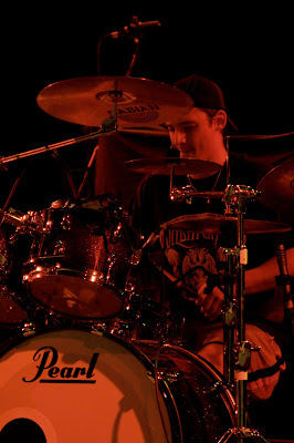
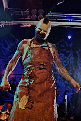
As for more keepers, here are a couple that were taken in the challenging red light:

Both photos are of the death metal band Hate Eternal. The person in the top photo is Erik Rutan, who is a living legend within the death metal community. The bottom photo is Jade Simonetto, of whom I know very little except that he is the drummer for Hate Eternal.

Ok, now you know who they are, let’s talk about the photos. Mr. Rutan had a 2 different colors shining on him through his set – red and yellow. This gave him a fiery presence on the stage, but oh boy was it a pain to shoot him through that. In most of the photos the yellow highlights were blown off the histogram and there was no way to recover them. Using Aperture I was able to recover some of the highlights here, but this was 1 of only 2 of Erik Rutan I was able to keep.

In Jade’s case, this one came out exactly as seen, which was really surprising. I’m guessing it had something to do with the fact that he was bathed in red light and only red light, which didn’t confuse my camera sensor. I was particularly proud of this photo since I was able to get a level of detail in the drummer than is usually possible without getting on stage.

At any rate, those were a couple of keepers from the pile of 800. Before I went to the show, I did walk around downtown Houston for a little bit and took some photos. Here is some random eye candy for you:

Downtown Houston from the west bank of Buffalo Bayou.


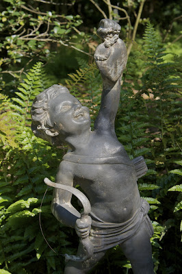
Cupid displaying his trophy. This is part of the Museum of Fine Arts, Houston Bayou Bend Collection.


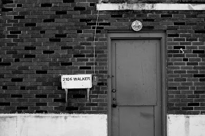
A back door to an Asian food distributor in the old Warehouse District of Houston. I like this one particularly for it’s composition.

As always, comments are welcome and encouraged so as to foster my growth as a photographer.

* – By the way, “The Sharp Carousel” has moved. The new blog name is “Mark Alan” and is now in the “Other Cool Blogs” section to the right. If you are not familiar with Mark, he does some very creative and very cool self-portrait work. Check him out, you won’t be sorry.

Argh

Concert photography marks one of my more frustrating endeavors. Sometimes I get it right on and other times (more often) I fail miserably with some shots. I changed tactics with a show I did a couple of weeks ago and set my camera to burst mode.

Before I used to always take my shot in one-shot mode and then wait for my next opportunity. Needless to say with AI Servo mode that it was really easy to lose a shot if the lens was focused on something other than the performer such as the microphone stand or the neck of the guitar. I found in the Since The Flood show that using burst mode would yield me at least one good picture in a given series of shutter actuations since the AI servo focus is constantly adjusting.
That leads me to the frustration of last night. The show was at Warehouse Live in the old warehouse district of downtown Houston, TX. It’s a nice venue and it’s the first time I’ve had a chance to shoot there. I did get some good shots, but here my big issue was lighting. Some of my shots that would have really kicked butt were the worst in terms of lighting. I took a little over 800 pictures last night, but the proportion of good to bad was really low in relation to the Since The Flood show.

I’m still in the process of going through the images. Hopefully soon I’ll have some of them up on my Flickr page. Here is an example of one where my skill with the use of existing lighting resulted in a bad picture:

This is Nothing, vocalist for the band Mushroomhead. This dead-on shot resulted in a level of noise that was completely unacceptable. The problem for me was that he posed for me to take this shot and the moment was gone as he had a show to perform. I tried to lower the noise level in AKVIS Noise Buster and got this result:

The noise level dropped significantly, but this was the best I could do with the noise and still keep the detail of the shot. The blown highlights and color aberrations also would need extensive Photoshop work to make this a serviceable photograph. Needless to say, I was a little disappointed. But the best part is I got a great shot of Nothing earlier in the evening:

At any rate, I do need to get some more of these shots processed. As always, comments are welcome and encouraged so I can grow as a photographer.

Sunshine

A couple of days after my last post we finally got some sunshine here in Southeast Texas. It was welcomed mainly because I could now start work on some good pictures. Overcast skies are good for really even lighting, but the resulting pictures can look so boring.

I also tried some new film this time as well. I have been shooting Kodak Portra 160NC and VC. The NC stands for neutral color and the VC stands for vivid color. To be honest I really can’t see a different because both films seem to be a little flat and contrasty. I suppose I should expect the contrastiness due to the fact that it’s ISO160. I shot 2 rolls of Fuji 160C color film (220-size) and I must say I like those a little more than I like the Kodak Portra offerings. After doing a print of one I was rather impressed. I should look into the Superia line of films.

I read about Kodak Ultracolor film, but I cannot find that in medium format anywhere, online or in a brick-and-mortar establishment. Well, I bit the bullet and ordered some 35mm rolls of Kodak Ultracolor 100 and 400. I also ordered some paper that will hopefully add some more saturation to the photos I’ve already taken… we’ll see.

As to the offering of photos for this entry… let’s examine them, shall we?


These 2 photos are among my favorites taken from the Fuji rolls. I love the composition on the upper picture (taken at Hermann Park in Houston, TX). The lower photo is just beautiful to me. In both photos (indeed on most of the roll) the colors are very vibrant, more so than on the Kodak Portra NC and VC films. The shots are a little contrasty, but to me it works in both pictures as it helps preserve the detail.


This was taken also on the Fuji film, but this one helps illustrate a little better about my last post. The whole picture seems more dynamic when sunshine is a factor. I need to learn to use it better to my advantage as I learned that sunlight can easily washout any color you come across (more examples later as I don’t have access to the machine that contains them at this point).


For those who think I may have forgotten how to use my DSLR, you’re mistaken. These were taken in Galveston, TX over the weekend. We have a digital project coming up in my photography class and the picture of the cathedral dome is going toward that project. The seagull was just an opportunity that presented itself on East Beach.

As always, comments are welcome and encouraged. For those of you who haven’t noticed, check out “The Sharp Carousel” listed under “Other Cool Blogs.” I have seen some of Mark’s work both online and off. He has much creativity and skill in him.

Learning

The past few days in Southeast Texas haven’t been the prettiest. The last time we had good sunshine was on the morning of 2 February. The sky was clear in the morning and had ceilings by 1:00 pm. Since then it’s been one long overcast day.

It’s funny how, in course of doing something, pick up fragmented pieces of information here and there, but sometimes we can’t seem to tie it all together in order to apply those pieces of information to real world problems. That’s what I was like when I started photographing. I would read articles in “Popular Photography” and see terms like depth-of-field, sunny 16 rule, power position, etc. I would find out the meaning behind these foreign terms and then try to apply them only to get negligibly better results. When I first enrolled in a photography course, I learned one concept that tied everything together – that concept was the light meter.

Ok, now that you’ve stopped laughing, I can explain. I never knew the purpose behind the little number line at the bottom of my viewfinder (as you know, I shoot a Canon DSLR). I knew that a smaller aperture number meant there was a bigger opening and knew how shutter speeds worked… but I could find a way to tie the concept together. I was shooting in shutter-priority mode to sometimes pretty bad results, sometimes pretty good results. My teacher explained the concept of the light meter and the lightbulb in my head went to full output.

I finally understood the relationship between the aperture and shutter speed and how the light meter would help me select the correct values to take the shot. I was elated after class. I was so elated that I went to CVS, bought 2 rolls of Kodak Tri-X 400, and shot the first roll in less that 30 minutes after getting home.

The same thing is starting to happen now with light. In my previous photo class, which was all black-and-white, we concentrated on mastering light and shadow in the picture. In color, light takes on a new dimension in that it will affect how your colors look when the light hits the film. With the addition of color as a new dependent variable, new depths can be achieved with the photograph.

That’s not to say I’m a master of light and shadow. I have a lot to learn in all portions of photography. If it were up to me I would add a third class to my school’s photography program. I can suggest it, but ultimately I don’t control how my state taxes are spent in the colleges.

To illustrate my point about light affecting color, consider the photographs below:


Both of these photos were taken from the same vantage point just a few minutes apart. The sky was heavy overcast. The clouds dispersed the light and made it very even all over the picture. The colors are still there, but not as vibrant as they could be if the sun was out. Now when the sun is out…


This was taken three days earlier in Waller County, TX, just west of the Harris County line. The clouds, which were a beautiful blend of altocumulus castellanus (which was surprising on a day like this as it indicates atmospheric instability) and cirrus clouds, are scattered letting in all kinds of light. The sunlight is letting the colors really pop and providing tonal range within the same colors. In the photos above, you can see that tonal range within the same color is absent.

I clearly have a lot to learn, but after developing these rolls and scanning them in I came out with a new appreciation of how lighting affects colors. I have 4 more rolls at the lab right now that were shot in overcast. I’m sure they will look good, but I’m really waiting for the sun to come out again.

Busy Busy Busy

I started classes 2 weeks ago. Between the day job, the hobby, trying to exercise, and keeping up with classword my life has been like a whirlwind the past couple of weeks. It’s only going to get even more hectic over the next couple of months as I try to tackle a couple of things that need attention.

However, since this is a photo blog and not a whiny emotional type blog, let’s get to the photography. I started my Photography II course earlier this month. The prophecies given by my Photography I teacher came to pass – we’re working in color for this course. This is not a bad thing as I want a better understanding of color where photography is concerned. I won’t say at this point whether I like color or black and white better since they both have their pros and cons.

We’re not going to be processing the film or developing prints in chemistry. The teacher has directed us to have our film processed by a third party and we will be using a color processor to achieve the prints. Our only interaction will be to expose the paper on the enlarger. I am a little sad that we won’t be working with chemistry ourselves as this helps to instill that photography is a process and not a singular event. I know I’ll be saving money by not having to purchase chemistry, but I have a feeling that paying a third party to process my film may get a little expensive.
The problem I’m have so far, however, is that I have 5 rolls of film shot (in 2 weeks time) and processed, but I have not yet had a chance to produce any prints! The teacher was there for the first 2 classes but has not been there for 2 of the last 3 meetings (the other meeting, which was the middle of the 2 that the teacher wasn’t present, I wasn’t able to attend due to a lingering migraine). I know he was sick and I hope everything is well with him… I’m just anxious to get started especially since I paid a lot of money to attend this course.
In the meantime, however, I’ve been keeping my Flickr page updated. I haven’t been trying to ignore this blog. It takes a lot of time to develop the words I write here and I want to make sure that everything is at the very least coherent. I apologize for those who may have been waiting for me to update these pages.
Anyway, on to the pictures…

My mother came down to Houston for 2 weeks to watch my cousins as my uncle (her brother) and his wife took a 20th anniversary vacation to Greece (which, incidently, is where they met and married… ironically neither one is Greek). My wife, my mom, her best friend in New York, and I all went down to Corpus Christi, TX over one weekend to visit my grandmother. Since I’m enrolled in a Photo II course, I took my trusty Pentax 645 along with my Canon DSLR. I shot three rolls of Kodak Portra 160 (1 roll of VC and 2 rolls of NC) and about 7 digital shots. After having the film processed, I’ve settled on the shots I like the best.

These 2 shots were taken with the Pentax 645. We were on a T-head along the coast looking at the replica of the Nina. Both of these were pointed out to me… my grandmother pointed to the pelican and my wife pointed to the buildings. The pelican was sitting on that post just past the end of a slip. I walked to the end of the slip to get him… he cast a disinterested look toward me, but that was it… he really didn’t care that I was there. As for the shot of downtown Corpus Christi – I had already gotten some similar shots from other vantage points on the T-head, but in one particular spot my wife had pointed me in that direction again and somehow I knew that where I was standing would be the best shot of these buildings.


In terms of composition this particular picture is my favorite. The city of Corpus Christi, with its shining beacons, is in the background. In the foreground is a desolate area of rock and dirt. The wide water barrier separates the city from the desolate area. The lone man with his fishing pole seems distraught. Has the water yielded no bounty today? Does he dread his task ahead? Perhaps he longs to be in the city, but cannot get there. Has the city cast him out? Is he an outsider to afraid to go in?

This was actually taken before we had gotten to the T-heads. Shoreline Drive follows the Corpus Christi coast right into the downtown area. Along this road are a number of small municipal parks were families can enjoy the weather. This was taken from one of those parks.


While the lonely fisherman may be my favorite, this one has quickly become a favorite on Flickr. I must admit I am rather proud of how this one turned out as in the original scan the picture was very washed out. The scale that is shown here really gives a sense of the size of an aircrafter carrier – even our old World War II-era vessels. I am anxious to get this one in the lab to see if I can get it to come out the same on paper as I got it using Aperture.


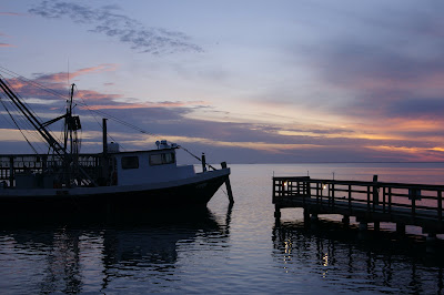
These final 2 pictures were taken with my DSLR at sunset on Padre Island, just off the coast of Texas. We were getting ready to eat dinner at a place called Snoopy’s. The patio area of Snoopy’s happens to be a pier. I went out their while waiting for my fish and chips to see if I could capture the sunset. Believe it or not, I was able to get these without needing my tripod. I was proud of both of these as this was one of the first times I was able to get an accurate color representation at the time of the shot and was able to keep the post processing to a minimum.

As always, comments are welcome and encourage so I can continue to grow.
Color Film

My Pentax 645 came with a 220 film back. At the time I didn’t know the difference between 120 film and 220 film so I really didn’t care. Well, when it came time to buy film, I realized there is a difference. The biggest difference between 220 film and 120 film is the number of exposures – 220 gives 30 exposures where 120 gives 15 exposures. What I found is that 220 film is becoming exceedingly difficult to find. My only option in black and white was Kodak Tri-X 320, and honestly I’m not really a fan of Tri-X film.

Off to eBay I go and finally (after getting sniped on 2 other auctions) I got a 120 film back for the reasonable price of $33.00. The seller also threw in 4 rolls of Fuji Reala 100 film. Well, what was I to do? I immediately shot up the 4 rolls of film and had them processed by a third party (I don’t know how to process color quite yet). Here are some of the results.

 
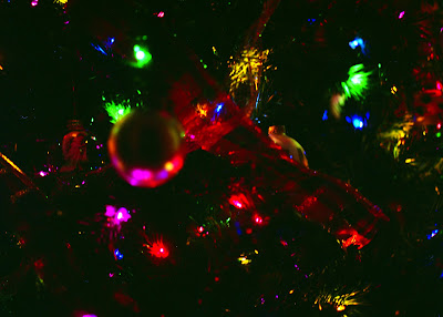
Ok, I admit it – I’ve always had cameras that automagically read the ISO of the film canister and I’ve never worked with medium format before. I was shooting Tri-X 320 before I got the film back and film and, you guessed it, I forgot to set the ISO on the camera. This was the result of the film being pushed but not developed as if it were pushed. This shot of my Christmas tree definitely sucks.

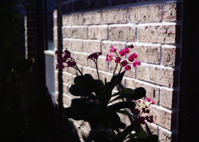
This shot was from the same pushed roll. The image itself came out good, but the colors were off. The evidence is the fact that these flowers were red, not pink. I guess the reason the bricks didn’t come out funky has something to do with the fact the sun was shining directly on them. This picture, however flawed from its original intent, came out very powerful (at least in my opinion).


After realizing my mistake and setting the proper ISO on my camera, I shot the last 2 rolls of film. This one was properly exposed, but for some reason very washed out. I’m not sure what happened because the images before and after both came out fine. If this had come out, I think it would have been pretty kick ass.

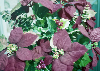
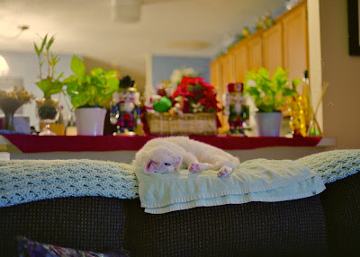
Now these 2 above are my success stories. In both instances the exposure came out perfect and the colors, after a little tweaking in Aperture, were dead on. I’ve found that my cat is actually a very difficult subject to focus because of her color… but this time I was able to get her and some of her fur detail. The poinsettia is my favorite of the 2 rolls that were shot properly as the detail was something I wasn’t expecting.

So, 60 pictures were taken and only 4 usable came out of it. I would say it was a pretty good day. I did find out one thing, though – I have a lot to learn when it comes to color photography in film. Digital pictures are easy to manipulate, but film is a whole different beast. I’ve been told that we will be working with color film next semester. This should definitely prove to be interesting.

As always, comments are welcome and encouraged so I can get better.

Final Exam Results

I got my final exam portfolio back today. I am proud to say that I received an A+ on it, I guess that means a 100. I hope it wasn’t on bell curve because that would mean that my classmates photos really sucked (and I know there were some pretty good photos my classmates took). My overall grade in the class was an A, which keeps my GPA in the high 3’s (woohoo!). I’m signed up for Photography II next semester along with a retake of Anatomy and General Psychology. Wish me luck for those in the next semester.

Christmas is upon us. In the previous years I haven’t taken much notice of things going on around me, but this year, since the happenings of December 2006, I’m taking better notice. I’ve been taking a lot of photos this Christmas and I thought I would share of few of them with you.


These 2 are part of my house decorations. They are located on the hearth in my living room. Some would consider the placement of the Nativity and a Santa Claus so close may be blasphemy. I beg to differ. While the birth of Jesus is the reason we celebrate Christmas, Santa Claus embodies the spirit of Christmas. That spirit being The Father giving the world his Son to save us from our sins.


These were taken at a client’s Christmas party this past weekend. I have a lot of candids, but here I wanted to post my artsy shots. Capturing that flame was a pain, though, as for some reason the fire kept throwing off my focus (even on manual).


These are part of privately funded public displays around Houston. The first one is a part of 3 very big nutcracker soldiers in the parking lot of an upscale strip mall near the Galleria. The picture of Santa is part of a much larger display on the front lawn of the AON building, which is located about 2 blocks from where the nutcracker picture was taken. The ‘much larger display’ was rather difficult to capture.

I’ve been messing with the shooting styles lately on my DSLR. It has gotten rid of the slight orange tint that’s been plaguing my pictures, but now some of the colors are being washed out. I find myself having to do a lot of color correction lately.

At any rate, give me comments because that’s how I grow.

« Older posts Newer posts »