Category: Critique (Page 1 of 2)

“Judging America” by Joel Pares

Stereotype is defined, in sociology, as “a simplified and standardized conception or image invested with special meaning and held in common by members of a group.” (dictionary.com), and the act of stereotyping is to cast someone in a stereotype (same source).  Since a stereotype is a simplified conception, it stands to reason that the sources of stereotypes are often themselves simplified (think of thuggish gangsta rappers or satanic black metal musicians).  As a veteran of the US Air Force, I often stereotyped Marines as macho imbeciles who couldn’t think for themselves.  The verb form of the word “judge” has many different nuanced meanings (dictionary.com), but the common thread is that judgement is, as an act that conclusive after evidence is brought forth and examined.  After meeting some Marines at the DoD Weather School at Chanute AFB, I came to judge Marines, on the whole. as honorable and brave people who chose a different path of service to our country.

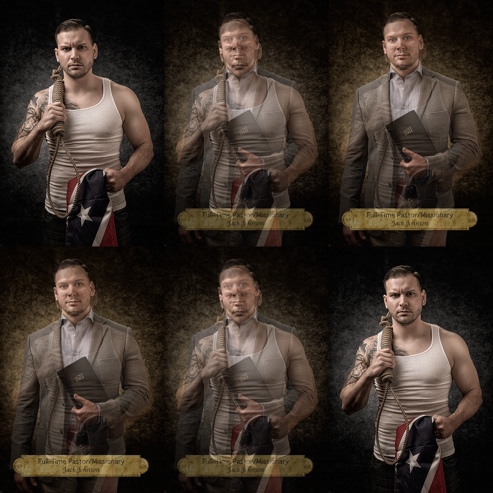
This verbose examination of the two words is important in understanding the series entitled “Judging America” from Joel Pares.  Below is one of the images from the series:

from "Judging America" by Joel Pares

from “Judging America” by Joel Pares

As the viewer can see, the image is a diptych of sorts.  It is an animated .GIF file.  The first image is a portrait set against a black background.  In the example above, it is a white man wearing a tank top.  He’s holding a noose in one hand and the flag of the Confederacy in the other.  After about 10 seconds, the image morphs into a portrait of someone against a tan background with text at the bottom revealing the identity of the person in the portrait.  It’s the same person, but now we see him wearing a casual outfit and carrying a Bible.  His name is Jack Johnson, and he’s a full time Christian pastor and missionary.

There is no artist statement on the artist’s website, so all I have to go on regarding the concept of this project are words from a Petapixel.com article:

They say not judge a book by its cover, for photographer Joel Parés‘ series “Judging America,” that’s exactly what he wants you to do… at first. Presented as simple portrait GIFs, Parés wants you to start by judging the book — or in this case person — by his or her ethnicity, profession, or sexual orientation, and then, just as you’ve decided what it is you want to believe about the person you’re looking at, he reveals the reality.

There’s the setup of this project.  Now let’s first dive in to the formal elements.

The presentation as animated .GIF files is a novel one for diptych images, and one I have never personally come across.  Normally, a diptych is one image made up of two separate frames (think of my Armed and … series), but here we have one frame that contains two images that are presented serially.  Obviously, this raises some financial challenges as presenting the project in way that has the intended impact would require some rather expensive computer equipment.  The least expensive option would probably require a computer and a pico projector for each diptych.  The color balance is consistent throughout, even if some of the digital processing is a bit heavy handed.  In some of the images, the HDR-style processing was taken a little too far and gives some of the subjects an almost cartoonish look.  In terms of composition, there is nothing really special going on in these images.  The portraits themselves are rather conventional.  I did, however, note that not all of the images were consistent with their use of the frame.  As this is a digital project, this could be dismissed, but it could also pose problems later should Pares ever decide to present printed images.

Now that the formal elements are out of the way, it’s time to take a much more critical view of the images.  Pares is presenting these diptychs as follows – the first image is that of a portrayed stereotype, while the second is the reality of that particular person.  In each image, we are presented with someone from a different ethnic or cultural background, with one case being sexual orientation and yet another being an occupation.  Pares wants us to judge the person, then find out how wrong we were in that judgement when the truth is revealed.

It’s all about the context.  Pares removes any context external to the subject (namely, an environment) and, using the relative safety of the studio (where images are created from anything that can be imagined), adds his own context to the subject.  In all of these images, we see a blatant projection of a stereotype of a particular subject – a Latino gardener, an Asian nail salon employee, a black thug, a Middle Eastern terrorist, et al.  All of these negative images are created from, what I can only assume, is Pares’ imagination as there is no artist statement to explain the process by which he arrived at these stereotypes.  In stripping the environment and adding his own context, one wonders if these are not a projection of his own stereotypes and prejudices of those from a culture, ethnicity, sexual orientation, or occupation that is not his own.  We never get to see just the person, we only get to see what Pares wants us to see.

If one sees a man snarling and wielding 2 guns, a woman holding an AK-47, or a white man with a noose, without any other context, how does one not tend to think negatively, especially given the heavy handed nature with which it is presented, especially through his very effective use of color?  Again, there is no artist statement, so there is nothing on which to base an answer to that question.

And that brings up the difference between the words stereotype and judgement.  Pares shows us the stereotype (from whose perspective?) and wants us to make a judgement from only the evidence he presents.  Perhaps this is only the humanist in me, but I believe a majority of people are capable of realizing that there is not enough evidence presented in the images in order to make a sound judgement.

Finally, the viewer is presented with the truth of that particular person.  Pares goes from a menacing black color cast to a warm brown color cast, in order to temper the negative judgement made by the viewer in the previous image.   For this author, it had quite the opposite effect.  The feeling I am being manipulated is closer to the emotion that these images evoke when I view this project.  Res ipsa loquitur.

Why can’t an Asian woman attending a graduate program at Stanford also work in a nail salon?  Why would we assume that a man with the word “Queer” tattooed across his chest and wearing a boa couldn’t be an outreach worker?  Why would we assume that just because one wears glasses and carries a backpack that he’s a nerd?

Pares was effective with one diptych.  Jane Nguyen is an Asian lady dressed as an exotic dancer in the stereotype image while in the truth image we find out that she is a widowed mother of three children.  When it comes to seeing occupations, the person’s life outside can never be known unless it’s revealed.  The occupation of exotic dancer carries with it a myriad of different negative stereotypes.  There also exist many different reasons why one would become an exotic dancer.

If this had been a critique on how entertainment and news media portray those of different cultural and ethnic backgrounds as well as sexual orientations and occupations, then this heavy handed approach could possibly take on a greater validity.  Better yet, why can’t we see the subjects in their environments and try to see those elements of the environment that might give rise to a stereotype?  In this way, the artist’s hand is minimized, and then the selective nature of photography allows for a more natural narrative to flow, and a lot less manipulation of the viewer on the part of the artist takes place.

In the end, I’m left with the feeling that the thesis was developed, but as the project proceeded, Pares failed to adjust his thesis for the results he was getting.  Then, instead of then reexamining the results, the decision was made to push ahead anyway and try to force the art to fit into the parameters of the original thesis (this goes back to my issues with conceptual art).  Again, without an articulated artist statement, this is all supposition, but a reasonable person could come to this “judgement.” As artists, sometimes the art teaches us.  I’ve personally learned a lot about myself in my last couple of projects, and even had to adjust my thesis for one of them as what I learned contradicted my formal assumptions.  This is how we learn and grow as artists.

As to the stereotypes and judgements of US Marines, as a veteran of the USAF, it is all in the spirit of friendly inter-service rivalry.  Semper fidelis, Mr. Pares!
Because There Ain’t No Cure for the…

I thought this song was an appropriate way to open with what I’m feeling right now.  At this point I’m waiting for the semester to start anew.  I have a lot of work ahead of me in terms of building a show for our senior exhibition while trying to build a body of work for the same show.

Earlier in my adventures this evening I came across the website of an artist named Brandon Bakus.  Brandon lives in, I believe, Ohio (that is if I am reading the phone number on his website correctly) and has recently graduated from the Ringling College of Art and Design where he minored in Photography.  As I was looking at the page listing his different projects, I first clicked on the “Borrowed Time” link (click here to view page).  The short statement reads as follows:

An intimate and delicate documentation of my time traveling throughout Europe with a borrowed camera.

The images themselves do give a sense of intimacy and there is a delicate balance running through them.  I was actually quite impressed with a lot of the images.  Brandon processed them well and did a really did a good job of editing them down.  It’s the last part of the that artist statement that throws me off.

There are 2 things that tie this series together – the fact that the images were all created in Europe and a borrowed camera was used.  In his attempt to strengthen the series by bringing forth 2 connections, he really has weakened it.  We can see the European in a few of the images, even if they aren’t the more famous spots on the continent.  The fact that he borrowed the camera, however, is completely irrelevant to the images.  Yet, he built the series around the fact that the camera was borrowed for his trip to Europe.

Therein lies the problem with conceptual art – it is too dependent on the idea and the artist (and in some cases the curator and art critic).  The art itself suffers.  These images could have stood well on their own as single images or as part of a text essay of Brandon’s trip through Europe, which would have communicated much more to the viewer.  Instead of getting a deep narrative, we are simply left to remark on how well he mastered the controls of a camera that was not his own.  The weakness of his concept drags the images down with it.  It may be true that the camera was borrowed (I’m not saying it isn’t), but it does nothing to bolster the body of work.

I contrast that to his series, “Findings,” (click here to view). In this series, Brandon goes back to one of the fundamental concepts that sets photography apart from other art disciplines.  That is the fact that photography is, for the most part, a selective process rather than a purely constructive process such as painting or sculpture.  As photographers our editing process starts with seeing the image in front of us, before the camera is even touched.  Even when images are constructed (or farmed as some would say), we have the ability to throw out those images that do not serve the needs of the project.  In this series, he definitely shows a grasp on this basic tenet of photography.

At this point I think I’m going to call it a day.  Before that, however, I must say goodbye to someone I knew for only a short period of time.  While most of my experiences with her were only in passing, the few times we did converse I found she had a huge and kind heart.  She was also a very talented artist and had just this year graduated with her BFA in Photography/Digital Media from the University of Houston, and that’s after completing a Bachelors of Science (Mathematics concentration) from SUNY Stony Brook .  I just found out the other night that she took her own life.  I wish I had gotten to know her better, but she did leave us with some great art to enjoy for the rest of the time we have on this earth.  Rest In Peace, Jameela Al Amin.  You will be missed by many.

“Borrowed Time” by Brandon Bakus

“Findings” by Brandon Bakus

Website for Jameela Al Amin

And here is a “finding” of my own from a few weeks ago as I was shooting a local concert.
_MG_8255

The Brown Sisters

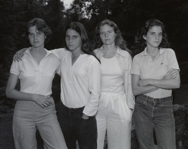
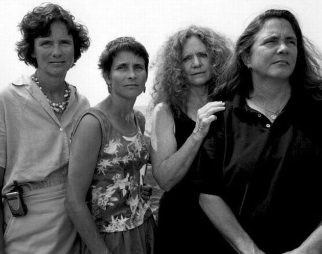
Keeping up a time based project is very exhausting mentally.  I started one this year only to stumble upon keeping up with the interval of creating the individual pieces due to the fact that I had so many other things pulling me in other directions.  Now, I’ve seen plenty of time-based projects successfully executed, but nothing prepared me for seeing the photographs of The Brown Sisters by Nicholas Nixon.  This book, which has been published in several editions, is a group portrait of Nixon’s wife and her 3 sisters, all in the same position but with different poses.  The series began in 1975 with the last known photograph taken in 2011.  The individual photographs are taken roughly 1 year apart from each other

The Brown Sisters in 1975

The Brown Sisters in 1975

We have the sisters 20 years later in 1995.  They have shed their teenage/post-teenage rebellious countenances for something friendlier.  They are still warmly engaging Nick and showing the presence of a strong bond amongst them.

The Brown Sisters in 1995

The Brown Sisters in 1995

Each photograph in the series is unique, even in their sameness in regards to the positioning of each individual sister. The facial expressions change every year as their relationship and bonds evolve over the years. What is missing here is contextual information. As far as we could tell, there is no information regarding the context under which each photograph was made. Were they at a family reunion? Was it Christmas time? Did they all live close together anyway and this was just an annual appointment that Nick kept up? We don’t know. But somehow, at least as far as I’m concerned, we don’t care. That is, until we come across this particular photo in the series:

nicholas-nixon-the-brown-sister-2004

The Brown Sisters in 2004

This is the first photo (taken in 2004, toward the end of the original series) where we see a shift in the way the sisters engage the camera.  Sisters 2 and 4 (I don’t know their names) are not even engaged with Nick, while sister 1 and his wife are.  2 and 4 seem to be looking off into the future as they begin to chart the course of their life’s journey.  Sister 1 and Nick’s wife both have sad expressions on their faces, as if they were grieving or mourning.  Did they lose a family member, perhaps their mother or father?  Has a member been stricken with a dread disease such as leukemia or another form of cancer?  Even their body language suggests something is wrong.   In many of the previous photographs, such as this one from 1995, we see the closeness they share through their physical contact with each other…  something we don’t see at all in 2004.

This drives home the point that we cannot know everything about a photograph.  We can and should try to communicate as much as possible through the lens, but there are instances where contextual information is necessary in order to understand the photograph.  Of course, this starts to get into conceptual art territory.  Here, however, we have a linear time-based series rather than something that is more laterally based in terms of series (such as a figure study).  The context of time, even though it does not fill all the holes, allows us to begin to understand the journey these sisters are currently taking with their lives. 

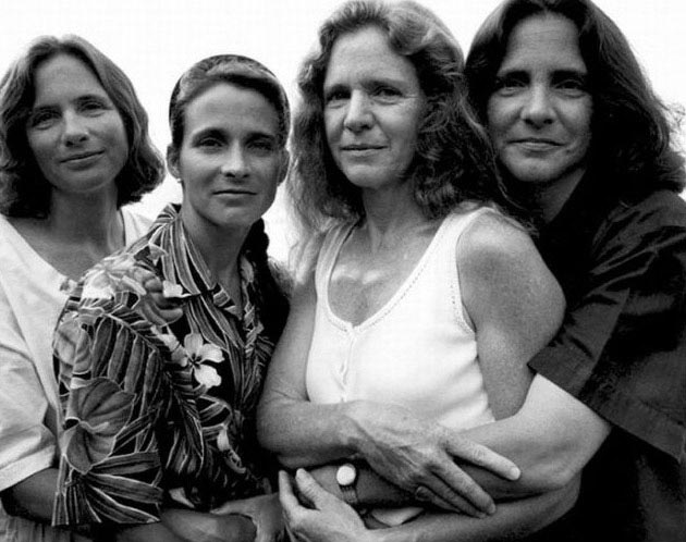
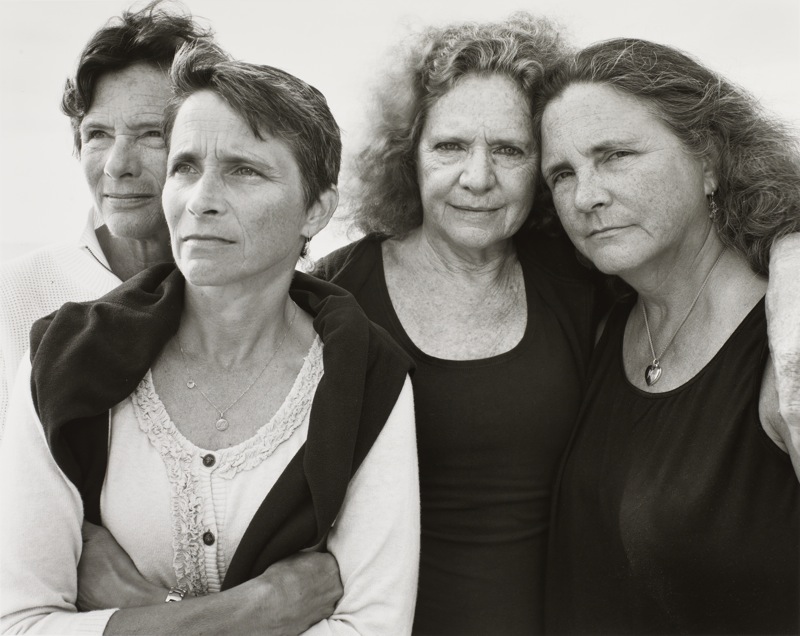
As an aside, I was able to find this photograph from 2011 as Nixon has continued the series.  The bonds shared by these sisters appears to be as strong as ever, even as they each realize that they must chart out their own paths through life (Nixon’s wife continues to engage him throughout, showing us that she is committed to walking the journey with him).

The Brown Sisters in 2011

The Brown Sisters in 2011


War/Photography

The Museum of Fine Arts – Houston is currently hosting a rather large exhibit on photography in war.  The pieces themselves date from the modern all the way back to just a few years after the origins of photography.  The exhibit itself is very large.  In fact, it takes up the entire mezzanine in the Caroline Weiss Law Building of the museum.  Contained in the exhibit are mostly prints, but also a few artifacts, such as pieces of camera technology used in combat zones during different periods, some preserved publications, and even some private journals from journalists and military members.

Most of the prints are original, such as the beautiful Daguerreotypes and silver gelatin prints, but there are also some inkjet prints of older photographs.  I loved seeing the original prints from the older processes.  There were several albumen prints, at least 2 salt prints, 1 carbon print, and, believe it or not, an autochrome print from France during World War I.  There is also one photo from the World War II era that is digitally manipulated, but we will get to that one later.

The reactions I’ve gotten from a couple of my peers who have gone to see this exhibit before me were both pretty much the same – the exhibit was wonderful and that their minds were “officially” blown.  I had to disregard those reviews so my hopes wouldn’t get too high regarding what I was about to see.  I also needed to suppress my own experiences in order to keep that from clouding my judgment regarding the exhibit, which was, of course, going to be the more difficult task.  So, with my mind as clean as I could get it, I walked into the exhibit and began to take it in.

The first thing that struck me was the sheer size of the exhibit.  I mentioned earlier that it occupied the entire mezzanine in the Law Building.  For those of you familiar with the Law Building at the MFAH, then you can appreciate the sheer amount of space dedicated to this photography exhibit. The nearly 3 hours spent walking the exhibit and taking in each piece underscored the importance of war to our history as a species, as well as showing the impact it has on our lives, even if we are far removed from the fighting.

The photos themselves were arranged in a way I would not have initially thought of doing.  The exhibit was broken down into different aspects of war, to include recruiting, actual combat, destruction, rest and relaxation, combat fatigue, memorials, et al, rather than by conflict or chronology.  This grouping does make sense.  The curator of the exhibit needed to strike a balance between highlighting war journalism while also making sure the importance of the messages conveyed by the photographers was not compromised.  To have arranged the photographs in a chronological order or to have grouped them by conflict would have merely turned the exhibit into a history lesson.

As for the images themselves, I actually have seen a lot of them before.  I recognized many from the “Aftermath: Exhaustion and Shell Shock” area as well as the “Aftermath:  Death” areas of the exhibit.  Each area contains one image that became iconic for that particular conflict.  In the former it was this image of a young officer with a “thousand yard stare” after coming back from an engagement.  There is also another rather famous image from the Battle of Gettysburg that shows the battlefield dead.  I am a little embarrassed that I cannot provide the photo in question as there are many similar photos of the battlefield dead at Gettysburg and I can’t remember exactly which it is.  Interestingly, photography started to come of age in the United States during the US Civil War.  The images of the battlefield dead in the US Civil War are often cited as the impetus for the change in public attitude towards war as the camera provided the means by which the actual horrors of war could be conveyed without an artist’s romanticizing a conflict years after it took place.

There is one image in the “Medicine: Wartime Medicine and Medicine Subsequent to War” section that still haunts me.  In this area the viewer is treated to photographs of people who are being tended to after suffering wounds in combat, as well as some of the long term treatments that these wounded soldiers need after returning home from battle.  Many of these are photos of soldiers with their prosthetic devices (usually legs).  There is one large image, the last image in the room, of a mother helping her son out of bed.  At first glance one would think this could be an embrace (a function of the vantage point of the shot), but when the detail is examined, it is evident that there is a piece of this man’s head missing.  Of course, we can surmise that this former soldier is no longer functional as an individual, and will now be, until the day he passes from this earth, dependent for his very survival on others.  I had to ask myself which was the greater cruelty of the war – that he suffered this grave injury or that he was made to survive?

I mentioned earlier that there exists, in the exhibit, one digitally manipulated photo in the “Portraits” area.  This was a full body portrait of General Douglas MacArthur standing next to Emperor Hirohito.  The artist who submitted the work, however, decided to digitally insert his head on MacArthur’s body.  I cannot say that I get why the artist did that, but the greater question was why the curator allowed that particular photograph into the exhibit rather than a reprint of the original image of MacArthur and Hirohito.  This one photograph is definitely the weak link in an otherwise excellent exhibit.

I suppose I can’t really say that my mind was blown by this exhibit.  In my Air Force days we were shown some pretty shocking gruesome images of the effects of chemical weapons during our chemical warfare training.  This was to underscore the importance of the training to our survival on the battlefield.  When I was becoming my unit’s SABC trainer, I also had the pleasure of watching video of battlefield triage, battlefield stabilization, and surgery at a MASH unit (all in Vietnam).  The amputation was definitely one of the most gruesome things I had ever seen up to and since that point.  The execution images are rather haunting, because for many of these they are the point of time just before or after one has crossed into death.  In those that don’t feature the condemned about to die, it shows what their physical beings are reduced to in death, be it scrunched in hastily constructed coffins or the bloodstained shirt worn by the condemned as his sentence was carried out.  The one that will continue to haunt me, however, is the image I described earlier of the man missing part of his head.  The image begs the question I asked at the end of the description, and it’s not one easily answered.

The 1971 film “Johnny Got His Gun” may be streaming somewhere on YouTube or Vimeo.  If not, you can order the DVD through Netflix.  After you watch that movie, you will understand why I ask that question.

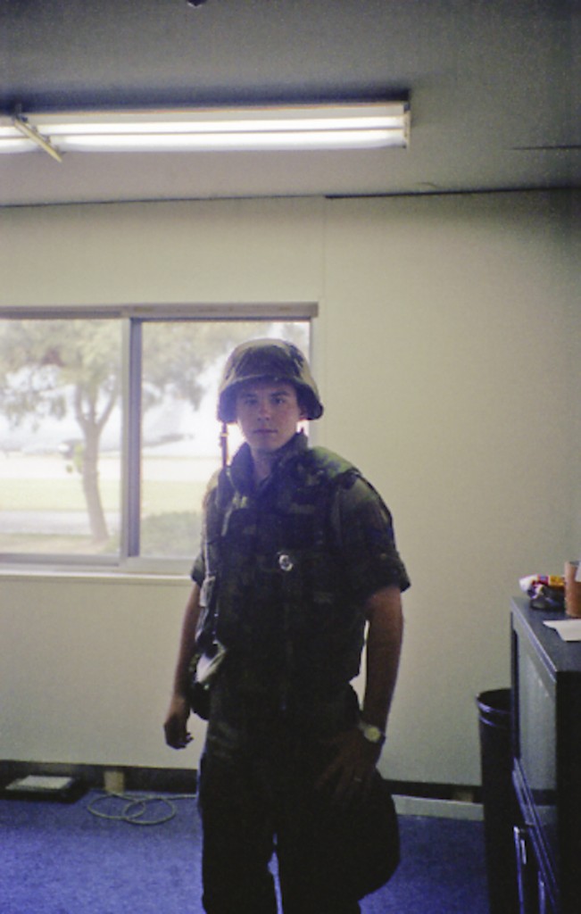
As for now, I leave you with me during my participation in one of the many wartime operation exercises that were conducted in Korea during my time there in 1994 and 1995.101607066

The Audience of Souls

What do you say to the dead?
Will you forgive me for living?

– Ronnie James Dio (1992)

There is a darkness here
You cannot imagine you cannot fathom
It speaks to me in tongues
Can you hear it?

I’ve built my tower of song
From words as bitter splintered bone
Gnarled and wretched, spiteful and harsh
I’ve cursed the vermin, the vermin of the earth
I’ve wished pestilence upon the foul and weak
Not just men, but women and children too
With a rusted blade across their throats

– AA Nemetheanga (2005)

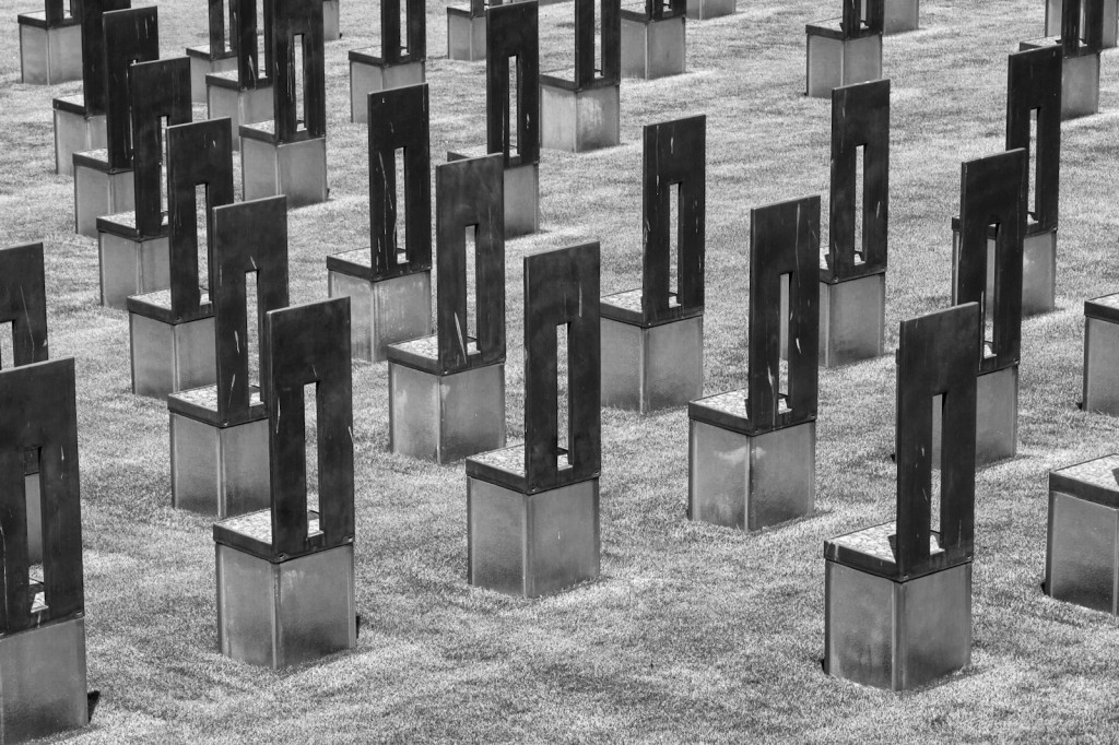
The memorial meant to heal sometimes has the opposite effect.  It causes feelings of sadness and darkness that are somewhat palpable.  On seeing this memorial I felt a darkness and an ill-ease of a wound that isn’t going to heal.  The chairs, meant to represent the victims of this vicious attack, are set to face a reflecting pool that soothes the wounds.  Soothing, however, is not healing.  The water is only an analgesic as you traverse the great distance between 9:01 and 9:03.  This ensures that the wound remains, forever if it is deemed necessary.

Part of the healing is the ability to commune with those victims, to feel the pain they felt as they were taken from us in a singular act of evil.  However, this is not to be.  The chairs facing the water are separated from the living.  We are not allowed to go up to the chairs and view what the victims are viewing, to feel their pain and take it in as our own.  The living can only face the chairs.  The chairs face the living as an audience waiting for those living souls to explain their continued existence.  Their judgement is affected by the wounds that are soothed, yet forever open.

I pray for those souls lost in that great act of evil, and will hope that we can one day heal this scar inherited from a madman.  I pray that one day they can find peace and that the living can also find peace.


Comparing Photographs – Two Tales Told in Two Ways

Around the dawn of the 20th Century, a new generation of photographers such as Heinrich Kuhn, Alfred Stieglitz, and Edward Steichen began to challenge the paradigm of photography as a technical activity as their compositions incorporated formal elements of art and their prints began to incorporate color through the use of the gum bichromate printing process. Successive generations of photographers such as Minor White, Ansel Adams, and Jerry Uelsmann pushed the artistic boundaries of photography even further, and today photography as a process is a fully recognized artistic medium.

Along with video production, photography as a medium has benefited greatly from advances in technology. The advances have covered nearly everything to do with photography, from the camera used (wooden boxes with no mechanical shutter to medium format digital SLR cameras) all the way to how the final result is produced (traditional paper to digital frames). Photographers have available a number of different technological processes and will often combine these processes in the creation of their art. The use of formal artistic elements along with the use of light and tone are the reasons behind the success of the two photographs, both different in terms of composition, narrative, and use of technology in processing, to be examined in this paper.

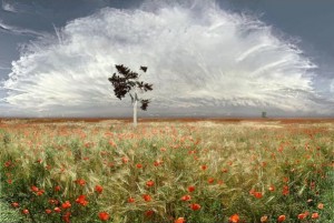
The first photograph is by Jean-Francois Rauziel entitled “Coquelicots.” This chromogenic print, which measures 47-1/4” x 71” and is mounted between two pieces of glass with no border frame, features a field of French Wild Corn Poppies (coquelicots) below and a very large anvil-topped cumulonimbus cloud above. In the field of poppies are two trees separated by large space (in both depth and lateral distance). The foreground tree serves to break up the pattern created by the field of flowers and the swirls of the cloud and it provides a starting point from which one can move their eye around the composition. This same tree holds a bird cage with one bird inside it. The horizon line splits the frame in two equal pieces. As the viewer is drawn in to the depth of the horizon area, the density of the flowers is greater and the cloud gets darker, and we see evidence of an approaching gust front from the thunderstorm.

The composition of the photograph itself is a landscape/nature scene, a genre which lends itself greatly to larger prints in order to emphasize the grandeur of nature. The artist’s use of a very narrow aperture brings the entire depth of the composition into sharp focus. With this, the artist uses the background tree to create depth within the composition using linear, rather than atmospheric, perspective. The streaks of the higher cirrus clouds show the motion of the thunderstorm toward the viewer, which implies motion while keeping the exposure time short enough to avoid motion blur. The small clouds near the horizon line show a gust front, the presence of which implies fast motion toward the viewer.

Lighting is even throughout the composition, which suggests the artist had the benefit of a front-lit scene. However, this is also a chromogenic print, which also suggests that the artist was able to use dodging and burning techniques to his advantage in making the print. The mostly even lighting serves to present us with a large thunderstorm, yet it does so in a non-threatening manner. The lighting brings a large sense of benevolence to the storm, belying its violent nature. As the viewer gets to the deepest parts of the photograph, the dark base of the cloud becomes more apparent, in turn showing the viewer that there is indeed violence with this storm. As the lighting is even throughout, the color becomes important. Without the color, it becomes difficult to differentiate between the different areas over the composition as a whole.

The symmetry created in the composition is nearly perfect in the lower and upper halves. The curvilinear line of the cloud is almost perfectly matched by the line created by the cut foliage in the lower half. This represents the cycle that allows life on earth to thrive. The curved line of the cloud is unbroken and resembles a crown. This shows the artist to be acknowledging the supremacy of the storm in this cycle. The horizontal line represents the strength and stability of the earth, which must work with the fluid nature of the sky (as suggested by the waviness of some of the cirrus clouds) in order to support life. The bird in the cage, which here symbolizes all animal life, is using the vertical line of the tree to assert its position, however small, in the overall cycle represented here. This tiny element is in the tradition of French painters such as Poussin and Lorraine. In these Baroque era paintings the artists downplayed animal life (in their cases they painted actual people) by making them and their activities very small relative to landscapes painted in the scenes.

Given that the print type and the fact that the scale is very close to a 2 x 3 proportion, it is clear that this is a film photograph printed using an analog enlarger. Digital photographs printed using traditional photo paper would bear the label “Digital Chromogenic” as the print type. This is an example of how new contemporary artists are using relatively traditional technologies in order to create new art through their chosen medium.

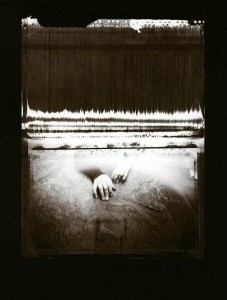
The second photograph is by a Houston Center for Photography Master Student named Mary Riggs Romain. The photograph, entitled “Perseverance,” is part of a series called Not Myself: A Path to Transcending Trauma. This photograph is a digital inkjet black and white print measuring 22” x 28” housed inside a metal frame. The print makes the hands nearly life size. The fact that they are not gives the viewer the sense that he or she is standing close by as the scene unfolds, but not so close as to be a part of the scene at this point in the series.

The composition itself shows a pair of hands coming from a lighted area and reaching into the darker space of the foreground. A person is resting there hands just outside a lighted area and is visible through the opening. The individual elements, layered over top of each other, make this appear as if multiple exposures were used in the creation of this photograph. This idea is reinforced by the holes, which resemble sprocket holes found on 35mm film at the top of what appears to be a curtain (at the top of the composition itself). Given the 11 x 14 proportions, however, it can be inferred that this particular composition is a photo manipulation of elements photographed and/or scanned by the artist.

The focal point of this piece is the pair of hands just below center of the frame. This element is also the only element that is not a straight line, which is what makes it the focal point. The curtain at the top half of the frame contains many vertical lines and one horizontal line across its top area. The repeating vertical lines are a strong exertion of control by the dark curtain, that it has a dark purpose to it. The horizontal lines denote the strength of the curtain’s resolve in performing the task of keeping the suffering person out of view and hidden from the viewer.

The main source of light here is coming from the other side of a curtain that prevents the viewer from seeing the entire body. The curtain itself is dark and ominous, and the foreground in front of the rock on the bottom also gets darker the further it goes from the light. This use of chiaroscuro effectively creates a reverse of what one would normally expect when confronted with a series on overcoming adversity. Because of this high contrast, color is not needed as the artist wishes us to focus on the image itself. Normally many pieces of this type would involve compositions from the point-of-view of the viewer as the suffering and would be going from darkness to light. This often invites the viewer to become a participant in the piece. This particular composition, however, shows the suffering person opposite the viewer, with this person seemingly offering her hand to the viewer as an invitation to come into her world. The light denotes activity on the other side of the crawlspace.

Symmetry is achieved through the vertical. In terms of the horizontal, however, the composition is asymmetric. The frame is split evenly along the horizontal axis by a dark horizontal line. This line serves to create the effect that the viewer is observing through a window. While the viewer can make up their own mind as to where he or she is while these events unfold, it is clear that, according to the artist, the viewer is the one in the dark.

This particular piece is part of a larger series by the artist. Unfortunately the larger body of work is not currently available so the context of this piece cannot be fully appreciated. Unlike the photograph by Rauziel, who was reacting to his environment, Romain selected individual elements to add to a base in order to build up the final composition. The sprocket holes along the top of the frame provide the only evidence of the source of any of the elements. It is not unreasonable to infer that the source elements are a mixture of analog and digital.

Today there are many artists that manipulate different selected elements from many sources to create new compositions. The most famous of these contemporaries are Jerry Uelsmann and his wife, Maggie Taylor. Uelsmann creates all of his surreal compositions using strictly traditional film and darkroom methods while Taylor creates all of her work digitally. Ramain’s photograph is also reminiscent of the work of Man Ray, who was a big influence on Jerry Uelsmann.

In terms of personal reactions, each photograph elicits a different response from this author. With Rauziel one almost feels as if they are standing outside in a field of coquelicot flowers watching an approaching storm. The only thing that keeps that perception from becoming the actual reality is the fact that Rauziel stopped at nearly 4’ x 6’ in terms of size with this print. In Ramain’s “Perseverance” there is both a darkness and insidious force at work. While the narrative, as seen by this author, is one of the suffering person trying to bring another into her world (where the viewer is actually the one in the dark), there also exists the possibility that narrative put forth by Ramain is that of the viewer being the one in suffering while the hand is the viewer’s only link and way back to the world of light. It would be necessary to study the entire series to know which of these competing narratives is correct.

John Szarkowski describes the five “interdependent aspects of a singular problem” (Szarkowski 3) when it comes to photography in his book The Photographer’s Eye. These problems are: The Thing Itself (presenting reality as it is found), The Detail (the question of why something is the way it is), The Frame (inclusion and exclusion from the photograph), Time (the slice of time in which the photograph was made), and Vantage Point (the view of the subject). A successful photograph solves one or more of these issues. In “Coquelicots,” Rauziel solves the problem of The Thing Itself by presenting the reality he has found, but also addresses the question of The Detail as a narrative is being formed with the imminent approach of the storm. Although the photograph is stop motion, we get a sense of time from this work as the motion implied by the clouds and gust front address the issue of Time. As this photograph addresses three of the issues, it succeeds on many levels with many different viewers. “Perseverance” is a typical example of The Detail as this, being part of a series, furthers the narrative the artist has created. Even when taken alone, we ask ourselves the question of what could be on the other side of the curtain or why the hands are even present.

Both photographs tell very different narratives. One projects the grandeur and majesty of nature and the circle of life while the other invites the viewer into the world of someone dealing with a traumatic event. In both cases the formal elements of line use and lighting serve to advance the goals of the artist. In the case of “Coquelicots,” the artist uses linear perspective created by a very deep depth-of-field and as well as the large scale of the print in order to achieve success. In “Perseverance,” the artist uses chiaroscuro to create the darkness and light of two very different worlds both inside a single frame. Both also use very different technological processes to produce the final results, which is one of the benefits enjoyed almost exclusively by photographic artists today.

Click to Embiggen


Click to Embiggen

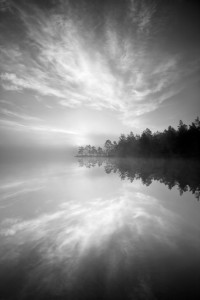
Magical Morning by Magnus Lindbom

Magnus Lindbom is a self-taught professional photographer from Sweden.  He earns all his money from photography-related work such as writing articles for publication, leading photo tours and workshops, and selling prints.  His goal with photography is “to inspire others to venture out into nature and experience for themselves what so many of us are missing in today’s hectic urban life”.  His concentration on landscapes (both color and black and white) have given us some amazing photos which seek to capture feelings rather than the place it was shot.

This photo, entitled “Magical Morning”, was taken at Tyresta National Park in Sweden.

The first thing that jumped out at me was the serenity that this photo conveys.  The mist on the water hides any ripples that would convey energy while allowing the reflections of the clouds and trees to come through with good clarity.  The gradations in the tone are nice and smooth, which definitely adds to the feeling of witnessing a serene morning sunrise.  As the scene appears to be backlit, that makes the gradations of tone (not to mention the great exposure) all the more impressive.  While I’m not a fan of placing the horizon in the center of the frame (something I have been guilty of more than once in the past), here the mist blurs the horizon enough to make one have to imagine it’s there.  In turn, the mist also makes obvious where the water meets the land.  While this helps the viewer see where the reflection begins, it does put a damper on what would have been the appearance of the land floating in the air.  In terms of composition all three elements (land, water, and air) are in good balance, with all three competing for, but none winning, attention.  The symmetry of the land and its reflection are almost insignificant when the photo is taken  as a whole.

All in all this is one of the best entries in this year’s “Folios” edition of Silvershotz.  The tones and mist definitely convey a sense of serenity and calm, enough so that the location of this scene is the very last thing I thought of when I looked at this photo.

More of Mr. Lindbom’s work can be seen by clicking here.

Anyone else have any thoughts?

Evening Clouds by Nenad Saljic

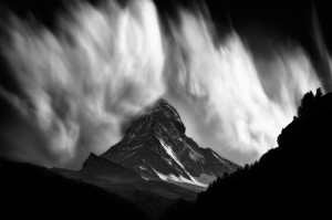
Croatian Nenad Saljic fell in love with photography and the mountains in his early teens.  Of course, life has a habit of getting in the way and in the course of some life events, he pretty much left his passions unpursued.  Fortunately for Saljic (and the rest of us) he rediscovered his passion for photography and has graced us with some beautiful black and white photos.  In 2009 and 2010 he produced a series called “Matterhorn”, which are, of course, shots of The Matterhorn in the Pennine Alps.  The photo below, entitled “Evening Clouds”, comes from this series (click on picture for a larger view):

Few things can bring forth the image a grand conjuration than watching clouds borne from orographically influenced winds.  I was treated to a few myself as a Weather Observer in the United States Air Force, although admittedly nothing to this scale.  I’m reminded of the great eye of Sauron from the Lord of the Rings trilogy.  I wonder if this is the last thing that most of the rest of Middle Earth will see before the shadow of death descends upon them.  One almost gets the feeling of being a Hobbit watching from a hiding place as the conjuration of evil begins to really take hold.

The play on the tones is the part that sets the mood of this photograph.  The dark foreground tones suggest a hiding place – we have our safe vantage point and as long as the mountain can’t see us we are safe.  The moutain itself is mostly low-key in tone.  Toward the bottom it is lighter and gets darker as you go up, which suggest that a transformation of sorts is taking place.  Of course, the clouds are the stars of this photograph.  The brilliant white stands in stark contrast to the rest of the photo, letting us that we are in for something.  The beauty of the clouds belies both the violence that produced them and the violence that is sure to follow their conjuration.  And when one looks at the fact that the peak of The Matterhorn is enveloped by the clouds, one can’t help but get the impression that they’re in the path of the full force of what’s to come.

Of course, these clouds are merely the result of updrafts over the surface of the mountian.  Even though I can’t see the rest of the sky, I would safely assume that support for these clouds is almost non-existent at a few miles from the mountian itself.  Of course, not many people outside the meteorological community (or those who live near the mountain) would necessarily know that.

Normally when we see photographs of the power of nature, it’s in the aftermath of whatever phenomenon took place.  This photograph provides a rare glimpse at how powerful nature is, even on a small scale.  What makes this photograph even more powerful is that it almost seems to contain that power, even though we know what’s coming toward us.  The play on the tones of the photo suggests a doom scenario where Mother Nature is releasing her full power and the viewer, unfortunately, is about to be caught up in it.

Saljic uses HDR processing pretty extensively in a lot of his more static work, which unfortunately makes his finished photographs look almost like rasterscan line drawings.  His “Matterhorn” series (at least from what I can tell) is free of HDR processing, which sets this series apart from most of his other work.  You can view more of the series by clicking here.

Would anyone like to discuss this photo further?

« Older posts