Well, another summer has come and gone. In about 5 days I make my return to the classrooms of the University of Houston to further my art education. I did have plans with some things this summer, but time and money constraints brought my actions more in line with reality. But it’s not as if I’ve just written off the summer. To compensate for my lack of creation, I’ve been spending a lot of my creative time reading and taking in the thoughts of other artists and thinkers, as you can see by some of my earlier posts. The art program at the University of Houston concentrates heavily on the conceptual. I think I’m on the right track, but it’s hard to gauge sometimes. At any rate, this is just a quick update to let you all know that I’m not dead.
Category: Education (Page 2 of 4)
I’m not sure where the time has gone. One minute I’m relaxing and the next thing I know is that Summer is half over. It’s not that I’ve been lazy as my energy has been geared more toward my activities with The Overtime Page and on my day job… it’s just at the end of the day my creative energy seems sapped. I’m going to have to do something about that, starting with a project I’ve been reworking using some new technique I learned about a month ago. I’ll have that up in a few days as it is currently a work in progress.
As a quick update, I didn’t do as well this semester in the grading department as I would have liked. I received a B- in Color Theory, an A- in Primitive Photography, and an A in Art History Critical Theory, which finished me out with term GPA of 3.447 and a cumulative GPA of 3.668 (through 2 semesters). While that can hardly be considered a bad GPA, I would like it to be better. Obviously the Color Theory grade was the biggest factor in straddling the A-/B+ realm. That class was something else (long story) and I’m glad to be done with it. I’ve promised myself that I won’t be taking any more “3rd Floor” courses (the 3rd floor is mostly reserved for the Graphic Arts program at UH), but of course we never know what opportunities may present themselves, so onward I push. Next semester I’m going to be taking Traditional Photography (formerly known as Intermediate Photography), which is a film based course, The Aesthetics of Faith (which sounds really cool as it will be taking some Critical Theory and applying it to original creations), and Video Art (a requirement of the Photography/Digital Media program at UH). I’m going to be a busy little bee come the end of August.
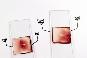
At this point I really don’t have much more to say. I’m coming out of my creative slump so expect a lot more soon. Have a good night, everyone, and keep tuned for updates on events as they happen. As for now, I’ll leave you with a signature creation from this past semester. This is a Van Dyke print of my Facebook profile photo. I hope you enjoy. Good night.
The first project for my Color Theory course was turned in about 2 weeks ago. The instructor has promised that she will return the projects to the class on 22 Feb. This is welcome news because I’ve been anxious to see her feedback. At this point, however, I’ll put it out of my mind and will worry about the current project – a project in which I am behind on schedule but rapidly closing the gap.
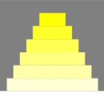
The project core is to create a 3-dimensional color “wheel” using one of the properties of color – intensity (saturation), value (light or dark), or color temperature. I chose value, with only 1 side of the value scale to be shown. This is because of the size of the piece and the difficulty I would face in completing a full spectrum value scale in the time alloted.
Conceptually I wrestled with this one a little bit. I asked myself how I could come up with a concept for a project that seemed nothing more than a technicial exercise. I did it for the first project, but that was fluky at best. As I was looking at my color wheel I saw the word “Primary” and then the light bulb started to illuminate my mind. I thought of pyramids, and then went back a little further and thought of ziggurats. Found chiefly in the Mesopotamian Valley, ziggurats were step pyramid structures that actually pre-date the pyramids (depending on who you ask, of course). The top of the ziggurat would be home to the city temple. These early structures were primary and are among the first architectural pieces that one will see in Art History 101. Since the Mesopotamian Valley is considered the cradle of Western Civilization, it stands to reason that here is where the early human artists began to formulate a primary understanding of color. I had a concept, now I just had to execute said concept (click on thumbnails for larger view).
- Click to Embiggen
- Click to Embiggen
I honestly don’t know enough about how ziggurats were built in relation to the rest of the city to really discuss. I do know, however, they were usually dead center in the city (for better defense since the temple was the most important building in the city), so they would need to be dead center on the surface. I borrowed from the Egyptians in that the pyramids were usually built in a careful arrangement. so I chose a north-south orientation. Basically, we have the primaries – the primary colors coming from nothing (since white represents no color in the art world) decorating the earliest large scale structures that rise toward the heavens, the source of all color. I think I may have gotten this one, but it will all come out in the execution.
Well, that’s it for now. Enjoy this rare burst of productivity from me as I move full force into this project in the morning. As for now, I need to make a list of materials and prepare to make a trip to Lowe’s in the morning. Have a good night, everyone.
Ok, the semester is finally over. I am happy to report that I received a semester GPA of 4.0 this past Fall. Now I’m looking forward to the Spring semester as it brings forth new challenges. For the upcoming semester I am enrolled in 3 classes – Color, Primitive Photography, and Critical Theory. This will bring me in a total of 9 credit hours with 15 contact hours per week. Hopefully I won’t be as frazzled through this upcoming as I was through this past semester.
At any rate, to dig into recent history just a bit, I promised I would share my final Computer Imaging project with everyone. The theme tying these 3 compositions together was science. Science and art, although the practitioners of each discipline think on different levels, are rather intertwined. Art provides the imagination that makes Science possible, while Science provides the materials through which Art can be expressed. The most pertinent evidence to support that theory exists in the fact that the 3 following images were created on a computer. To add further depth, I tried to approach each composition in the way a more well-known artist would approach it. Without further ado, here are the compositions:
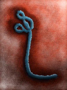
This is a digital portrait painting of an Ebola virus. When we don’t really understand something, we often humanize the subject for various reasons. With this particular composition, I attempted to humanize the virus by giving it a formal portrait. The real irony here is that a virus is technically not a living organism. This is the reason for the lighting and texture applied throughout the painting itself. This painting could be a cross between a Mannerist style painting such as those done by Pantormo (elongated form and non-primary color palette) and an early Baroque as done by Caravaggio (recessional lighting and open composition).
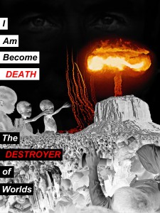
This particular piece was driven by the work of Barbara Kruger. Kruger’s work centers mainly on social issues, especially the roles of women, and (in every example I’ve seen) incorporates some sort of text. Here we have the aftermath of the nuclear age that was ushered in by Dr. J. Robert Oppenheimer. Societies throughout history have had to compete with other societies for resources, be they basic (food, water) or more advanced (access to ports, oil). War was often a method of first choice in order to seize the desired resources. The development of nuclear weapons changed the dynamic in the way people think about war. Nation states are now less likely to go to war with other nation states that possess a nuclear capability and more likely to negotiate to further their national interests. People die in war, and the human tendency to violence resulting in warfare could be seen as a natural check on species overpopulation. Since war is less prevalent between members of the “Nuclear Club,” populations have been growing, thereby causing greater strain on increasingly scarce resources. In this composition we think of the spirit of Dr. Oppenheimer looking at his creation. The nuclear blast acts as a camera flash, exposing the scenes of rioting, desertification, and starvation onto film. The pointing upwards all goes back to the spirit of Dr. Oppenheimer.
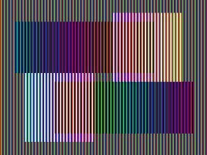
Finally we have an homage to Carlos Cruz Diez. Cruz Diez continues to work in challenge our perceptions of color. Going back to biology, we perceive color through the rods and cones in our retinas. Everyone perceives color in a slightly different manner, even if those differences are not measurably apparent, because we are all unique. The composition above takes the primary digital triad (Red, Green, Blue – aka RGB) and places white and black vertical lines over top. As it moves from left to right, the distance between each black and white line increases by 1 pixel, causing a shift in the way the color is perceived by the individual. Consider this your warning – the physical reverberations caused by this will make your eyes feel tired after viewing.
Anyway, so there you have it. I’ve been experiment quite a bit with the chromatics, but have put that on hiatus until I start my Color Theory course this next semester. At this point I’m revisiting an old project in order to make my concept more fully realized. I will share it with everyone once I have it complete. As for now, it’s rather late and I’m rather sleepy. Feel free to comment and I wish everyone here a good night.
I can’t believe it’s December already. The past 45 days have gone by in a blur. At this point I am looking forward to relaxing (relatively, I still have to feed myself and keep the net and lights on) and preparing for the next semester. Oh yeah, and the stretch run of the NFL season (GO TEXANS!! 9-3 as of Week 13). The semester for UH is over for me and next week I have 2 final exams at Lonestar. This should prove to by my last semester at Lonestar (unless I choose to complete an AA degree, but that probably won’t be necessary).
I do have some final project images to share. I think with this entry I will show you my Fundamentals of Digital Photography photos, since I kinda held back on showing those outside of class this semester. I put this together as if a child was telling a story with pictures. Honestly, the group was rather eclectic and I needed a unifying theme. Click on each individual picture to embiggen:
And that was my final project for my photography class. The individual pictures were to be taken from the best of our work over the semester. While the professor didn’t set any rules as to how it should be presented, I did want a theme. I should be getting grades back any day so I will keep you posted on that.
This class, honestly, was a great experience. I wasn’t sure how much I was going to learn given it was fundamentals course. When the instructor introduced us to a book called “The Photographer’s Eye,” things changed rather quickly and a new dimension was added into my thinking when looking through the viewfinder. I can see my growth through the semester, and I hope you can as well.
Comment at will.
Again we start rolling around to another month and I haven’t posted any updates. So, here goes with the latest adventure in Rick’s Picture Corner.
As you all have probably noticed lately, a lot of these posts have been focusing on works created in Photoshop. This is primarily due to my work in one of my classes (Computer Imaging) in which I am working almost exclusively in Photoshop CS5 to create the works for class. Don’t forget, these are pictures, too. I’m still shooting, but a lot of my time with my camera has been taken up by my Fundamentals of Digital Photography class, and most of the work done there thus far has been technical in nature (such as shooting equivalent exposures, etc.). In the most previous assignment and in the upcoming assignment I had license to be creative, and I will share the results with you on those very soon. But as such – on to the artwork at hand.
The self-portrait project received a grade of 90… just barely ‘A’ category. I was told that the kidney stone narrative was my weakest due to the use of filters. I’m actually interested to know how the break down of the because the only thing we received was a strip (I’m not joking) of paper with a grade and a quick comment. At this point I am not sure how much I was dinged by the use of the filter, even though I offered a valid defense as to why I used it. I suppose I could just ask her, but I’ll probably just let it go.
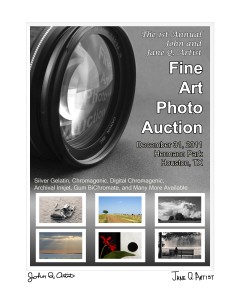
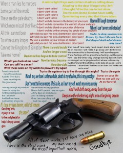
The project we just completed for the class was to incorporate text in 2 ways – in the first piece we were to make a poster, flyer, etc for an event, with the only caveat being that it had to be entirely fictional. Oh, and we were supposed to emphasize art over commerce (whatever that means). The second piece was to be a purely fine art piece incorporating text in some way. It was on this second piece where things got a little tricky.
For my first piece I came up with the following:
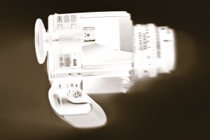
This, as you can tell, was for a fictional Fine Art Photography auction. This was a pretty straightforward composition. I used the lens photograph as the dominant element to draw the viewer in to the composition. The reflection in the glass pushes the eye out to the main text. Once the person finishes reading the main text, he or she is transported to the bottom, where the eye seems to naturally flow with the text and photographs. The white border simulates a window mat (standard mounting for photographs) with signatures from John and Jane Q. Artist at the bottom of the window. I placed white borders around the individual photos at the bottom to simulate window mats there as well.
Now, the second composition was a little more difficult, but this is what I turned in:
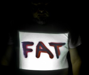
This particular piece drew some quick visceral reactions from some of my classmates (I could see the looks on their faces). I won’t get into the why, but I can (and did) defend every artistic decision I made with this piece. I had a few questions on the choices I made with the text, especially regarding the text above the gun. I defended each choice and the person asking seemed satisfied with the answer given, except toward the end. One particular person seemed to get a little nit-picky about different elements and I shot each statement and question back with a defense. Her neighbor chimed in with a subtle just let it go statement and the professor finally made the final statement regarding this piece. Feel free to comment as you like – the only thing I ask is that if a discussion develops, keep it respectful.
Well, that’s it for tonight, folks. The point of this entry was to share my recent work with you all. The days are getting busier as we start heading into Week 10 at UH and Week 9 at Lonestar, which means I’m over halfway to the end of the semester. I do have more to talk about, but that will have to wait another 24 hours. To all my faithful and not so faithful readers – I bid you goodnight.
My English teacher wasn’t kidding when he said that I was a glutton for punishment this semester. A total of 18 contact hours per week is kicking my butt. Well, it’s all for the greater good of learning, correct?
So now as I struggle with trying to repair a broken upright freezer (and replacing the spoiled food) and dealing with a family member who is being referred to hospice care, I find solace in some of the artwork I’m creating. I haven’t been creating much on the photographic front as my focus in that course thus far has been technical in nature. Where the ideas are coming through is in my Computer Imaging course. We were given a lot of license to play as we wanted with this current project. The requirements called for 3 composed images with at least 1 image being a self-portrait photograph taken with a DSLR camera and the dimensions on all 3 images were to be 5″ x 7″ at 200 dpi.
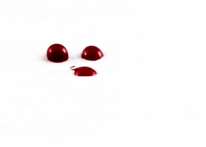
I’ve done quite a few self-portraits in the past 12 months, both for assignments and for personal use. I did not want to take another “normal” self-portrait. After not too much thought, I came up with this:
The 3 red dots are drops of my own blood. Blood is the most elemental part of us as a living being. Blood is also sacred in the spiritual sense. In simplest terms, it is our essence. I was a little hesitant when I showed the instructor (that maybe she wouldn’t get it), but she seemed to be very warm to the idea and its originality. At first I left the paper just off white (as wax paper tends to be), but then the instructor asked if I had considered pushing the edges to pure white. I had, in fact, considered that, but I was going for strict precision, with almost a clincal feel to the photograph. But after reading an interview with Elliot Erwitt in a magazine, I realized that photography isn’t about what you see, but how you see it. So, I pushed the edges to pure white and got an effect better than I expected (I improved the clinical feel as added the feelig that I’ve come to contaminate your sterile little world, watch as my shadow spreads). I left the imperfection on the flattened drop because I am not perfect.
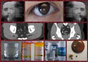
So on we go to Composition 2, or, as I like to call it, the “Kidney Stone Altarpeice.”
This one came to me relatively fast as I was looking through some old images and came across the photo of my kidney stone from earlier this year. Interestingly, in the week prior to beginning this piece we had studied the Ghent Altarpiece by van Eyck. Drawing inspiration from that, as well as the ancient Egyptian tomb paintings, I created a narrative in register format using images from my collection, as well as a royalty free image for the Momento Mori element. You may recognize the eye from my “Evil Eye” composition from this past Spring. The pictures flanking the center eye element are both the same photograph, just reversed. It was a long exposure of me sitting perfectly still and then just a half second before the shutter closes I moved as if screaming. The elements of the middle register are the transverse and frontal views of my kidney stone as seen by a CT scanner. The bottom register contains a glass of water, the actual pill bottles from the prescriptions given by my urologist after diagnosis, a lot of water, and then the kidney stone(s) next to a penny. I added a filter to each element to make it look as if it had been painted on brick. I added that filter to the borders as well to make those areas resemble bare red brick. I may yet revisit this portion to see if the effect works better with a texture rather than a filter. The instructor seemed rather pleased as I told a narrative using my own photographs but was able to do it in a non-linear fashion.
And finally, I came to Composition 3:
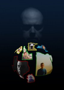
In this particular piece I show myself in different parts of the US and the world. These are not all the places I’ve been in the world, but these are the places that left a deep impact on who I am and will help shape what I will become. In each place I have always felt as though someone was watching over me so I could learn the lessons I was meant to learn while there. This particular one was a little more difficult to realize. During our individual meetings I showed the instructor the elements of state/nation outlines and photographs. She said she was “intrigued” by what I had done, but, just like me, she wasn’t sure what I could do to tie them together. What better way to tie them together than to use a cosmic force? I had thought about using my “Event Horizon” painting from last year, but I thought to go with the picture of me watching over me (after all, did not God create us in His image?). I chose to use blue as the base color as it is a benevolent color. All in all I thought I was rather successful with this one, but we didn’t discuss this one during critique. I’m not sure if that means it was good or if it was bad. I guess my grade will reflect what she thought of it.
All in all I’m enjoying this semester as I’m learning more than ever before. That’s not to say I hadn’t learned anything up to now… my previous instructors have left deep impressions in my mind. It’s just that now I seem to be led in a different direction as my mind’s eye is being pried open even further than before. I’ve already received my next project and I honestly can’t wait to see how the ideas I have for it begin to take shape.
As for now, however, I need to get some sleep. Goodnight and sleep well to all my faithful and not-so-faithful readers.
Well, the first project for my Computer Imaging course has been submitted for grading. I guess I will be finding out next week what the instructor thinks of my artwork, but until then I have other things to do.
The next project will be a self-portrait. As I’ve done three self-portraits in the past twelve months, I wasn’t too thrilled with the assignment. I have some ideas, however, and I will mull those over in time. This assignment will be, once again, three different compositions. The first will be a straight RAW photo that is processed in Photoshop. I use Lightroom for initial processing of RAW photographs and then only move into Photoshop if I need some heavy duty processing (mostly if I’m going to get extra-creative). Since I’m not the teacher, however, I will be following instructions like a good little student :-D. The other 2 compositions are going to be some sort of photomanipulation of a self-portrait using at least three sources. Also, each of the 2 compositions is supposed to be different. I have a few ideas on those as well. This should be, umm, interesting.
Holy crap the new Morbid Angel album is horrible!
The other classes are proceeding apace. This is going to be a busy but very rewarding semester. I just had my senior hold removed at UH (I have senior standing due to credits earned at the community college level even though I’m not quite a senior in terms of the courses I’m taking) and then I can start to think strategically on a long term plan for finishing the degree. I’m looking forward to this challenge, especially now that I’m in the thick of things.
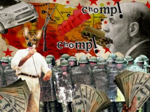
Also, I did promise the three compositions from my first project. Here is the breakdown:
The 1st composition was to be inside a space of 480 x 360 pixels at a resolution of 72 dpi. For this one we could only use cut and paste aspects of collage work. The only exception was that we could resize the image to fit the work if necessary, which is good because 480 x 360 pixels is not a big space in which one can work.
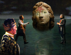
The 2nd composition was to be inside a space of 4.5″ x 3.5″ at a resolution of 200 dpi. This composition could be manipulated as we saw fit.
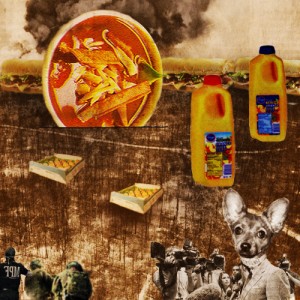
The third composition was to be inside a space of 500 x 500 pixels at a resolution of 72 dpi. In this composition we were allowed to manipulate as we saw fit, but this time we needed a unifying color theme. I chose orange.
The Houston Chronicle was to be the source for all three compositions. While not required, it would have been wise to make all three compositions something different and for each one to have a concept behind it. I conceptualized all three of the my compositions. Without further ado, here are “Chomp!,” “Lucretia’s Judgment,” and “Revenge of the Food.”
These took a little longer than I would have thought. I’m not much for collage work, so this was definitely a challenge.
Well, I have an assignment for my Fundamentals of Digital Photography class to finish up, so I’m heading out. I will update everyone soon regarding my progress. Until then, my faithful and not-so-faithful readers, I bid you goodnight.
I’ve been taking classes for 3 weeks now at the University of Houston and am going into the 2nd week at Lonestar College. This is beginning to kick my butt. The 12 contact hours total each week at UH isn’t helping anything. This week we’re going to be kicking things into gear in both my Art History and Government courses. In my Computer Imaging and Photography Fundamentals courses we kicked things into high gear the 1st day.
Well, enough complaining. I’ve been hard at work on my first Computer Imaging project. This particular project is in 3 parts – each one with different parameters in terms of tools used, size, and resolution. The instructor expects each part to be different, so that’s taking a lot of creative energy. The unifying thing among the 3 parts is that the elements must come from the Houston Chronicle newspaper. I have 2 of the parts done… it’s part 3 that I will have to work on later today(!).
I know this is a pretty short entry, but I’m rather sleepy and I have an appointment in the morning with my academic advisor at UH. I will post my compositions once I have completed the 3rd. Football season starts for me on Sunday – so that will give me an escape for about 12 hours a week (yes, I watch that much football during the season hehehe). Goodnight, everyone.
I am happy to report that I am finished with my English course. After the midterm we had 4 classes then moved straight into our final paper. The professor set it up to where we had to give a presentation on our papers, but only a couple people would be presenting per night and you didn’t have to come to class until you were scheduled to present. I gave mine just this past Wednesday and he gave me my final grade today (I got an A!). The best part, once the presentation is complete, that’s it for your semester. This definitely takes a load off my mind as we move into the final stretch. I have one more art project, an audio tour (and accompanying paper), and two finals left to go in the next couple of weeks.
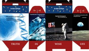
I finally finished my retail package. I completed the design and print run about seven hours before it was due. It took three attempts to get the printer settings correct (kinda hard with generic paper and no profiles) and it ended up being a matte finish, but that’s ok. I cut the design and folded it and then realized that I screwed up on the placement of two words on the bottom. As it was nearly 3 am when I realized this, I ran another print in the hopes I would get a chance to cut and fold during the class, but no such luck befell me. It’s ok, I hope she doesn’t ding me too hard for that little design flaw. I chose to make a wine box and made a fictitious little company called “In Vino Veritas.” The artistic theme for the design was to be something to do with self-improvement. I chose “Believing in Yourself” and put little inspirational quotes over photos of things that we as human beings have accomplished. The first was the discovery of DNA, the second was Mount Everest, the third was Neil Armstrong with the US Flag on the surface of the moon, and the fourth was a picture of the Earth as seen from the moon. On the bottom I put “In Wine Lies Truth” (it was here I messed up the placement of the words “In” and “Lies” – they were partially covered by the fold flaps). On the top flaps I placed a solid color and little scattered graphics of wine bottles. Here is the template graphic for the project:
Some of you out there may recognize the 366th Fighter Wing motto, but I digress. The professor has the completed project at this time. When I get it back I will take some photos to show what it looks like in its final form. I wish I would have had time to take it to Kinko’s to have it printed on glossy cardstock as the matte finish doesn’t allow the colors to pop at all. But hey, at least I got it done.
Now my wife is wanting me to design some boxes for the giveaways for her parents’ Golden Anniversary next year. Is it unethical to charge this to my in-laws?
Now I’m on to my next project, which is to create a postage stamp. It can be from any country, real or imaginary, and has to have at least one example of each of the following: a currency notation and price, a scanned texture, and an edge like you see on real postage stamps but this one has to be created using Photoshop’s vector pen tool. I have a few ideas and will hopefully begin executing them shortly.
Sweetness came to me today in the form of a piece of plastic. I have been wondering about pinhole photography for a while, but never really felt like buying a body cap and drilling a tiny hole into it to give it a shot. The other thing that turned me off about that idea, too, was the fact that the hole would allow dust into my sensor while the mirror was up. Well, I have to worry no more… I found out Lensbaby makes a pinhole optic for their Composer lens. And it is only $35 at Camera Co-Op. Happy Birthday to me!!! Tomorrow I will be taking it outside while the sun is high so I can see what my mind can create. I am soooo looking forward to this.
At this point I have one more picture I can share with you from my gallery. Feel free to comment at will.
Well, my friends, I need to pop in that Celtic Frost CD and get back to work. You all have a safe and happy Easter Weekend and I will see you all again soon.
