Red is just one of those wavelengths that frustrates the hell out of me sometimes. When I was shooting a lot of concerts I would have problems with blown highlights because heavy metal performers love red lights. There was a really good photo I got of Erik Rutan from the death metal band Hate Eternal that eventually ended up as a black and white photo because I could not get the red light on his skin properly adjusted. The problem, however, isn’t just limited to the digital image on the screen, it also manifests when I’m trying to print certain red wavelengths on my Epson 2880. When I shot the April 2008 performance of Mushroomhead in Houston, I got a really good photo of one the vocalists (click here to see the photo). I was ready to use it as an image for a class project. Unfortunately, it cost me a lot of money in terms of paper, ink, and time only to realize that I could not get the red to print digitally without the blown highlights. I ended up getting it printed through a third part using the digital chromogenic process (digitally exposing an image on color photographic paper then developing the paper as you would normally) – the professor had given his blessing on using that method when he assigned the project. The photographic paper properly rendered the colors and I was able to use the image.
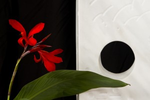
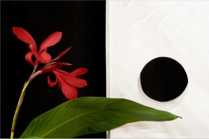
Fast foward to 2011 – I haven’t thought about it much since then as I haven’t had any photos to be printed that were flooded with red light. Yesterday I took some photos of a monolithic scultpure for someone. As part of the composition we placed a red orchid-type flower next to the piece and while the owner was cleaning off another plant I took some artsy type shots of the flower and scultpure. Here is the photo that I ended up with:
As part of post processing I increased the luminosity of the red in the flowers in order to really get a good contrast against the white marble of the sculpture. I was pretty proud of the digital result and decided that this particular photo needed to end up in my print collection (also for sale if anyone is interested). So I fired up Photoshop, made the adjustments to Brightness (my printer tends to print a little darker than it appears on screen) and went to the print dialog. Unfortunately, a large area of reds in the flower were out of gamut for the printer and paper profiles. “Dammit!” I thought, “Not this again!” I printed a low quality test and the reds were blown out, as in the subtle tonal changes were gone.
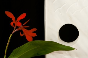
So, I consulted Photoshop help and figured out how to view gamut warnings in real time when working with the images. As an added bonus it could reproduce the gamuts of the various paper ICC profiles I have installed. Since I primarily use luster paper (it’s a nice middle ground between glossy, which I don’t like, and matte, which often looks washed out) I was able to get a good idea of its limitations. I attempted to replace the colors. While I was able to save the subtle tonal changes, the resulting colors were not really true to what I wanted:
As you can see, the reds are now a pinkish color. It doesn’t look bad, but it’s not the true color of the flower. For this particular photo I wanted to stay as true to the actual colors as possible. What to do? What to do?
I looked at the other paper types I have and tried those profiles. I found that with the matte finish papers I have (Velvet and Somerset) I got more of the colors in gamut, but still had a large area outside the gamut. Then I realized that last week a couple of sheets of Ilford Galerie Smooth Pearl inkjet paper came into my possession. I installed that profile and viewed the gamut warning. I was amazed to find that this paper had a larger gamut than the Legion papers that I had been using. There was still an area of reds that were out of gamut, but the area was much smaller than before. I opened the color replacement dialog and then found the in-gamut replacement color very closely matched my original processing:
I lost a little bit of the tonal changes, but in the final print the changes were still extremely subtle. I score this as a win. The print itself turned out great, although it is a little more glossy than I normally use, I can see this paper finding its way into my printer when the need arises.
What did I learn from this? There are A LOT of different papers out there (which I already knew) but the differences in color gamut between the brands seems to be more than I initially thought. Unfortunately, the quality papers are not cheap – my Legion MOAB Lasal Luster (11 x 17) costs US$70 for 50 sheets and that’s in the mid-range price for that size paper. There is also the issue of ink costs (US$15 per cartridge for the Epson R2880 – these don’t hold much ink at all), time, and waste. Clearly, experimentation is going to cost a lot of money and that’s something I will only be able to do over a long time. If I could afford a digital chromogenic setup then I would be all set, but that’s quite the capital investment there. The upside of this is I gained a bit of understanding of the printing process, a bit more understanding of color, and learned a few more tricks in Photoshop. I also found that printmaking is not something simple… there is a lot more to learn about this. What am I getting myself into?
Well, that’s all for now. I hope everyone is having a good Easter and I will see you all again soon.


Leave a Reply