Page 11 of 17

More Practice

We got some ice in Houston overnight.  As this city rarely sees wintery weather, it is ill-equipped to handle it.  As such, the city pretty much shuts down and people generally stay home.  If the city planned a little better, maybe shutting down wouldn’t have had to have been an option…   Let’s get back to the subject at hand.

I realized today that I needed some more practice with the mixer brush if I was going to get some good results on my digital project.  So, that’s what I did today and I ended up with this:

Click Image to Enlarge

Ok, I’m going to toot my own horn here and say that this is probably one of the most sophisticated pieces I’ve produced using Photoshop (aside from some logos I did a few years ago).  I got some elements of highlight and shadow, along with some shading.  I didn’t pay too much attention to elements of composition and concentrated more on the use of the mixer brush.  I think I may be getting on to something.

Moving Right Along

The project is nearing completion in the creative phase.  Soon I will be in cleanup phase.  Here is how it looks as of about 3 minutes ago:

Click Image to Enlarge

I have some fine detail lines to finish up, then I need to fine a way to neatly paint in the field markers.  I may also go in and darken some colors in the shade areas in order to make it look a little more painterly.  Once that is done I can do the cleanup work like filling in missed spots and cleaning up some of the more messy lines.  I have a few titles kicking around in my head, but nothing set in stone.  I do know it will have something to do with the Smurfs.

Well, anyway, what do you all think so far?

What the Hell…

I can’t sleep anyway so I worked on the project some more.  I found there were issues with the black and white version of the photo I was using.  The issues came from adjustments I had made to the color filters in the black and white.  The reason I made the adjustments was to lighten some of the darker tones in the photo.  Well, this led to a few problems with skin tone (especially when both coaches and Tarvaris Jackson and Joe Webb looked like they had nasty skin rashes).  I went back in, removed the adjustments to the tones, and found that the darker tones actually help the picture.  Well, without further ado, here it is:

Click to enlarge

I’ve always referred to the Vikings former Head Coach as Papa Smurf (every time I saw him his beard reminded me of Papa Smurf), so I decided to turn the coaches and players into Smurfs (albeit very large and very human looking Smurfs).  I went with the garish colors on the clothing because these are colors one normally does not associate with the NFL.  I did have the field painted purple, but there were some mistakes I made in the coloring process that show up when the layer is visible.  Unfortunately I’m going to have to start that part all over again, but that should be no bother.

At this point I would estimate I’m about 3/4 of the way done in the coloring aspect.  Then I’ll do the touchups on the bleed areas and some outlines to give it maybe a comic book feel (perhaps “The Smurfs Play in the Superbowl”).

For those geeky/nerdy types – the original TIFF file I started with came in at 79MB (the picture was taken with an 18 megapixel DSLR camera).  Now, with the layers added, the PSD file comes in at 349MB.  The size of the JPG alone is 6MB.

Well, that’s it for now.  I need to try to get some sleep.  Goodnight, everyone.

Digital Art Class

This class is proving to be pretty fun.  I don’t particulary enjoy going through the lessons in the book, but I know that they will help me get more familiar and comfortable using the 5 gazillion tools that are available in Photoshop.  Last week I was given my first project for the class.  The project is to take a photo (can be digital or print), make it black and white if needed, and then to hand color the photo.  The instructor (someone for whom I have a great deal of respect) does not want us to color it like the original.  She wants us to get creative with the colors and to not be afraid to use some of the more funky brushes that are found in Photoshop.

I must admit it took longer than I thought it would to find a photograph to use, but in the end I selected one of my own:

Click the photo to enlarge.

I took this photo last summer at Minnesota Vikings Training Camp in Mankato, MN.  I thought this might make a good starting point since it has some detail, but is not so detailed as to require pixel-by-pixel coloring to get a good result.  I’ve been working on this since about Friday for about 2 hours each day.  It’s definitely taking longer than I thought it would, but it’s coming along very nicely.  I’ll share with you all once I have the final coloring done.

Well…

It’s only the 2nd day of class so I didn’t really learn anything I didn’t already know. But that’s ok, it gave me time to experiment a little in class and inspired me to experiment a little at home.

I somehow always knew Cy Twombly’s art would influence me in some way.  I’m not talking about his paint or chalk scribbles, but his very large and nearly solid color canvas paintings.  The Menil Collection here in Houston has an outbuilding dedicated just to Cy Twombly.

This was me experimenting with color blending, just as one would with a real paintbrush.  I didn’t really have a plan going into this – the picture just sort of created itself.  Perhaps it’s the final hues of a day that’s about to end.  Perhaps it’s a blurred closeup of Jupiter seen from space.  Maybe it’s a red-hued scale showing that there are very few absolutes in this world – most is just a shade of one of the 2 extremes.  Or, it may have just been a guy with some time to experiment a little with his computer drawing program thing-a-ma-jig.  That’s the great thing about art – there is never 1 correct answer.

Perhaps I can find a way to make something similar to the work of Mark Rothko.

While this isn’t a photograph, this is part of my evolution.  Does anyone have any comments?

PS – This looks pretty awesome printed on Anasazi Canvas…  I might need to have this one mounted.

Next Step

Yesterday I began the next step in my evolution. My Digital Art course began yesterday and today my Art History I and Composition II courses begin. I’m looking forward to the art courses as well as the composition course. The composition course, aside from being a requirement, will definitely help hone my critical thinking skills as well as my writing. I have to admit that I’m a little ambivalent about Art History I. I suppose it will help give me a sense of where the collective art world has come from and where it can go, but frankly I found art history utterly boring in high school. Hopefully the instructor can find a way to make it exciting and challenging on a deeper level than just looking at ancient scultpures honoring the sacred feminine.

The digital art course is the one that piques my interest the most.  For all of my post-processing work I use Adobe Lightroom 3, which I find gives better results and finer control than Apple Aperture.  I tried using Photoshop CS2 to do RAW processing, but found it to be incredibly lacking in terms of control and output.  It eventually got to the point where I used CS2 for 3 purposes:  TWAIN capture, correction of scratches and dust spots from film scans, and as a vehicle for making prints with my Epson R2880.  I pretty much taught myself how to do these things (and a few more), which I count as a small victory.  Photoshop is a very large, very powerful, and not very user-friendly monolithic program that can be daunting when one is exposed to it for the first time.  Tips and tricks from various websites have helped here and there, but I’m thinking that in order to unlock its true power I’m going to need a structured setting.  Now that I have a copy of Photoshop CS5 (thank you, education discount!!) I can couple that with the course and truly create some good stuff.  The fact that this is a requirment for a BFA Photography doesn’t bother me in the least.

In the next month or so I hope to sit down with an advisor and hammer out a plan of attack in order to apply for the BFA Photography program at the University of Houston.  Entrance to the program is competitive but I still need these courses (along with a few others) in order to apply.  Of course, between my dental issue and my current bout with kidney stones I hope I can find an opportunity soon.  Also, this will give me plenty of time to really beef up my portfolio.

Well, I must get back to work…  have fun everybody.

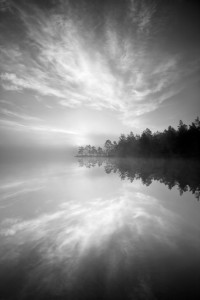
Magical Morning by Magnus Lindbom

Magnus Lindbom is a self-taught professional photographer from Sweden.  He earns all his money from photography-related work such as writing articles for publication, leading photo tours and workshops, and selling prints.  His goal with photography is “to inspire others to venture out into nature and experience for themselves what so many of us are missing in today’s hectic urban life”.  His concentration on landscapes (both color and black and white) have given us some amazing photos which seek to capture feelings rather than the place it was shot.

This photo, entitled “Magical Morning”, was taken at Tyresta National Park in Sweden.

The first thing that jumped out at me was the serenity that this photo conveys.  The mist on the water hides any ripples that would convey energy while allowing the reflections of the clouds and trees to come through with good clarity.  The gradations in the tone are nice and smooth, which definitely adds to the feeling of witnessing a serene morning sunrise.  As the scene appears to be backlit, that makes the gradations of tone (not to mention the great exposure) all the more impressive.  While I’m not a fan of placing the horizon in the center of the frame (something I have been guilty of more than once in the past), here the mist blurs the horizon enough to make one have to imagine it’s there.  In turn, the mist also makes obvious where the water meets the land.  While this helps the viewer see where the reflection begins, it does put a damper on what would have been the appearance of the land floating in the air.  In terms of composition all three elements (land, water, and air) are in good balance, with all three competing for, but none winning, attention.  The symmetry of the land and its reflection are almost insignificant when the photo is taken  as a whole.

All in all this is one of the best entries in this year’s “Folios” edition of Silvershotz.  The tones and mist definitely convey a sense of serenity and calm, enough so that the location of this scene is the very last thing I thought of when I looked at this photo.

More of Mr. Lindbom’s work can be seen by clicking here.

Anyone else have any thoughts?

Evening Clouds by Nenad Saljic

Croatian Nenad Saljic fell in love with photography and the mountains in his early teens.  Of course, life has a habit of getting in the way and in the course of some life events, he pretty much left his passions unpursued.  Fortunately for Saljic (and the rest of us) he rediscovered his passion for photography and has graced us with some beautiful black and white photos.  In 2009 and 2010 he produced a series called “Matterhorn”, which are, of course, shots of The Matterhorn in the Pennine Alps.  The photo below, entitled “Evening Clouds”, comes from this series (click on picture for a larger view):
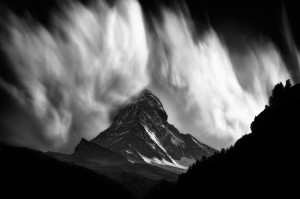
Few things can bring forth the image a grand conjuration than watching clouds borne from orographically influenced winds.  I was treated to a few myself as a Weather Observer in the United States Air Force, although admittedly nothing to this scale.  I’m reminded of the great eye of Sauron from the Lord of the Rings trilogy.  I wonder if this is the last thing that most of the rest of Middle Earth will see before the shadow of death descends upon them.  One almost gets the feeling of being a Hobbit watching from a hiding place as the conjuration of evil begins to really take hold.

The play on the tones is the part that sets the mood of this photograph.  The dark foreground tones suggest a hiding place – we have our safe vantage point and as long as the mountain can’t see us we are safe.  The moutain itself is mostly low-key in tone.  Toward the bottom it is lighter and gets darker as you go up, which suggest that a transformation of sorts is taking place.  Of course, the clouds are the stars of this photograph.  The brilliant white stands in stark contrast to the rest of the photo, letting us that we are in for something.  The beauty of the clouds belies both the violence that produced them and the violence that is sure to follow their conjuration.  And when one looks at the fact that the peak of The Matterhorn is enveloped by the clouds, one can’t help but get the impression that they’re in the path of the full force of what’s to come.

Of course, these clouds are merely the result of updrafts over the surface of the mountian.  Even though I can’t see the rest of the sky, I would safely assume that support for these clouds is almost non-existent at a few miles from the mountian itself.  Of course, not many people outside the meteorological community (or those who live near the mountain) would necessarily know that.

Normally when we see photographs of the power of nature, it’s in the aftermath of whatever phenomenon took place.  This photograph provides a rare glimpse at how powerful nature is, even on a small scale.  What makes this photograph even more powerful is that it almost seems to contain that power, even though we know what’s coming toward us.  The play on the tones of the photo suggests a doom scenario where Mother Nature is releasing her full power and the viewer, unfortunately, is about to be caught up in it.

Saljic uses HDR processing pretty extensively in a lot of his more static work, which unfortunately makes his finished photographs look almost like rasterscan line drawings.  His “Matterhorn” series (at least from what I can tell) is free of HDR processing, which sets this series apart from most of his other work.  You can view more of the series by clicking here.

Would anyone like to discuss this photo further?

« Older posts Newer posts »