Page 4 of 17

Armed and…

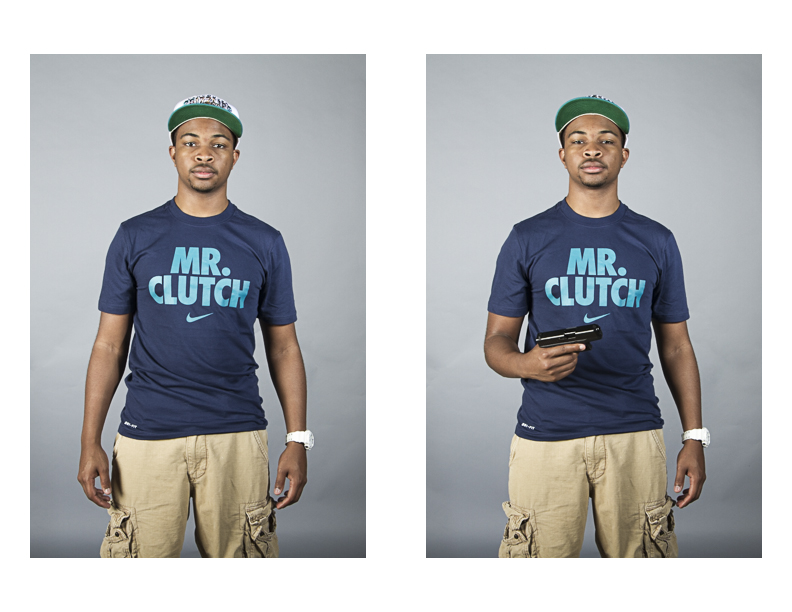
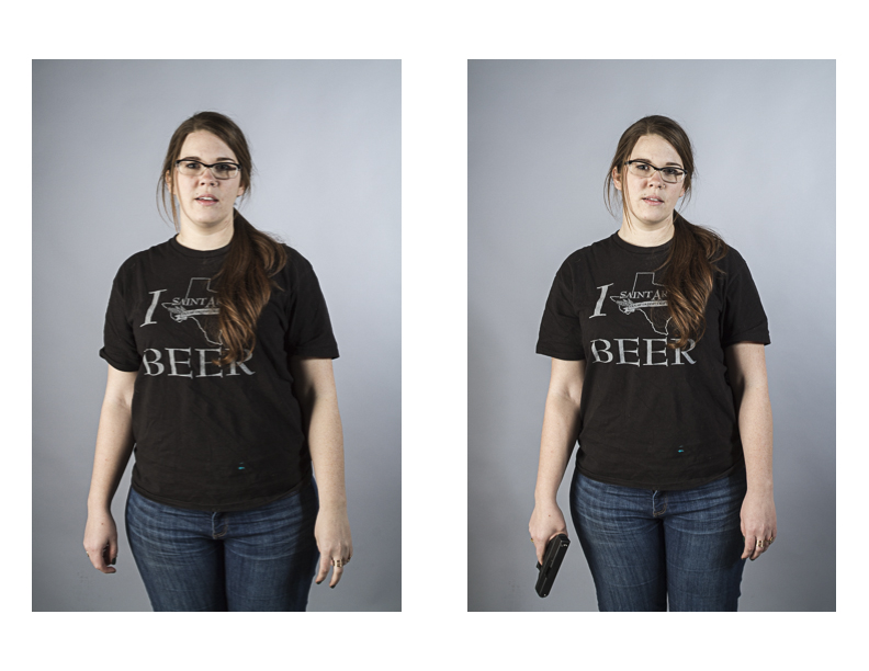
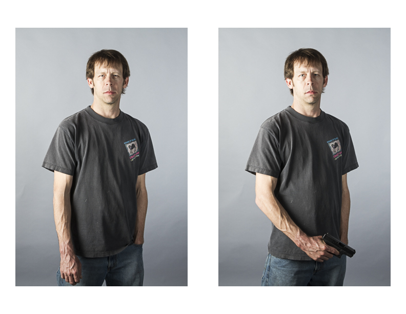
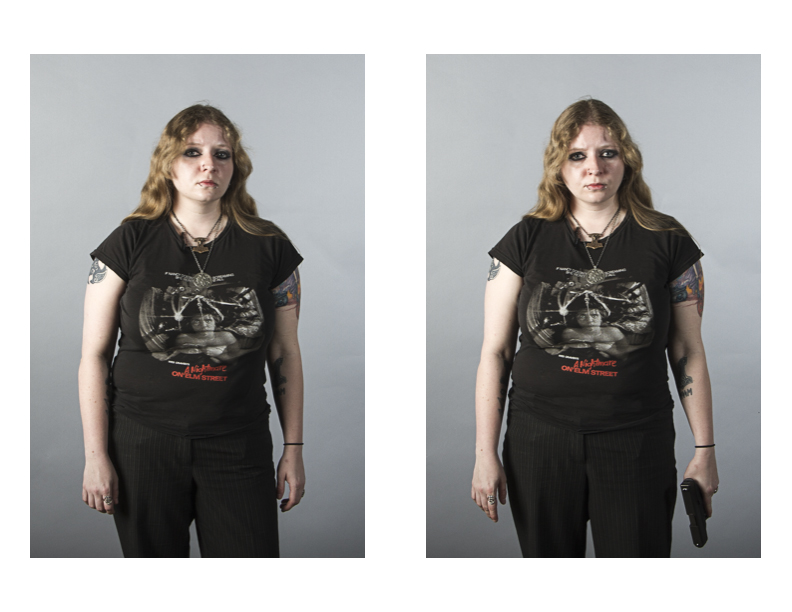
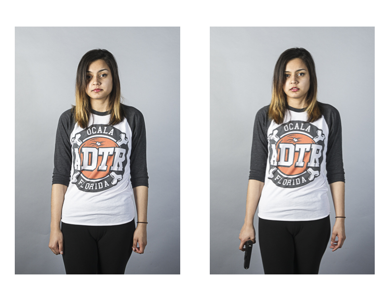
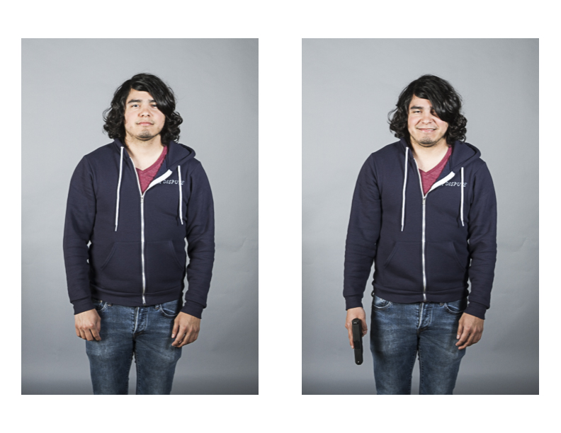
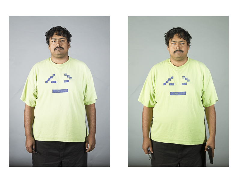
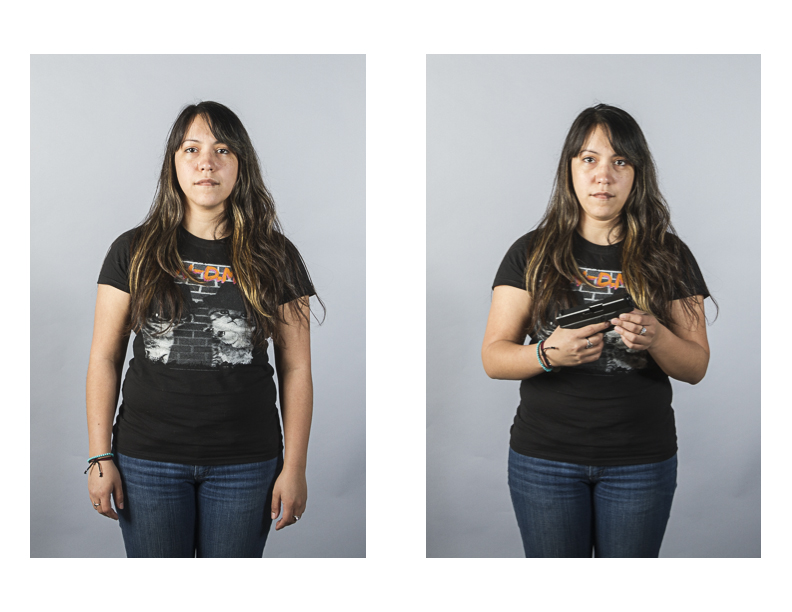
Gun control has become a hot-button topic again in the past few years, with several high-profile mass shootings having taken place in the United States. In response to these shootings, many on the pro-gun control side have exhibited outright fear of guns, even to the point of expelling children from school just because an object they possess is shaped like a gun, while many on the pro gun-rights side have called for loosening the restrictions currently in place regarding firearm ownership.

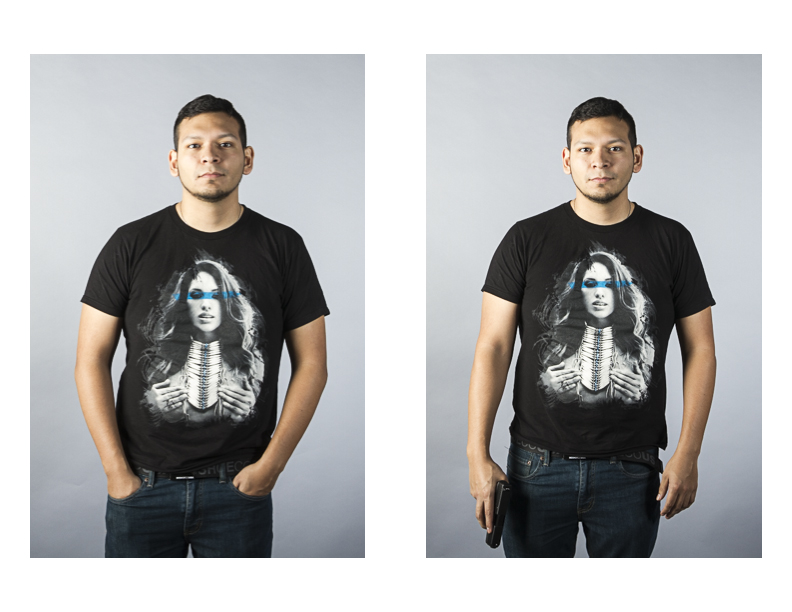
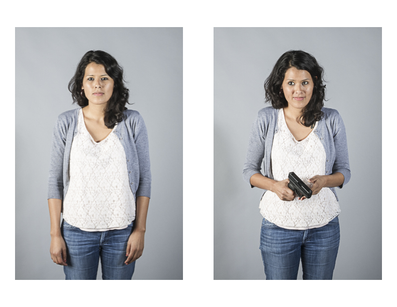
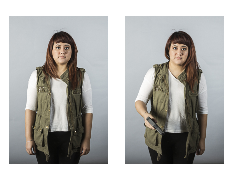
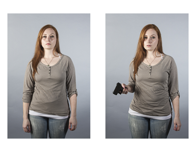
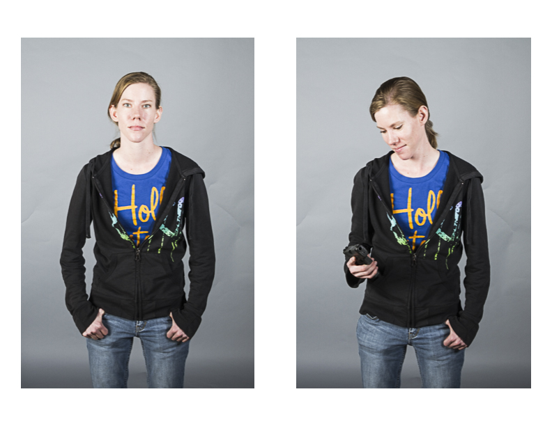
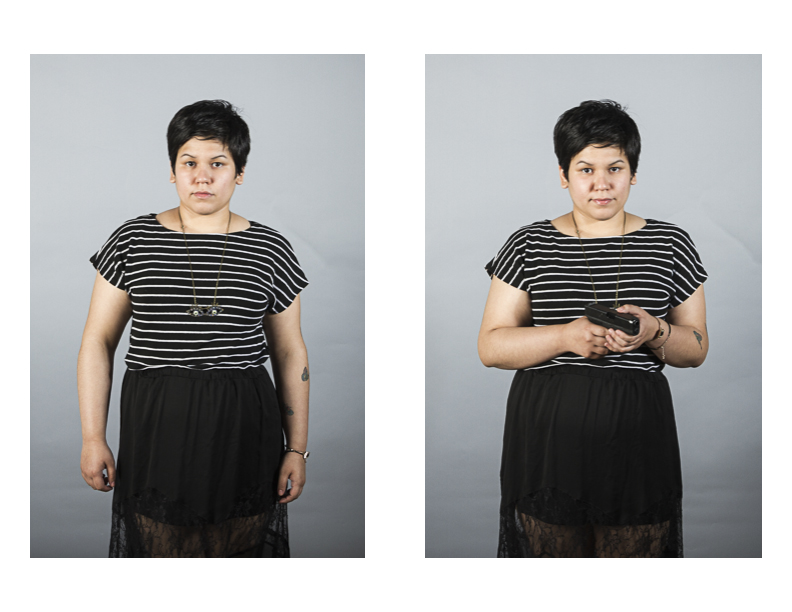
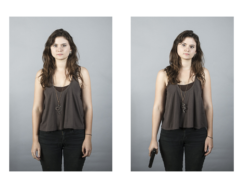
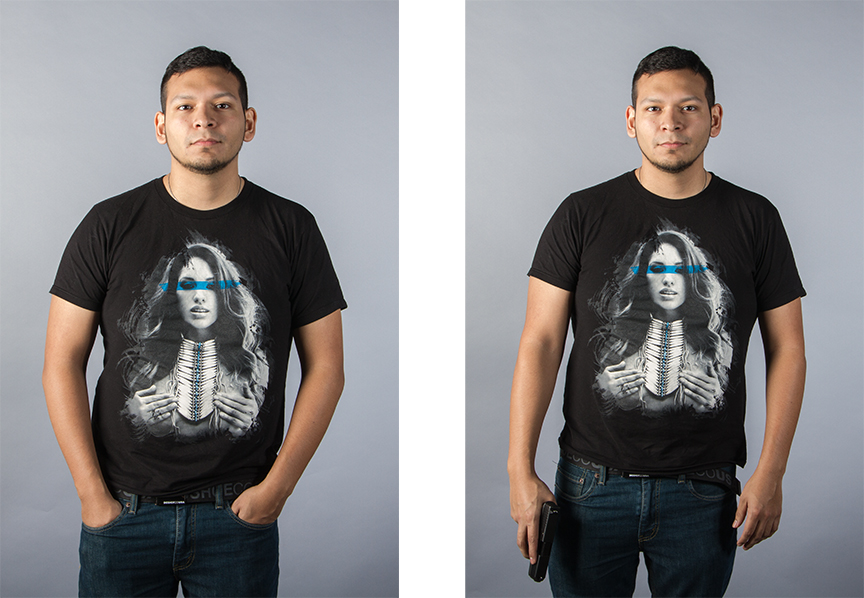
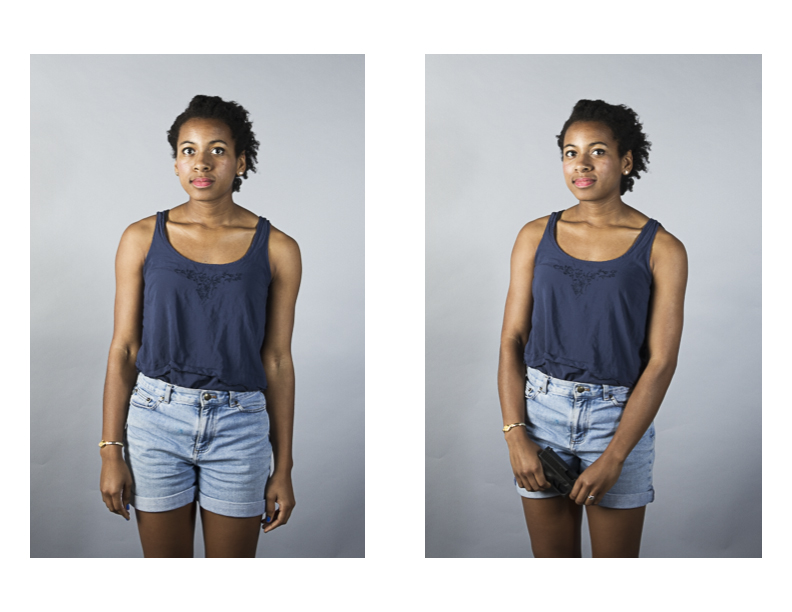
In this project, I examine the ideas of projection and perception when it comes to possession of a firearm. In each diptych, a person is photographed empty-handed in the first frame and then photographed with what they believe is a loaded firearm in the second frame. It is necessary that the subject believe the firearm is loaded, as an unloaded firearm does not have the same power as an object as a loaded firearm. The subjects are photographed on a plain background so the viewer is only able to focus on the person rather than the environment. As a result, the viewer must confront his or her own prejudices regarding people and the object of power that they hold. In terms of the subject, they must also come to terms with how they will carry themselves while in possession of an object that is designed to kill.

The gun control debate is one that is not likely to be over soon. The on-going goal with this project will be to foster greater understanding of the positions of both sides of the debate. When they can come to a greater understanding each other, meaningful dialog and sensible action can be taken to reduce gun violence in the United States and hopefully prevent another mass shooting.

Allyson Huntsman

Andrew Sosa Brenda Cruz Brenda Franco Cameron Wolfe Claire Jeff Bradley Kelley Kounter Lizette Soto Michael Alaniz Rahul Rao Sarah Rodriguez Stevie Falter Theresa Dunham Victoria Gonzalez Adrienne Myers

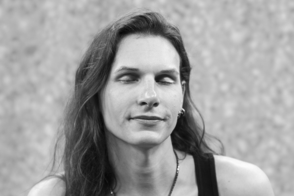
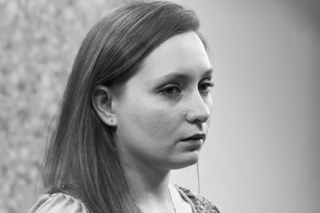
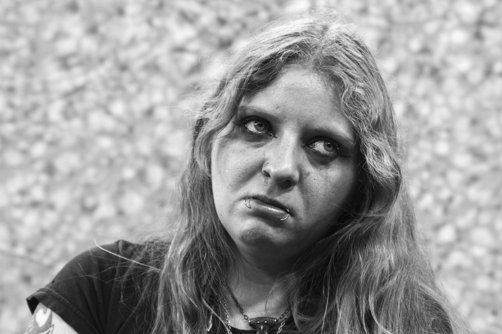
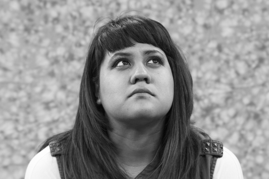
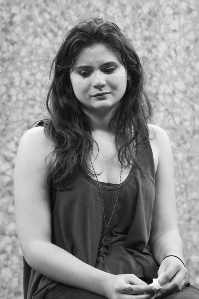
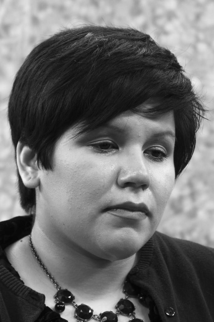
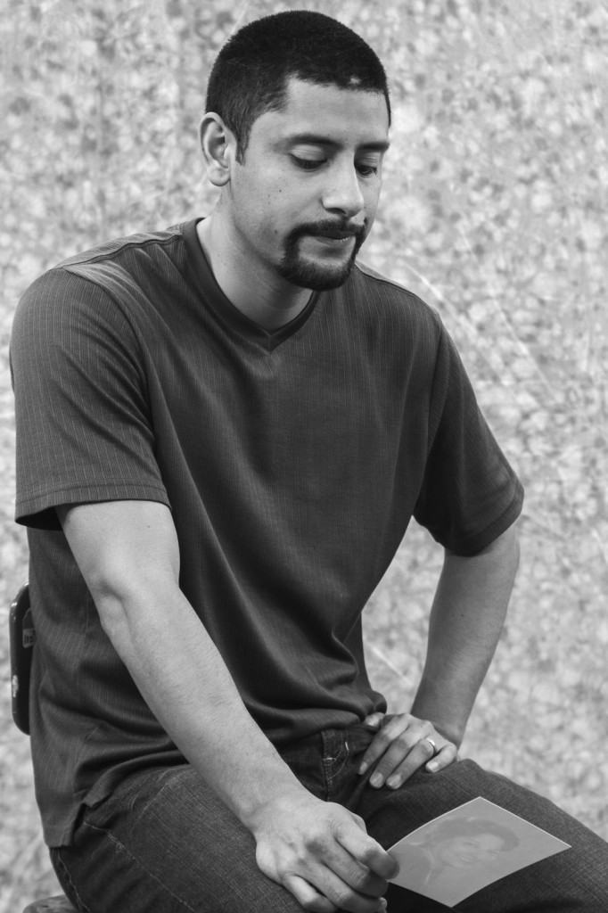
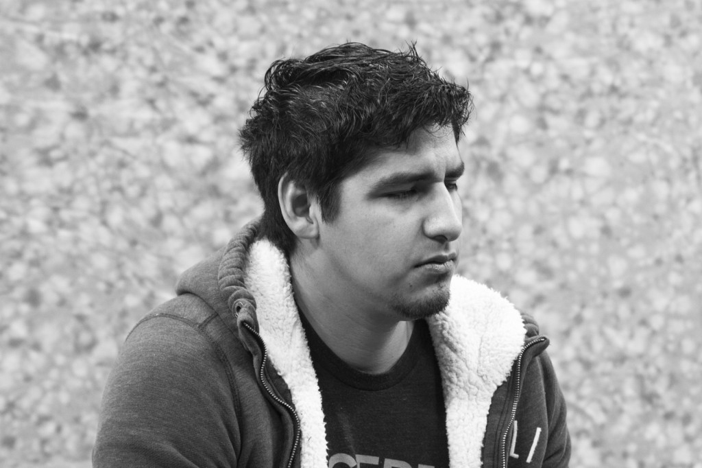
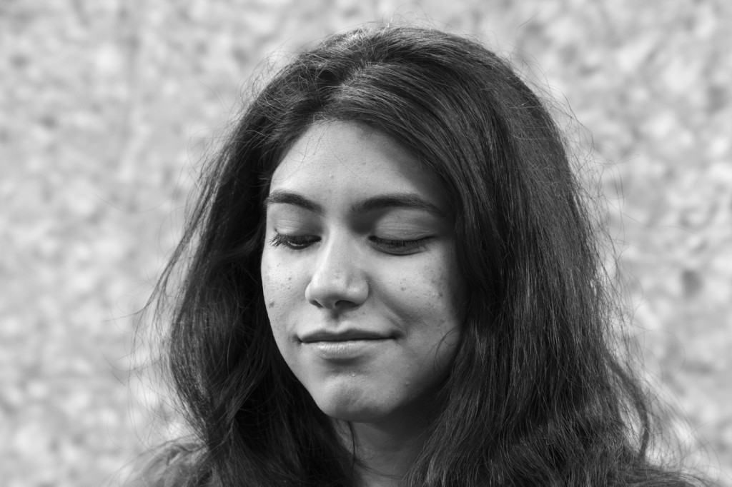
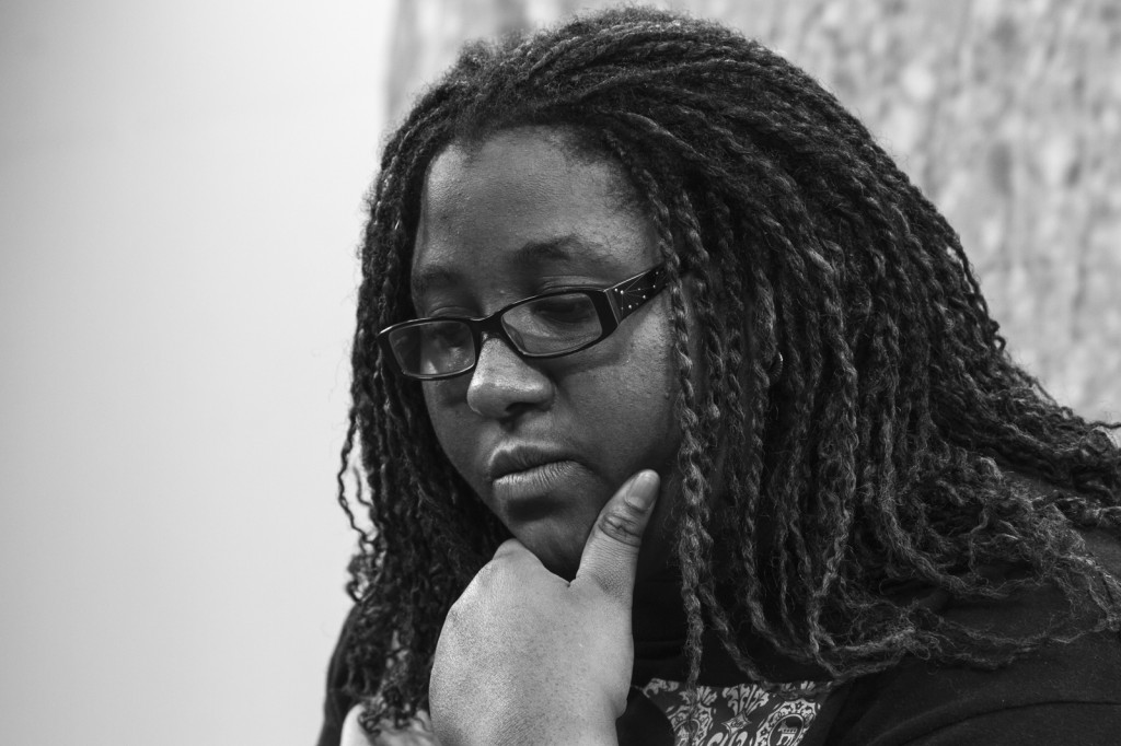
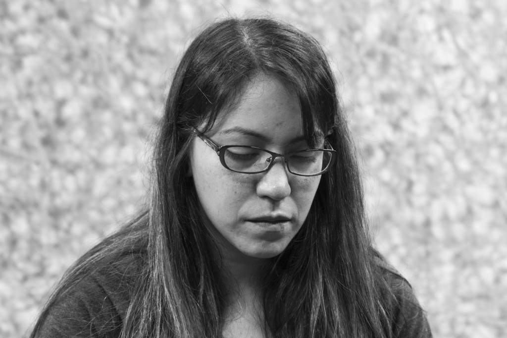
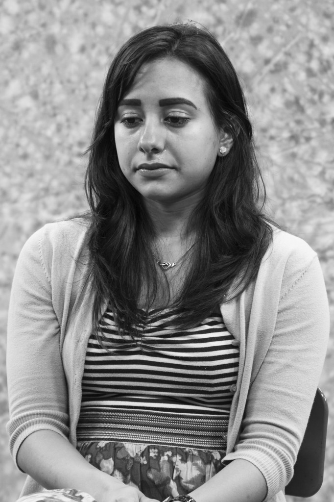
Emotional Portraits

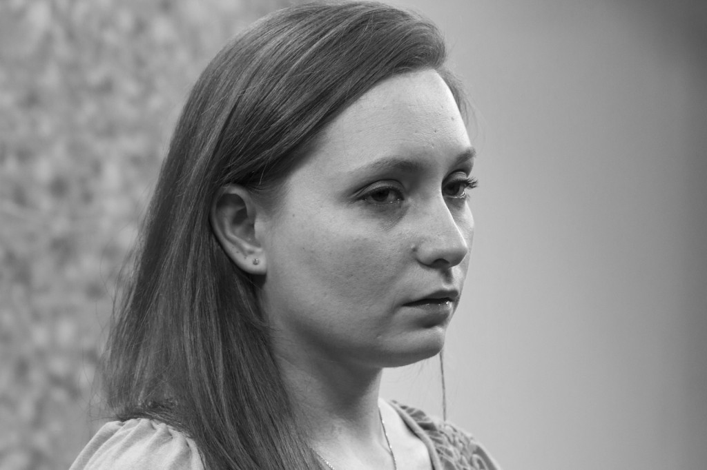
Emotions are an important aspect of human activity and often drive our interpersonal relationships as well as our decision making in both obvious and subtle ways. While many artists focus on bringing out the “true person” of a portrait subject, the focus on this project was to bring out the true emotion being expressed by the subject.

In this project, each of my subjects brought a photograph of someone close to him or her and used that photograph as a jump-off point in telling me a story about that person. The story told, whether a happy or sad story, was completely up to the person being photographed. Throughout the story, I took photos with my camera while varying my angle in relation to and the distance from my subjects. I also asked questions regarding the story in order to dig deeper into the relationship between my subject and his or her subject. Using the concept of the “decisive moment,” I captured the image of my subject that best expressed the emotion(s) that underlie the nature of the relationship between my subjects and their own subjects.

Much of the emotion that is expressed in formal portrait photography is either directed (think retail portraits) or is prompted by the artist, such as Richard Avedon when he would often ask psychologically jarring questions of his subjects in order to elicit a certain type of response. By using the approach I described earlier, I was able to minimize my role in directing the individual, thus allowing my subject to be more open and honest in their storytelling, which in turn allowed for an honest expression of emotion.

Emotional Portraits Main Images (1 of 13) Emotional Portraits Main Images (2 of 13) Emotional Portraits Main Images (3 of 13) Emotional Portraits Main Images (4 of 13) Emotional Portraits Main Images (5 of 13) Emotional Portraits Main Images (6 of 13) Emotional Portraits Main Images (7 of 13) Emotional Portraits Main Images (8 of 13) Emotional Portraits Main Images (9 of 13) Emotional Portraits Main Images (10 of 13) Emotional Portraits Main Images (11 of 13) Emotional Portraits Main Images (12 of 13) Emotional Portraits Main Images (13 of 13)

Down Memory Lane

It’s almost the end of the semester and I’m finding myself at the digital printing lab trying to finish up my project.  There’s another student with me, so at least I’m not lonely, but the stretch between these prints is rather long as it’s taking 15-20 minutes to print a 12″ x 18″ photo at 300 dpi.  What’s a boy to do?

I went ahead and fired up Flickr and started looking at some of my past images.  I sat there wondering if I would take the same image now, at least 3 or 4 years later.  It’s a hard question to ponder.  I would have to answer the question of how much my vision has changed over the intervening years.  Before that, I would need to ponder how I’ve been affected by what I’ve seen, heard, studied, researched, etc.  What is relevant now vs then?  Too many questions must be answered.  Sometimes it’s easier to look at old work and just enjoy it.

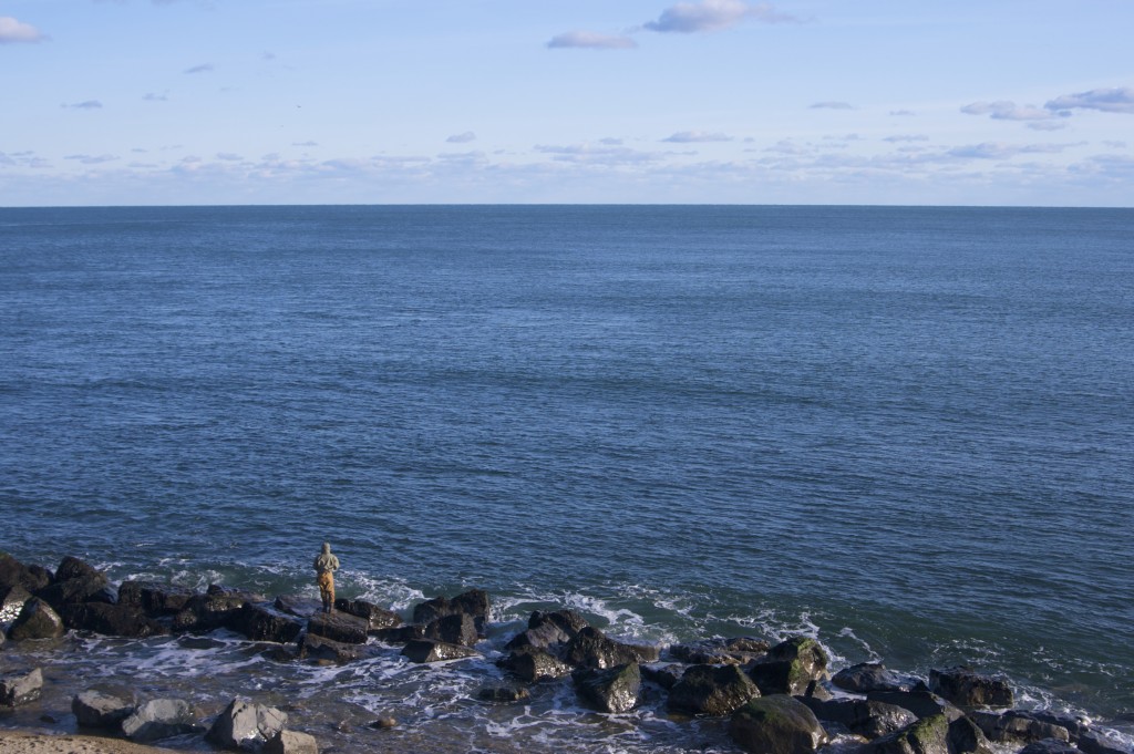
Atlantic Ocean

The above image actually appeared in my Primordial Light blog from a few years ago.  This was taken from atop the lighthouse at Montauk Point in Montauk, NY on Long Island in November 2008.  When I looked out over the balcony of the lighthouse, I was thinking of Hiroshi Sugimoto and his seascape photos.  Keep in mind that I had only seen those photos once prior to this point and I could not remember the name of the artist, so I went off memory the best I could at the time.  I didn’t really notice the fisherman until I had started looking through the viewfinder to figure out how to best position the horizon.  When I saw him down there, I immediately realized that he needed to be in the frame.  I had to figure out how to resolve the composition in my mind, however, as the rule-of-thirds with the horizon and the fisherman wasn’t going to be possible from my vantage point.

I finally settled on setting the horizon at the top 1/3 line with the fisherman and rocks taking up a smaller proportion of the space in the frame.  This, I felt, was a good symbol of how little land there is on Earth vs how vast its oceans are.  The man fishing, to me, became the human spirit facing the challenge ahead and overcoming it in order to further his survival.  Anyway, that’s my story and I’m sticking to it.

I will be revisiting some of these older photos again soon and thinking about my thought processes when they were made.  This will definitely serve as a good exercise of where I come from in terms of photography and where I’m going.  As for now, it’s time to start my next print.

It’s All About the Content

I know I should really post more than once a month.  This semester is kicking my ass a little bit, but that’s not necessarily a bad thing.  I’m learning a lot and finding out things about my vision that I never realized before.  But we won’t go too much into that with this post.  Let’s go ahead and keep this one on the simple side.

I can’t remember if I mentioned this or not (and frankly, I’m too lazy to go back and look), but our in-depth topic of study this semester is portraiture.  This is a little out of my comfort zone as I’m not one to shoot people.  I guess this comes a little from a view I had of portraiture that was rather limited in scope.  I have had models sit for me before and they expected direction from me.  The problem for me in those situations was I would go into them with very little in terms of an idea other than “I just want to photograph a person in various poses.” Needless to say, it was a little difficult to get much in the way of content from them.  That’s not to say that those sessions were wastes of effort – I did get some good shots out of my subjects.  They just seemed to take a lot more effort than I anticipated.

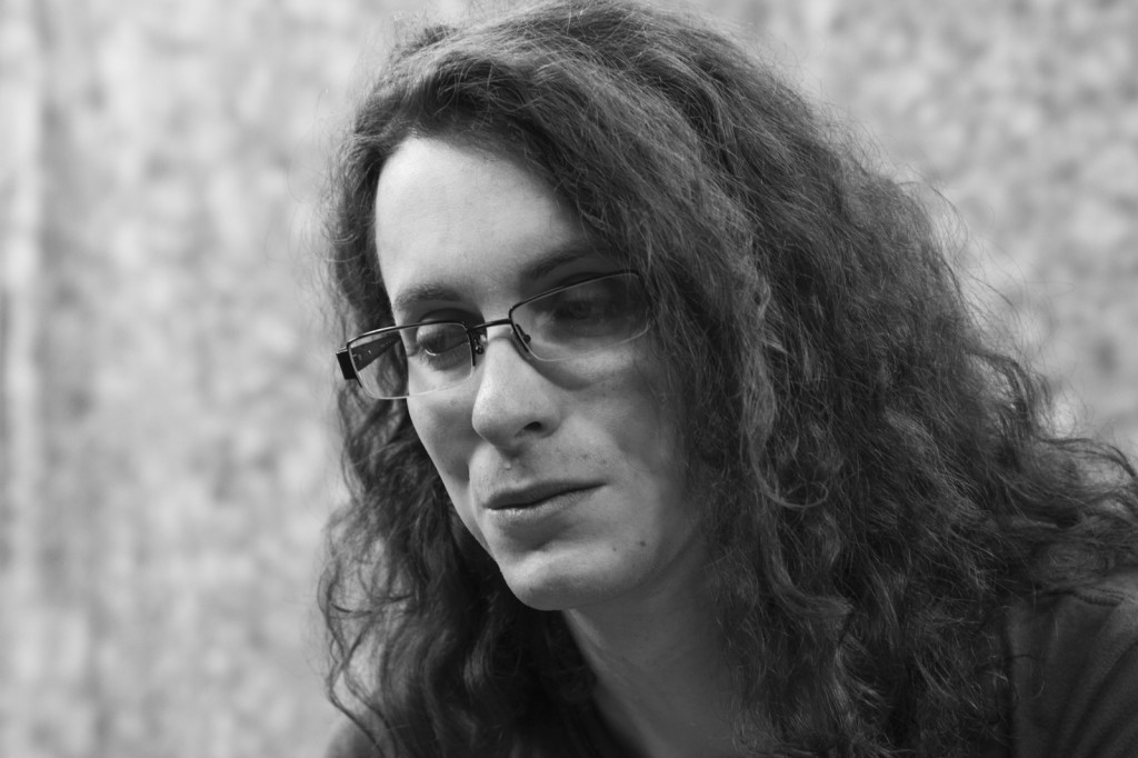
A couple of years has passed since those early sessions.  I found out that having an idea was very important when going into a shooting session.  Currently I have 3 active photo projects.  Of those, 2 are portraiture projects that have concrete ideas attached to them.  One deals with projection and perception while the other deals with emotion.  Of course, the emotion project could be a perception/projection type project as well, but since this is a rather specific area, I am a little hesitant to lump it under that heading.  After all, isn’t portraiture all about perception and projection?  But I digress…  here are 2 images of those projects in progress (click image to embiggen:
andrew _MG_3780

I’m sure my readers can tell which is which in terms of projects.  We just had a midterm critique and I received some really positive feedback on the images in the projection/perception project.   The only real negative was one of the professors really didn’t care for the print quality, which I thought was very fair given there were some issues with the color balance throughout the series.  All in all, however, the feedback was very positive and the critiquing bodies expressed an interest in more samples as well as how I edit them down for the final series.  We ran out of time so we weren’t able to discuss the emotion project images I submitted.  I’m not unhappy about it though, as the project is specifically for my class with Keliy Anderson-Staley, and not my overall semester project (which the other is).

Speaking of Keliy Anderson-Staley, she is a professor that the University of Houston and a bit of a rising star in the fine art portraiture game.  She shoots a lot of tintype portraits.  A tintype is made when a metal substrate (tin, in this case) is coated with an emulsion and then used as the “film” in the camera.  The “film” is then developed, fixed, and washed pretty much the same as film.  The emulsion is slow (in this case it was a 15 second exposure) so Keliy used a bar to help keep my head upright through the entire exposure.   The use of tin as a substrate and the wet collodion emulsion is one of the earliest processes of photography.  She took this of me in February:
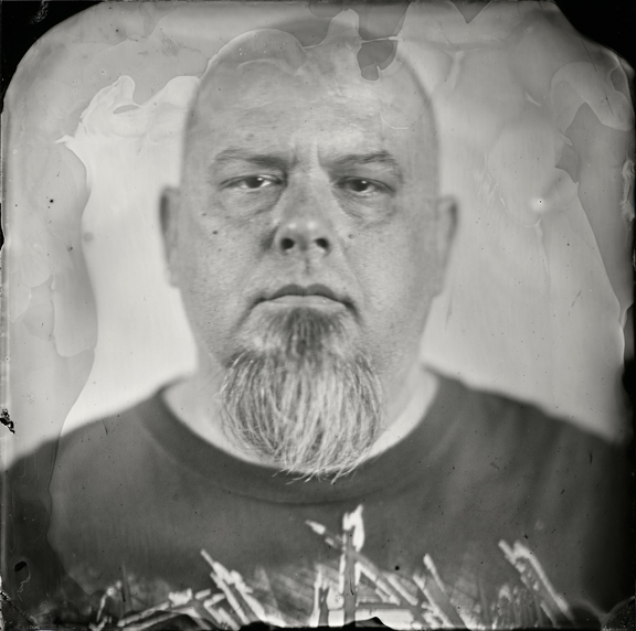
Rick_tintype

I highly recommend checking her website (link at end of article).  She has some really good stuff up there.

Well, at this point I should be heading out as it is late and I need to be awake in a little over 4 hours.  I will update again soon as a lot has happened for me, and I have many more ideas I would like to discuss.  Feel free to comment at will, and don’t forget to check out Keliy’s work.

Keliy Anderson-Staley (anderson-staley.com) 
Heavy Metal

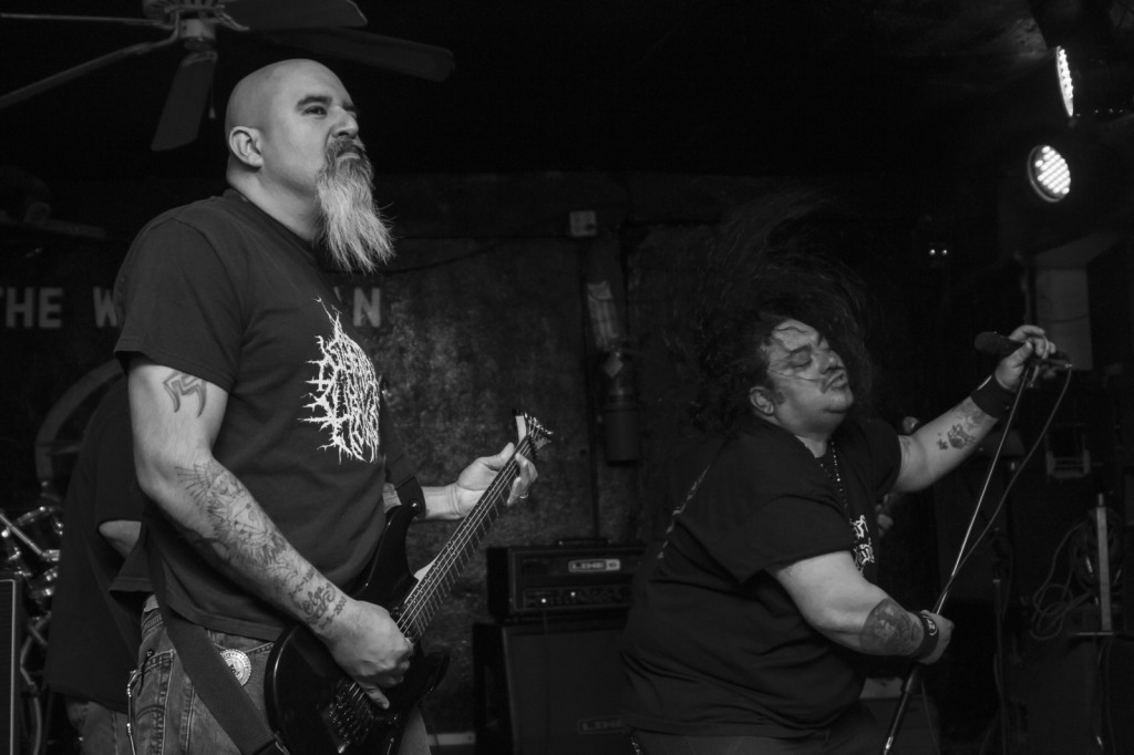
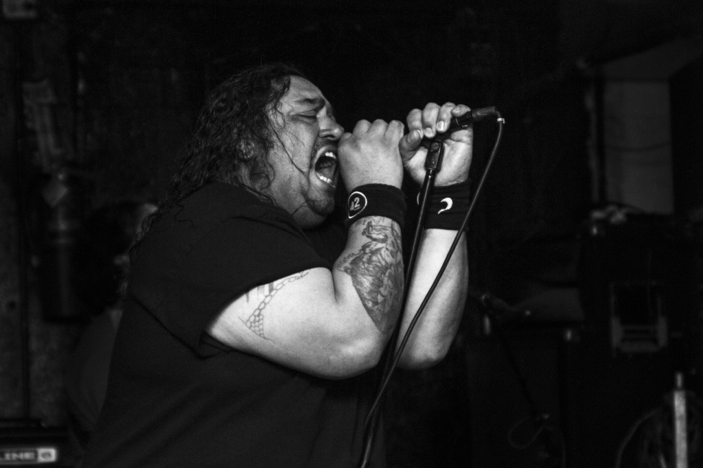
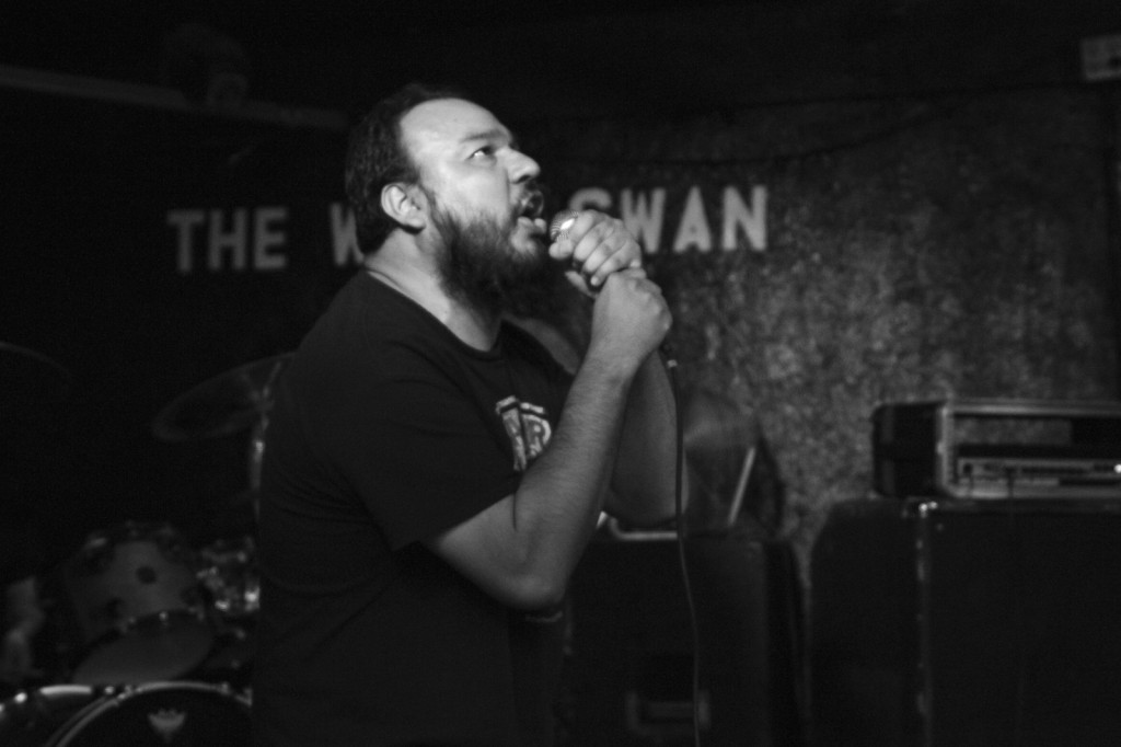
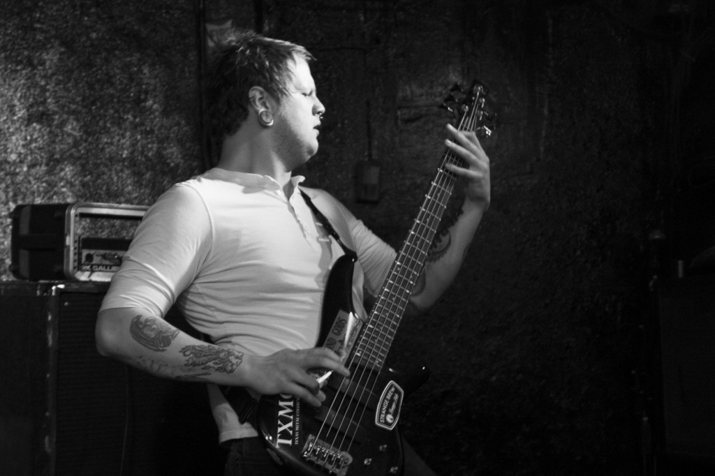
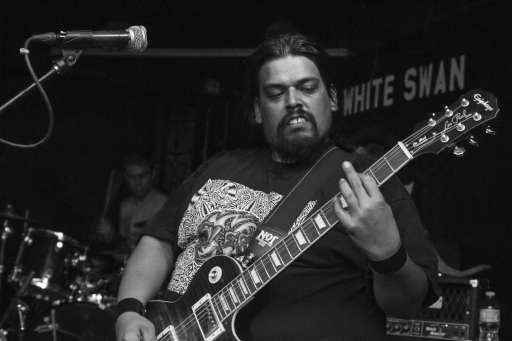
Sometimes we get so caught up in the demands placed on us, we forget sometimes what it was that drew us into (for me, back into) the art world.  I took a photography course to learn how to take better concert photos and it reawakened the artist in me that had been lying dormant for nearly 2 decades.  After getting caught up in some of the pretense of art school, I found a little zen after watching the Bob Gruen documentary on HBO (it had been sitting on my DVR for several months).   That very night I was able to get back to my roots and have a little fun with my camera while enjoying the hell out of some of Houston’s local heavy metal scene.
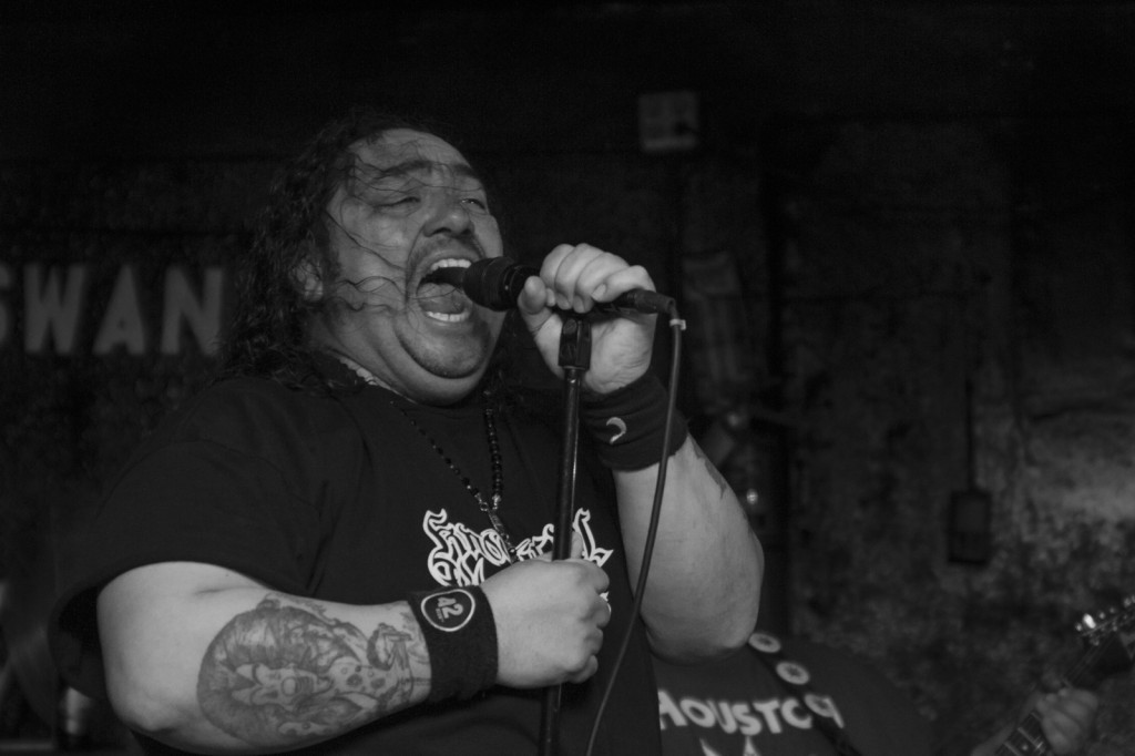
These are all in black and white because, to be blunt, the lighting in that particular venue is awful.  They have the colors, but there aren’t enough and they aren’t powerful enough.  It’s ok, though, because the black and white in this instance helps bring out a little more of the fury of some of these performances.

I leave this to you to enjoy.  And when you’re done, check out Bob Gruen’s website (click here) and the work he did in the 1970’s and 80’s.

Bag of Tricks Bag of Tricks-2 Bag of TricksBeyond Gods And Empires Beyond Gods And Empires-2  Day 46

The New Semester…

… is already in Week 3.  We hit the ground running with our morning professor.  I’ll get into the breakdown of how things are working in another post.

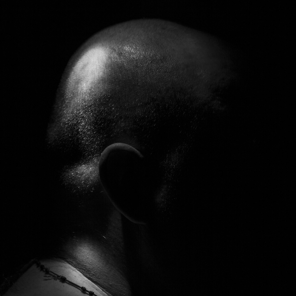
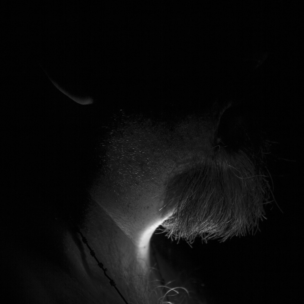
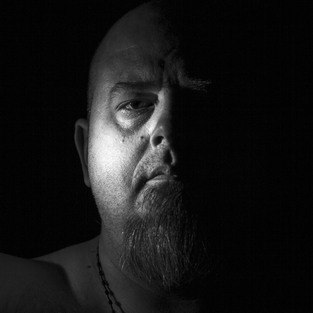
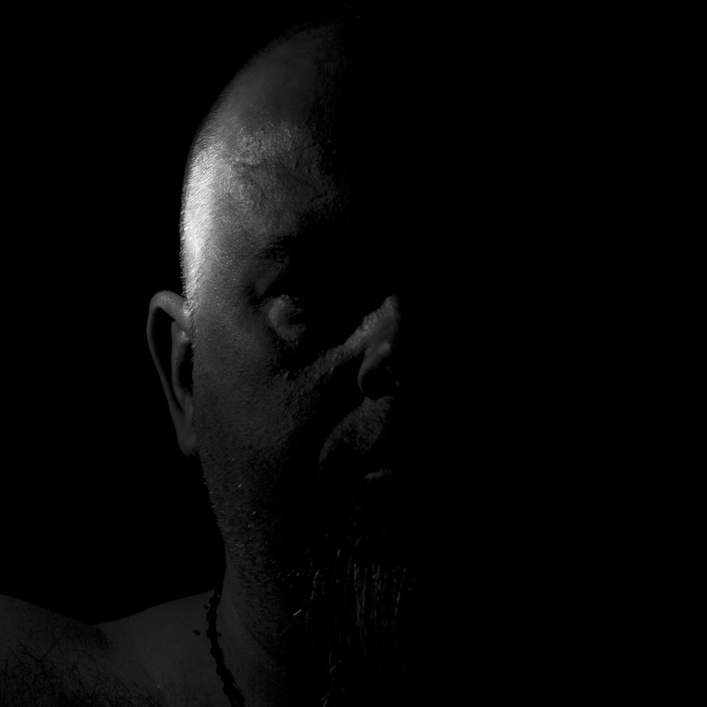
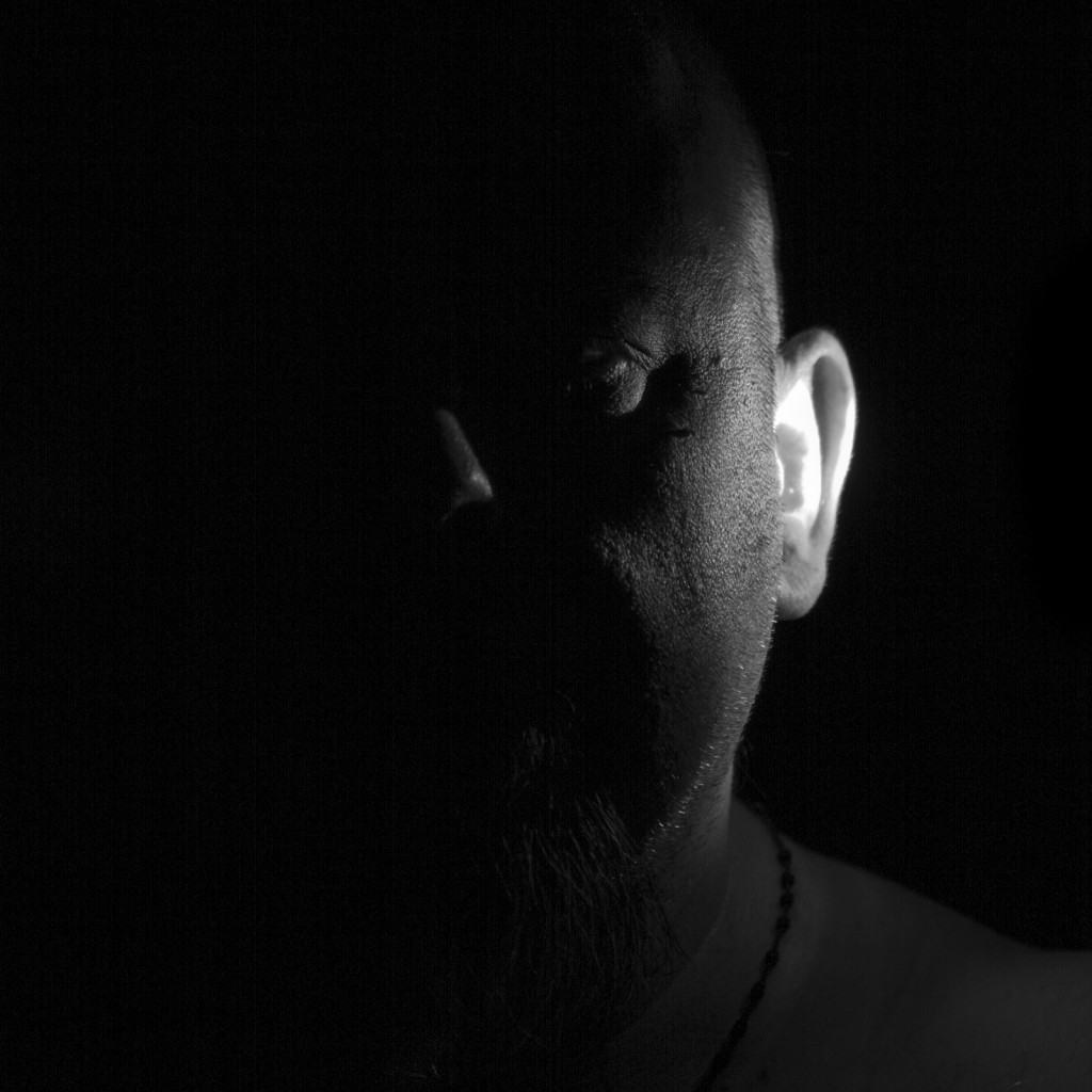
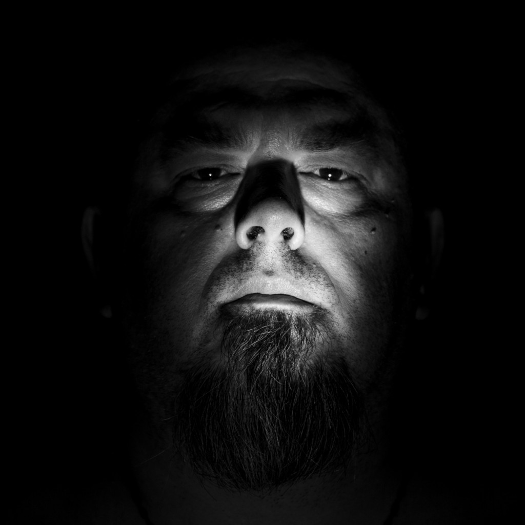
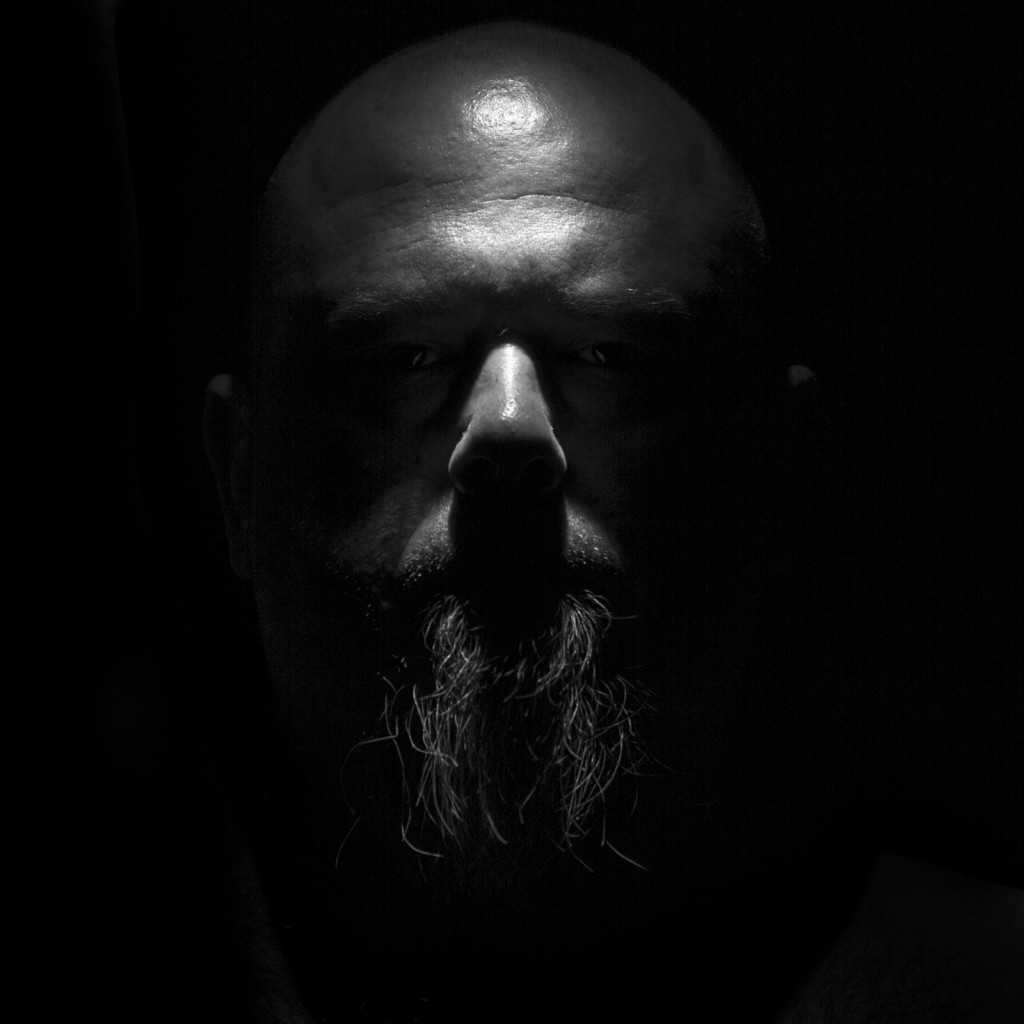
Just know that portraiture is out of my comfort zone when it comes to photography.  I guess it’s just because I’ve never really tried all that hard with it.  Well, it would fit that our morning professor has given us Portraiture as our in-depth study topic regarding photography this semester.  The first project, which is due for me in about 3.5 hours, was to be a study of the human form.

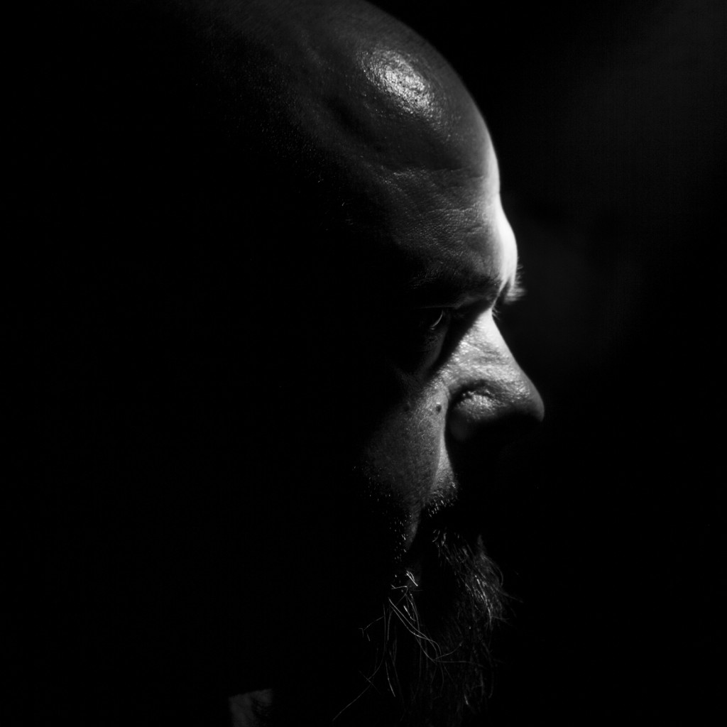
This study is a self-portraiture series using a flashlight to shine a hard light on my body to highlight specific areas.  The images chosen focus on my head and facial area.  To be perfectly honest, I’m a little emotional over seeing how these played out and I’m actually evaluating why that is in my mind.

But enough of that, here is my first project.  Please leave feedback when you can.

Project 1 (8 of 8) Project 1 (7 of 8) Project 1 (6 of 8) Project 1 (5 of 8) Project 1 (4 of 8) Project 1 (3 of 8) Project 1 (2 of 8) Project 1 (1 of 8)

Forward, March!!

The Year 2014 is now upon us.  Each new year brings with it new possibilities and new chances to start fresh on things we would like to improve, either with ourselves or our environment.  It is important, however, to remember that from which we came.

For me, I’ve come off a rather busy semester and have been accepted into a program that, from what I’m told, will make this past semester look like playtime.  I’m definitely looking forward to the challenge.  I’ll be learning from 3 different professors: Delilah Montoya (the head of the PDM department at the University of Houston), Keliy Anderson-Staley (in her 2nd semester as a UH professor), and Arianne Roesch (making her professorial debut at UH).  I’ve yet to learn from Ms. Anderson-Staley (although we’ve met) and Ms. Roesch, so this should be a very interesting semester.

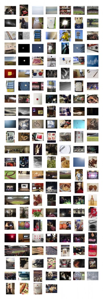
I said in the 1st paragraph that it’s important to remember that from which we’ve come as we move forward.  With this in mind, the image I present to you is the grid of all of the “daily” photos I took in 2013.  There are 157 total images in this grid.  Let’s face it, taking a pic every day can be mentally exhausting when there are so many other, more important, priorities throughout the day.  Some days have multiple images associated with them.  I removed all the context, yet kept them in their chronological order.  I encourage any of my readers to share their thoughts with me on this or any of my blog entries.

At this point I will wrap up this entry and say,”good night and happy 2014!”

2013 Photo Grid

Click on the image to view the full size


Renewal of Germane Activity

I’m still decompressing at this point.  I edited a video assignment from earlier in the semester based on feedback received.  This final video contains the portfolio I submitted for review to enter the BFA program.  I also went to a birthday party last night for a friend of mine that was nice, even if I did stay relatively sober.  This was after a trip to the Catherine Couturier Gallery (Link) here in Houston to attend the opening for “Deck the Walls.” All in all, it was a good night.

The Catherine Couturier Gallery (formerly known as the John Cleary Gallery) is a gallery that represents photographers exclusively.  And these aren’t just any photographers.  Among her clients are some of the heavyweights in the medium.  These names include Elliot Erwitt, Jerry Uelsmann, Maggie Taylor, and the estate of Edward Weston.  The selections on the wall last night were fun pieces from a wide range of artists.  If you’re in the Houston area, I highly recommend checking it out.

I gave a preview of where I was headed with the portfolio review in a previous entry (“Concept #1“).  In that entry, I attempted to remove the object from its normal context and cause the viewer to have a moment of objectivity when contemplating the object before him or her.  This required me to regard the photograph as an object rather than an index of an object.  The intent of this was to give the viewer an object to consider in an objective manner, even if that objectivity was momentary.  This particular project, of course, is rather dependent upon the final print and its mounting in order to achieve maximum impact.

I explain this as this youngest and least developed (in terms of execution) subject matter.  I will explore this concept more as time goes on (and I can get access to a camera that could yield some incredible results.

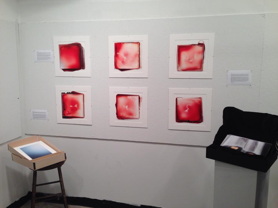
The idea was put forth by my professor to enter my blood slide portraits and my cloud photographs for consideration as well.  The professor felt that all 3 projects conveyed deep intellectual thought (that compliment caught me off guard, but it was very much appreciated) and that would demonstrate that I’m not tied to a single idea.  I thought about this for a couple of days and decided to go with the professor’s idea.   I mean, go big or go home, correct?

For some lighthearted entertainment, I was able to roll the digital versions of my portfolio submission into a video assignment.  Please enjoy this (post-critique revised) video:

https://vimeo.com/81331707

Feel free to ask any questions you may have of the work presented and I will be happy to answer.  Until the next time, please have a good evening.

This was the exhibit for the portfolio review.

This was the exhibit for the portfolio review.

The Decompression Chamber

This semester went by very slowly and very fast at the same time.  The amount of work I did this past semester exceeded my expectations (and initial cost estimates).  At least I had football to keep me grounded.  The UH Cougars went 8-4 while the Houston Texans…  well, let’s just say they’ve seen better seasons.

The semester, at least for us art school undergrads not in a Bachelor of Fine Arts (BFA) or Art History program, ended this week.  I turned my final video project in on Tuesday, while my Portfolio Development course effectively ended for me on November 20.  On the day prior, I submitted my portfolio for review in seeking acceptance into the BFA Photography/Digital Media program here at UH.  I am happy to report that I have been accepted and will start those classes in approximately 6 weeks.

I know I should avoid hyperbole, but the pace at which my activity level picked up in the month prior to the review seemed exponential.  Each day for the 2 weeks leading up to the day found me at the photo lab 5 nights a week taking care of things for the review.

So here I now find myself just bleeding off the stress.  Soon I’ll be rested (sleep was not a priority in November) and ready to start, what I am told, is a much more demanding series of course.  To this I say, “bring it on!” Just let me get some sleep first.

It's the day after my semester ends, and I still can't seem to stop studying.

It’s the day after my semester ends, and I still can’t seem to stop studying.

For other viewing pleasures, the following was my submission for my final video project:

https://vimeo.com/80902751

Concept #1

Here we are…  now I’m getting ready to enter the final stretch of getting into the BFA program at the University of Houston.  Barring any surprises in terms of academic requirements (as far as I know I’m good to go, but I still need to meet with my adviser to verify my academic standing), all that stands in my way is judgment of my portfolio.  I’m tinkering with the main candidate concept right now.  I also have another series, one with which I’ve been working for over a year, but that one is not as well developed on an intellectual level just yet.

Without further ado, here is a working statement and my current photo candidates:

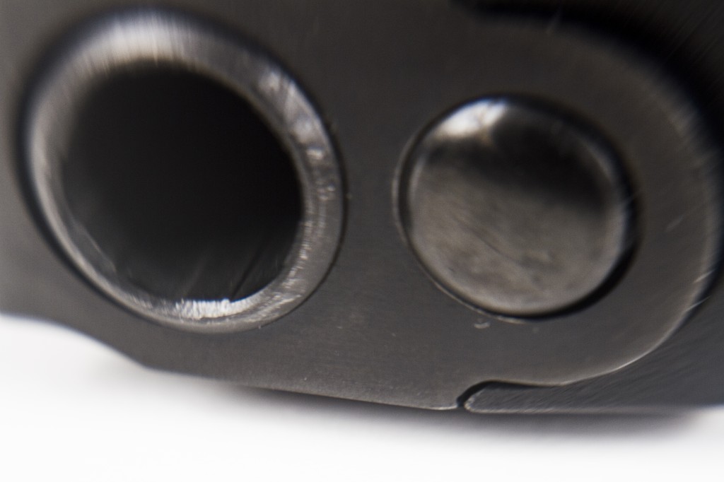
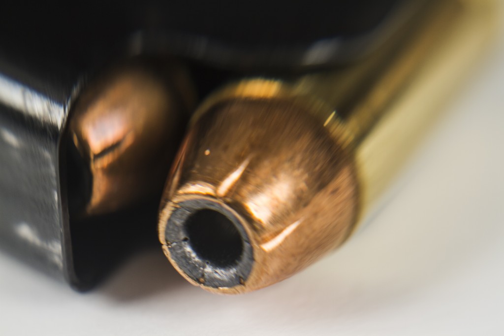
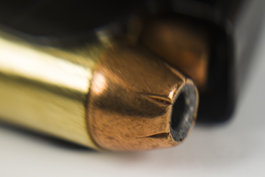
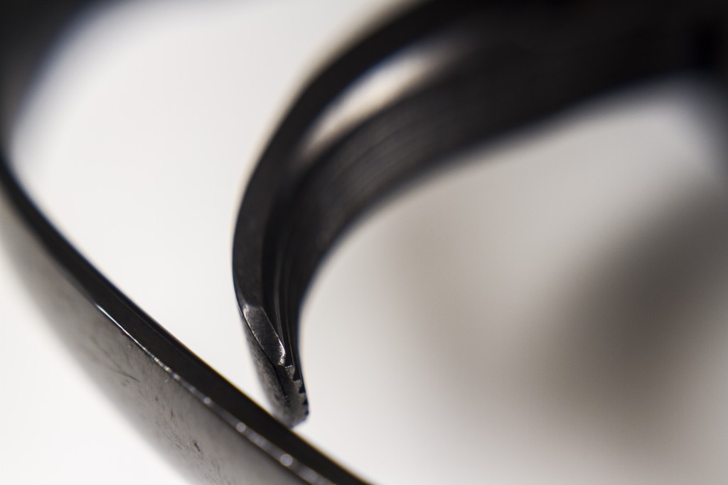
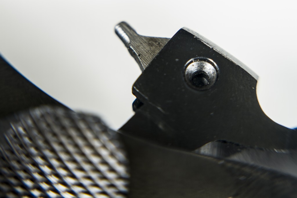
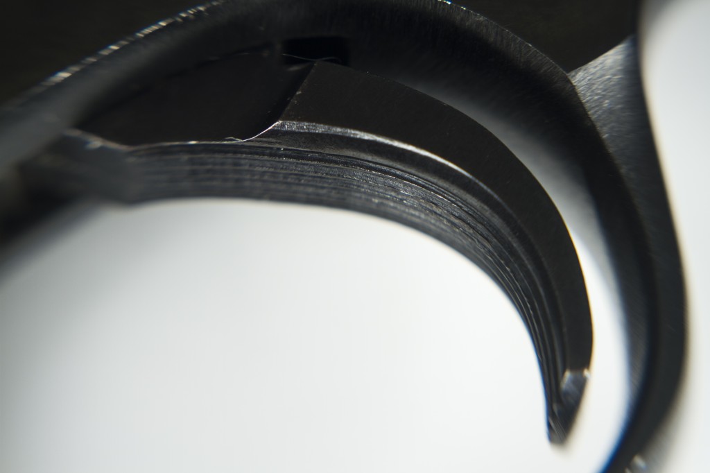
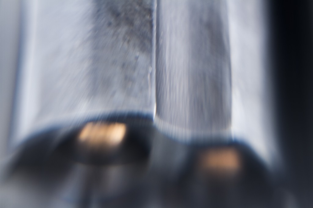
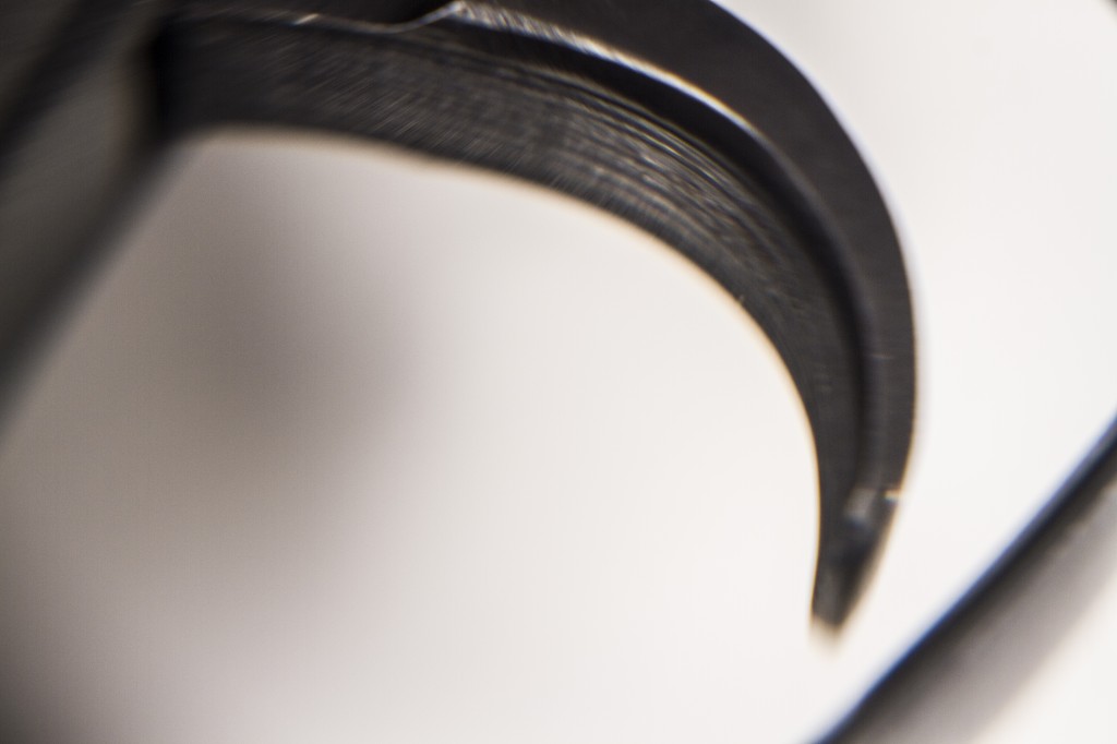
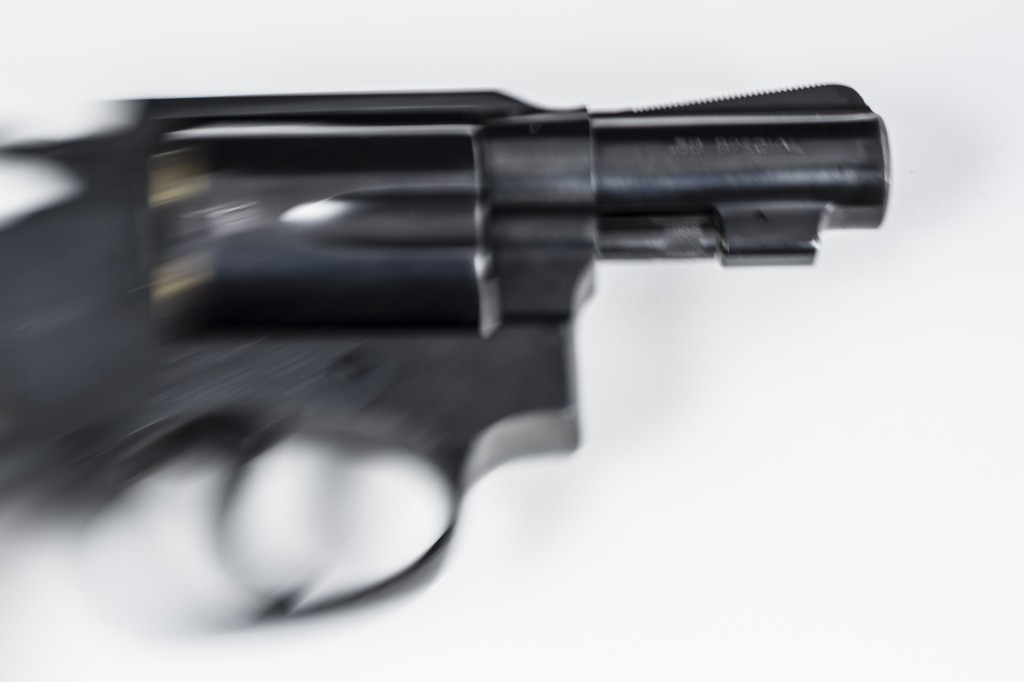
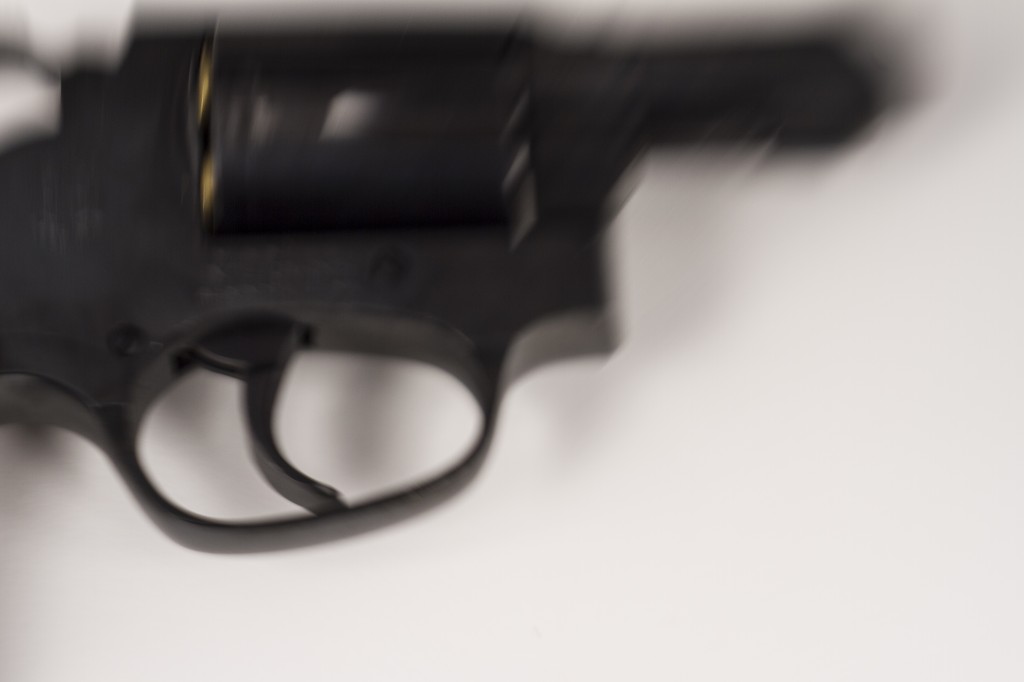
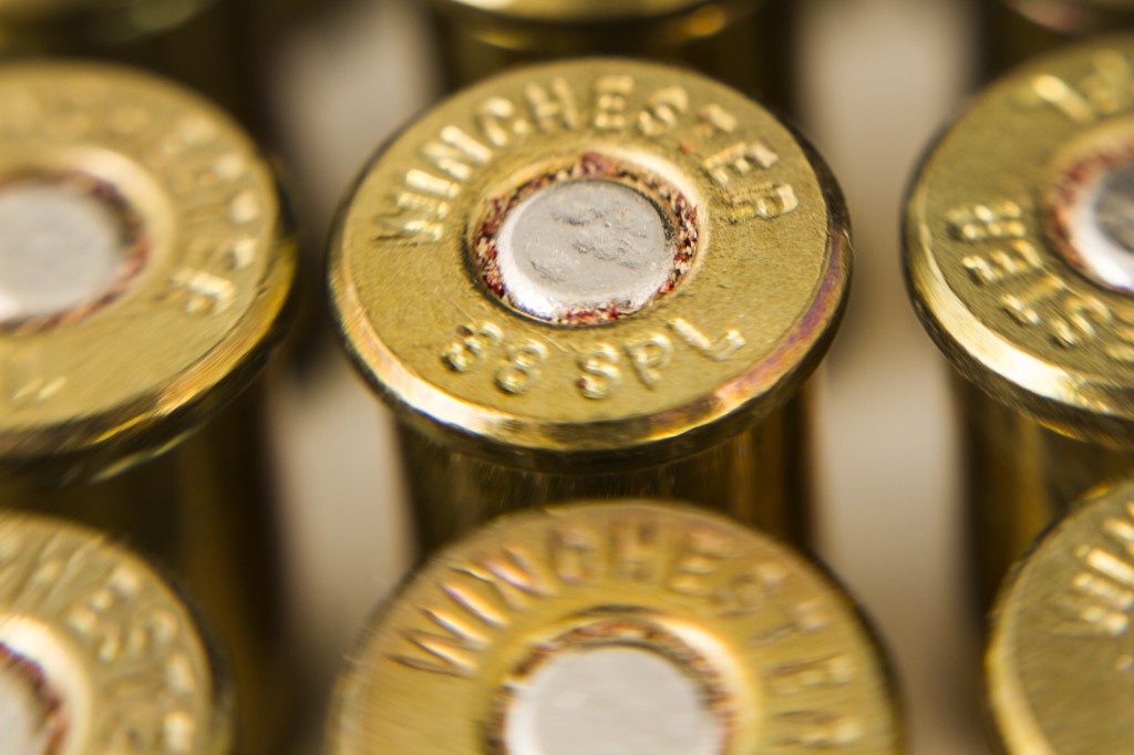
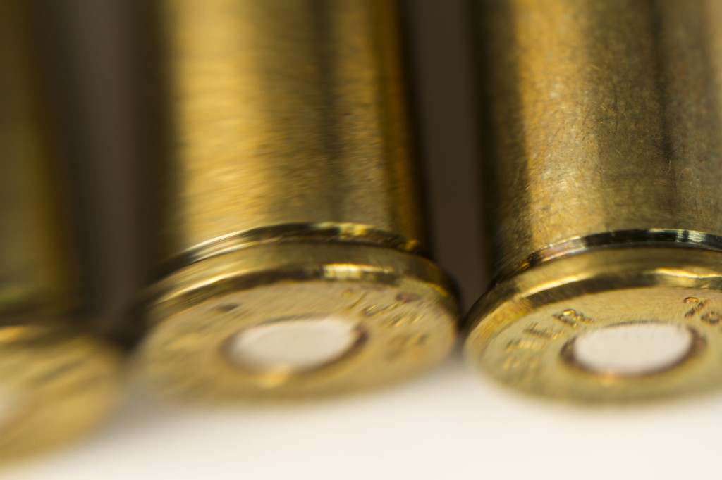
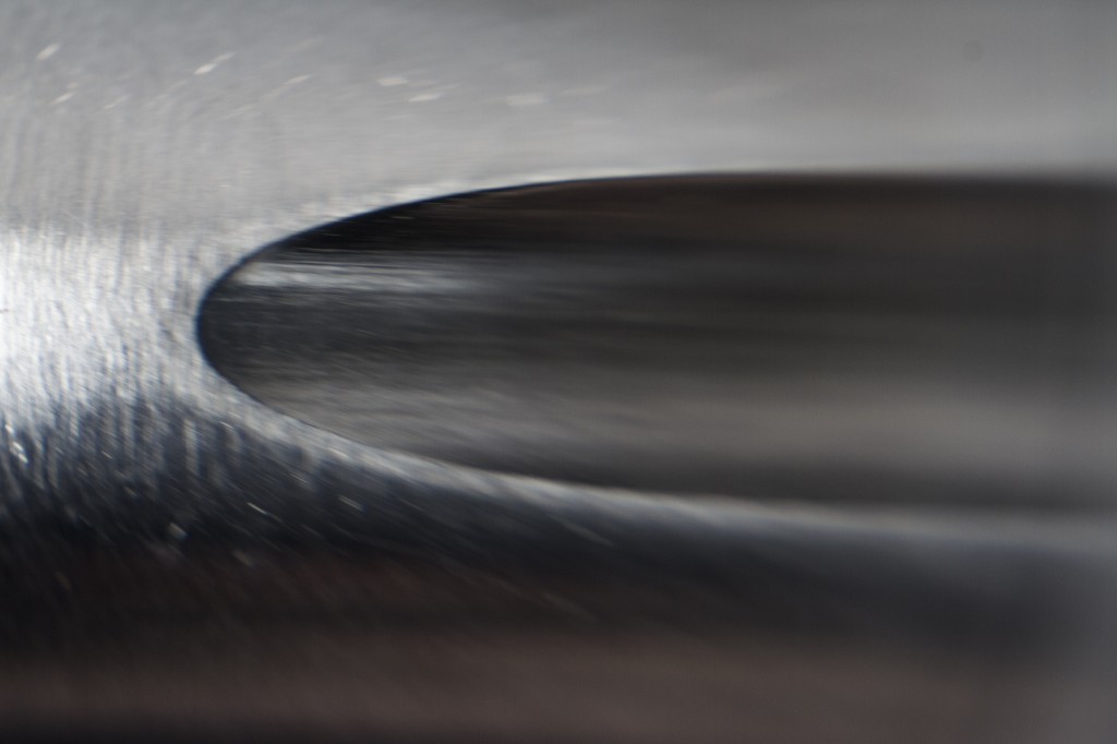
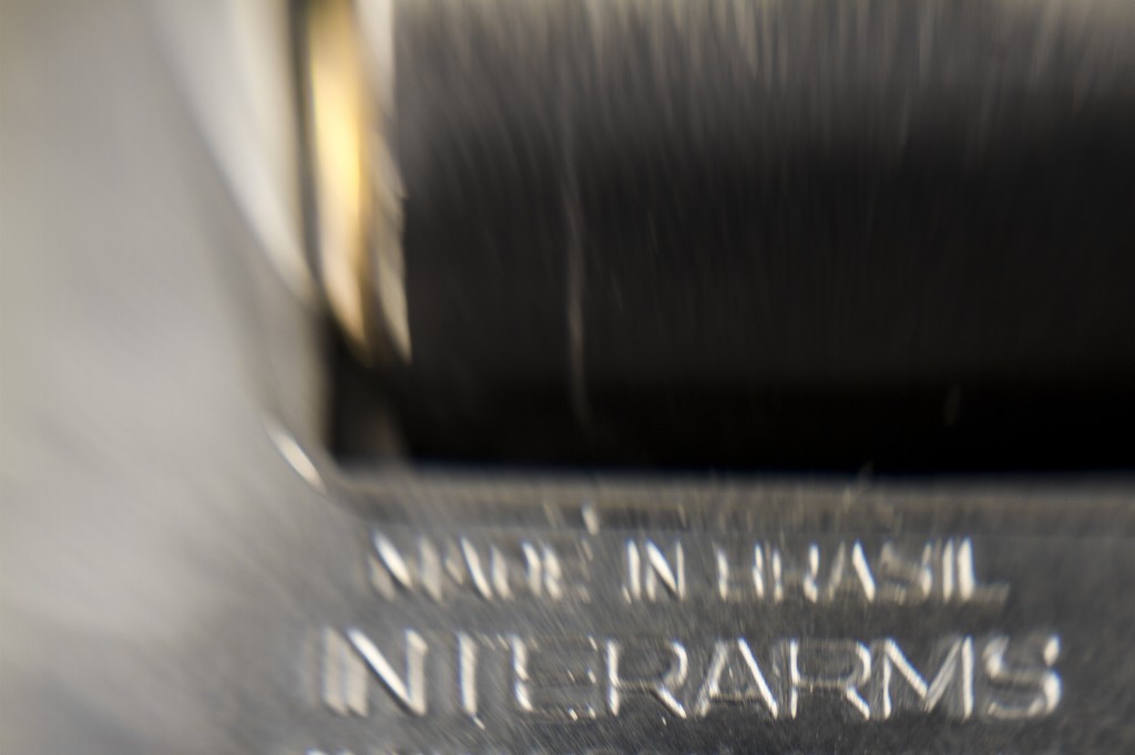
Like a garden rake or a screwdriver, a gun is a tool built for a purpose.  The purpose for which guns are built is to kill.  Unlike the above named tools, as well as many others, people hold a certain fascination for guns.  Often people will try to own as many as legally possible, whether it is economically feasible or not for that particular individual. 

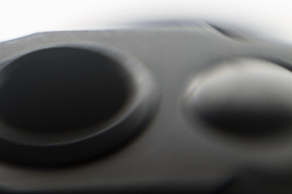
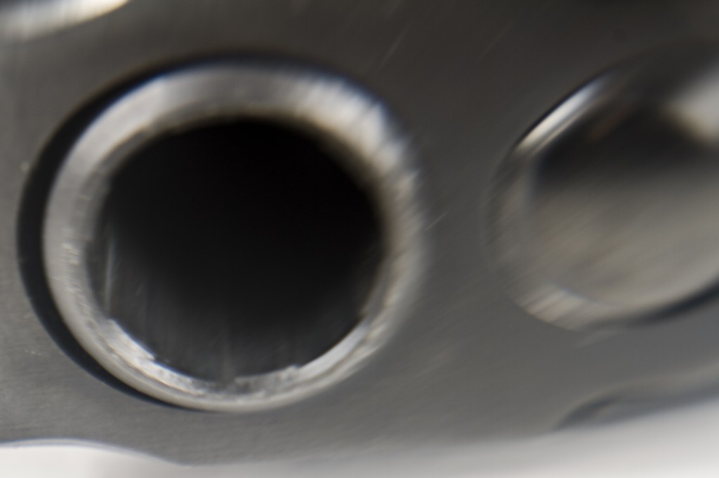
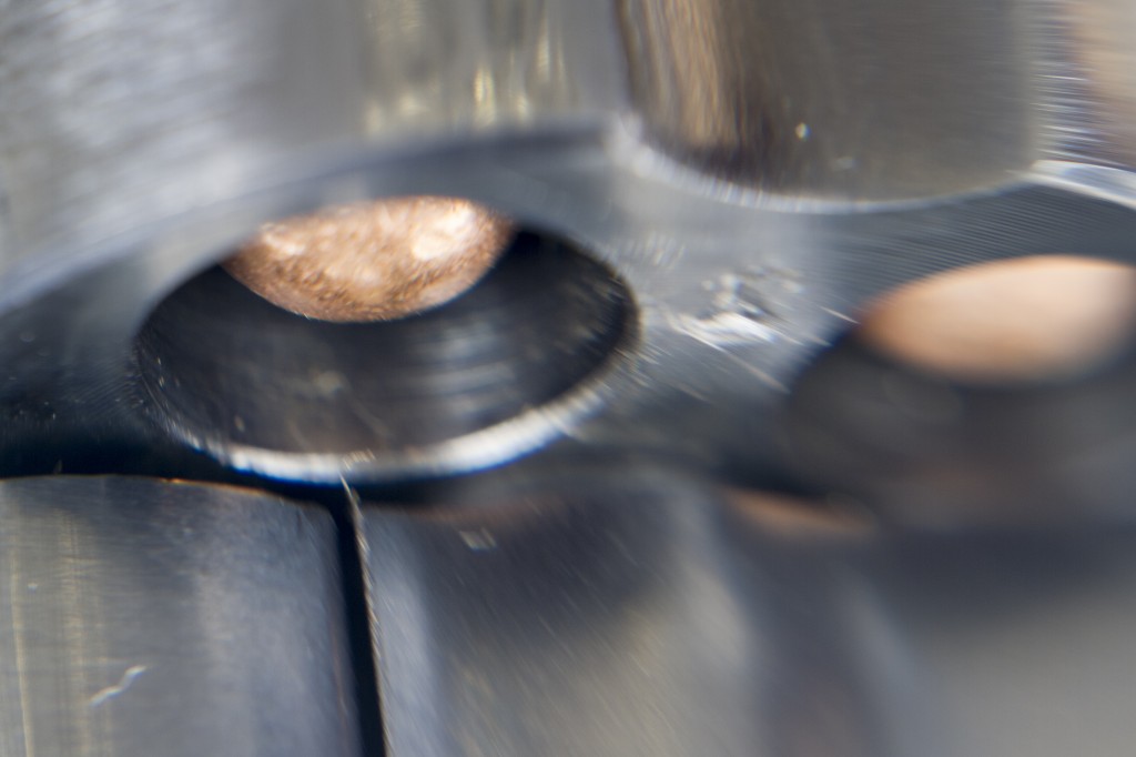
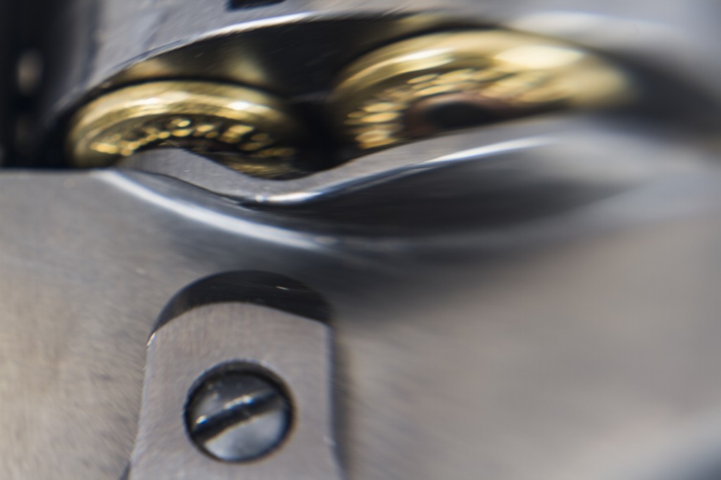
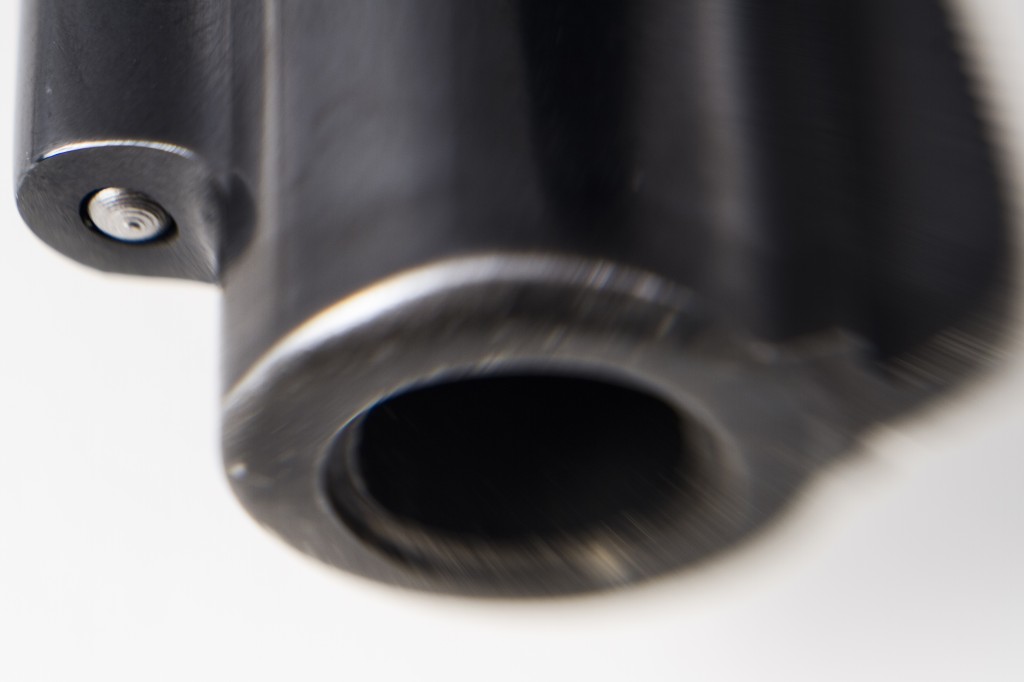
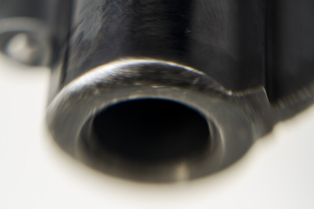
This project will attempt to deconstruct the gun in order to see what it is that may be a root for their fascination.  As this medium is merely an index of a gun, I will attempt to employ those things that the camera does well in order to minimize the fact that the image is an index and allow the viewer to think they are looking at the object being indexed.  The use of light and shadow, as well as selective focus, will be employed in order to isolate various parts of the object.  In some cases, there will be no complete focus anywhere within the frame.  The goal is the force the viewer to come to the objective facts of the image in front of them, thereby delaying the entry of their own external context into the thought process and giving them a chance to consider objective facts. 

_MG_9816 _MG_9817 _MG_9820 _MG_9825 _MG_9831 _MG_9832 _MG_9835 _MG_9839 _MG_9840 _MG_9841 _MG_9847 _MG_9848 _MG_9849 _MG_9851 _MG_9853 _MG_9856 _MG_9865 _MG_9867 _MG_9912 _MG_9914 _MG_9917 _MG_9919 _MG_9920 _MG_9921 _MG_9923 _MG_9926 _MG_9927 _MG_9928 _MG_9929 _MG_9931

Click on any image above to embiggen that image.

Keep in mind, this is a working concept, and it may not even be the final.  With that, comment and critique at will.

« Older posts Newer posts »