Around the dawn of the 20th Century, a new generation of photographers such as Heinrich Kuhn, Alfred Stieglitz, and Edward Steichen began to challenge the paradigm of photography as a technical activity as their compositions incorporated formal elements of art and their prints began to incorporate color through the use of the gum bichromate printing process. Successive generations of photographers such as Minor White, Ansel Adams, and Jerry Uelsmann pushed the artistic boundaries of photography even further, and today photography as a process is a fully recognized artistic medium.
Along with video production, photography as a medium has benefited greatly from advances in technology. The advances have covered nearly everything to do with photography, from the camera used (wooden boxes with no mechanical shutter to medium format digital SLR cameras) all the way to how the final result is produced (traditional paper to digital frames). Photographers have available a number of different technological processes and will often combine these processes in the creation of their art. The use of formal artistic elements along with the use of light and tone are the reasons behind the success of the two photographs, both different in terms of composition, narrative, and use of technology in processing, to be examined in this paper.
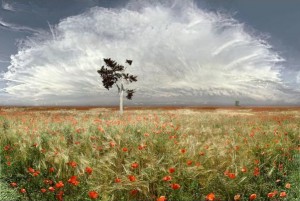
The first photograph is by Jean-Francois Rauziel entitled “Coquelicots.” This chromogenic print, which measures 47-1/4” x 71” and is mounted between two pieces of glass with no border frame, features a field of French Wild Corn Poppies (coquelicots) below and a very large anvil-topped cumulonimbus cloud above. In the field of poppies are two trees separated by large space (in both depth and lateral distance). The foreground tree serves to break up the pattern created by the field of flowers and the swirls of the cloud and it provides a starting point from which one can move their eye around the composition. This same tree holds a bird cage with one bird inside it. The horizon line splits the frame in two equal pieces. As the viewer is drawn in to the depth of the horizon area, the density of the flowers is greater and the cloud gets darker, and we see evidence of an approaching gust front from the thunderstorm.
The composition of the photograph itself is a landscape/nature scene, a genre which lends itself greatly to larger prints in order to emphasize the grandeur of nature. The artist’s use of a very narrow aperture brings the entire depth of the composition into sharp focus. With this, the artist uses the background tree to create depth within the composition using linear, rather than atmospheric, perspective. The streaks of the higher cirrus clouds show the motion of the thunderstorm toward the viewer, which implies motion while keeping the exposure time short enough to avoid motion blur. The small clouds near the horizon line show a gust front, the presence of which implies fast motion toward the viewer.
Lighting is even throughout the composition, which suggests the artist had the benefit of a front-lit scene. However, this is also a chromogenic print, which also suggests that the artist was able to use dodging and burning techniques to his advantage in making the print. The mostly even lighting serves to present us with a large thunderstorm, yet it does so in a non-threatening manner. The lighting brings a large sense of benevolence to the storm, belying its violent nature. As the viewer gets to the deepest parts of the photograph, the dark base of the cloud becomes more apparent, in turn showing the viewer that there is indeed violence with this storm. As the lighting is even throughout, the color becomes important. Without the color, it becomes difficult to differentiate between the different areas over the composition as a whole.
The symmetry created in the composition is nearly perfect in the lower and upper halves. The curvilinear line of the cloud is almost perfectly matched by the line created by the cut foliage in the lower half. This represents the cycle that allows life on earth to thrive. The curved line of the cloud is unbroken and resembles a crown. This shows the artist to be acknowledging the supremacy of the storm in this cycle. The horizontal line represents the strength and stability of the earth, which must work with the fluid nature of the sky (as suggested by the waviness of some of the cirrus clouds) in order to support life. The bird in the cage, which here symbolizes all animal life, is using the vertical line of the tree to assert its position, however small, in the overall cycle represented here. This tiny element is in the tradition of French painters such as Poussin and Lorraine. In these Baroque era paintings the artists downplayed animal life (in their cases they painted actual people) by making them and their activities very small relative to landscapes painted in the scenes.
Given that the print type and the fact that the scale is very close to a 2 x 3 proportion, it is clear that this is a film photograph printed using an analog enlarger. Digital photographs printed using traditional photo paper would bear the label “Digital Chromogenic” as the print type. This is an example of how new contemporary artists are using relatively traditional technologies in order to create new art through their chosen medium.
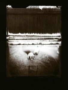
The second photograph is by a Houston Center for Photography Master Student named Mary Riggs Romain. The photograph, entitled “Perseverance,” is part of a series called Not Myself: A Path to Transcending Trauma. This photograph is a digital inkjet black and white print measuring 22” x 28” housed inside a metal frame. The print makes the hands nearly life size. The fact that they are not gives the viewer the sense that he or she is standing close by as the scene unfolds, but not so close as to be a part of the scene at this point in the series.
The composition itself shows a pair of hands coming from a lighted area and reaching into the darker space of the foreground. A person is resting there hands just outside a lighted area and is visible through the opening. The individual elements, layered over top of each other, make this appear as if multiple exposures were used in the creation of this photograph. This idea is reinforced by the holes, which resemble sprocket holes found on 35mm film at the top of what appears to be a curtain (at the top of the composition itself). Given the 11 x 14 proportions, however, it can be inferred that this particular composition is a photo manipulation of elements photographed and/or scanned by the artist.
The focal point of this piece is the pair of hands just below center of the frame. This element is also the only element that is not a straight line, which is what makes it the focal point. The curtain at the top half of the frame contains many vertical lines and one horizontal line across its top area. The repeating vertical lines are a strong exertion of control by the dark curtain, that it has a dark purpose to it. The horizontal lines denote the strength of the curtain’s resolve in performing the task of keeping the suffering person out of view and hidden from the viewer.
The main source of light here is coming from the other side of a curtain that prevents the viewer from seeing the entire body. The curtain itself is dark and ominous, and the foreground in front of the rock on the bottom also gets darker the further it goes from the light. This use of chiaroscuro effectively creates a reverse of what one would normally expect when confronted with a series on overcoming adversity. Because of this high contrast, color is not needed as the artist wishes us to focus on the image itself. Normally many pieces of this type would involve compositions from the point-of-view of the viewer as the suffering and would be going from darkness to light. This often invites the viewer to become a participant in the piece. This particular composition, however, shows the suffering person opposite the viewer, with this person seemingly offering her hand to the viewer as an invitation to come into her world. The light denotes activity on the other side of the crawlspace.
Symmetry is achieved through the vertical. In terms of the horizontal, however, the composition is asymmetric. The frame is split evenly along the horizontal axis by a dark horizontal line. This line serves to create the effect that the viewer is observing through a window. While the viewer can make up their own mind as to where he or she is while these events unfold, it is clear that, according to the artist, the viewer is the one in the dark.
This particular piece is part of a larger series by the artist. Unfortunately the larger body of work is not currently available so the context of this piece cannot be fully appreciated. Unlike the photograph by Rauziel, who was reacting to his environment, Romain selected individual elements to add to a base in order to build up the final composition. The sprocket holes along the top of the frame provide the only evidence of the source of any of the elements. It is not unreasonable to infer that the source elements are a mixture of analog and digital.
Today there are many artists that manipulate different selected elements from many sources to create new compositions. The most famous of these contemporaries are Jerry Uelsmann and his wife, Maggie Taylor. Uelsmann creates all of his surreal compositions using strictly traditional film and darkroom methods while Taylor creates all of her work digitally. Ramain’s photograph is also reminiscent of the work of Man Ray, who was a big influence on Jerry Uelsmann.
In terms of personal reactions, each photograph elicits a different response from this author. With Rauziel one almost feels as if they are standing outside in a field of coquelicot flowers watching an approaching storm. The only thing that keeps that perception from becoming the actual reality is the fact that Rauziel stopped at nearly 4’ x 6’ in terms of size with this print. In Ramain’s “Perseverance” there is both a darkness and insidious force at work. While the narrative, as seen by this author, is one of the suffering person trying to bring another into her world (where the viewer is actually the one in the dark), there also exists the possibility that narrative put forth by Ramain is that of the viewer being the one in suffering while the hand is the viewer’s only link and way back to the world of light. It would be necessary to study the entire series to know which of these competing narratives is correct.
John Szarkowski describes the five “interdependent aspects of a singular problem” (Szarkowski 3) when it comes to photography in his book The Photographer’s Eye. These problems are: The Thing Itself (presenting reality as it is found), The Detail (the question of why something is the way it is), The Frame (inclusion and exclusion from the photograph), Time (the slice of time in which the photograph was made), and Vantage Point (the view of the subject). A successful photograph solves one or more of these issues. In “Coquelicots,” Rauziel solves the problem of The Thing Itself by presenting the reality he has found, but also addresses the question of The Detail as a narrative is being formed with the imminent approach of the storm. Although the photograph is stop motion, we get a sense of time from this work as the motion implied by the clouds and gust front address the issue of Time. As this photograph addresses three of the issues, it succeeds on many levels with many different viewers. “Perseverance” is a typical example of The Detail as this, being part of a series, furthers the narrative the artist has created. Even when taken alone, we ask ourselves the question of what could be on the other side of the curtain or why the hands are even present.
Both photographs tell very different narratives. One projects the grandeur and majesty of nature and the circle of life while the other invites the viewer into the world of someone dealing with a traumatic event. In both cases the formal elements of line use and lighting serve to advance the goals of the artist. In the case of “Coquelicots,” the artist uses linear perspective created by a very deep depth-of-field and as well as the large scale of the print in order to achieve success. In “Perseverance,” the artist uses chiaroscuro to create the darkness and light of two very different worlds both inside a single frame. Both also use very different technological processes to produce the final results, which is one of the benefits enjoyed almost exclusively by photographic artists today.

Click to Embiggen

Click to Embiggen
