I knew I wanted to include at least one picture of one of my dogs in my final project once the vision of direction became clear. I was originally going to do them all in digital (since material waste isn’t a factor) but since I had exhausted my ideas with 35mm I decided to see if I could luck out on finishing the roll. As luck would have it, I did get some really good photos with my 35mm film camera, but of course, I had to decide which one would make the final cut. It was by no means an easy task.
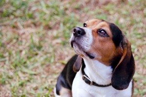
I really liked this picture of Ozzy, my Beagle, but it seemed there was something not quite right with this one. The colors were good and the soft focus gave him a smooth look (Beagles tend to have small but apparent wrinkles on their snouts and jowls, which is one of the reasons they have such powerful noses). It finally hit me that the reflections of light in his eyes were what threw the entire photo off. The reflections give him an otherworldly look that to left me feeling a little less than comfortable. So, this shot went out the window. I was kinda disappointed as this was my first choice upon inspecting the negatives prior to scanning.
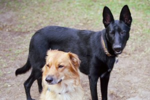
I liked this picture first and foremost for the composition. It isn’t your conventional animal portrait. Both dogs are looking in the same general direction and Sharon (the German Shepherd/Golden Retriever mix) is looking forward with intent while Angela (the black German Shepherd) is trying to figure out what’s going on. The biggest problem I encountered with this one was a matter of depth-of-field, with Angela not being fully in focus. There was also the problem with the Newton rings on Angela (that’s a downside to using flatbed scanners for film). Try as I might, I just could fully eliminate the rings.
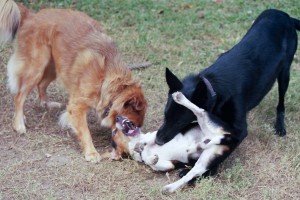
I pity Ozzy sometimes when the ladies gang up on him. This picture stopped a good bit of the action but there was just enough motion blur to give me a sense of the intensity of their play. Compositionally this isn’t a bad shot and you can get a sense of Ozzy’s frustration by his expression and his baring of teeth. Ultimately, though, I decided I wanted to go a little less violent with my picture selection. Otherwise, this one may have made it in as the selection for the 35mm film camera.
Three young dogs tend to move very fast in their wrestling matches. This photo was actually a mistake on my part as I forgot to double check the settings when I went from aperture-priority mode to full manual mode (for some stupid reason I thought they would remain the same). The result was a nice motion blur. The motion blur hides the violence rather well, but in the end I just wasn’t feeling this one. When I look at it now, I think there was just a little too much blur in the photo.
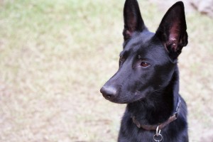
This was one of the finalists in my search for the picture to be included in the final. I loved the look on Angela’s face when I took this photo. It has the look of a puppy (she was just over a year old at the time it was taken) with curiosity yet trying to maintain her composure in case her curiosity turned out to be danger. The rejection came from the composition. Her right ear is cut off at the tip while the left ear remains whole. Also, there’s a little piece of something in the upper right corner of the photo that I found distracting. I supposed I could have cropped it out, but to be honest the cropping did not look much better than the original. Otherwise, I loved the tonality and color balance in this photo.
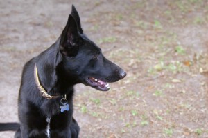
As you may or may not recall, this was my selection for inclusion in the final project. Angela manages to keep an air of dignity about her as she fights through the exhaustion of her previous running around. Also, she continues to watch for danger even while obeying my command to sit. Compositionally this is a very simple photo, which is something I continually strive to accomplish. The grass is vivid yet subdued enough that it doesn’t compete for attention with the subject of the photo. Plus, in my opinion, Angela is a beautiful example of a black German Shepherd with German bloodlines.
Anyone have any thoughts?
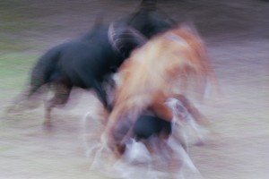
The contrarian view – I find the blurred image to be the strongest. The motion conveyed can lead the viewer to thoughts of playful pups or a violent struggle. Both present powerful emotions in the viewer.
Overall, I find the rest to be static in comparison. Motion-wise, they still would be with the same settings. But to me, they just don’t conjure the same thoughts and feelings.
But honestly, blurred is where I am at overall right now. I’m finding beauty in Chris Friel’s latest works. Here’s an example -> http://www.flickr.com/photos/cfriel/5283563511/
Fair critique, Bill. Don’t get me wrong, I do like the blurred photo a lot. However, the final shot of my German Shepherd is the one I felt best captured her spirit. One can see from her slightly drooped neck and panting that she just got done performing some physical activities. Yet her ears are at attention and she us looking into the field with intent, as if always on guard. That to me best captured the spirit of the young Geman Shepherd Dog.
I am of the belief that if I had been able to freeze the ground the blurred photo would have been more powerful as it would have emphasized the violence of the motion. I’m not talking tack sharp focus, but just enough to show the contrast between the respective inertias of the elements.
Blur can definitely make a powerful photo. I’m more in the camp of selective focus at this point, but I have seen fully blurred frames that are extremely powerful.